entries Tagged as [typography]
El Lissitzky: ‘Frankreich’
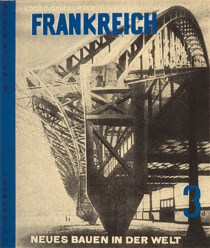
Cover design by El Lissitzky for Roget Ginzburger’s Frankreich (France) 1929.
From Neues Bauen in der Welt, a book series on modern architecture published in Vienna.
Below, recent release by Brooklyn-based Dream Diary, El Lissitzky.
Dream Diary: El Lissitzky
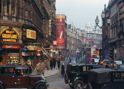
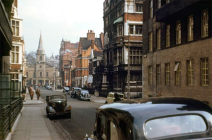
1940s London in colour
‘These photographs were taken using Kodachrome film by the improbably and wonderfully named Chalmers Butterfield, probably in 1949.’
Click on the images for larger images/zoom features/jump.
DJ Munoz/London Calling: You Drive Me Crazy (Yellow Drill Remix)
Images found via Peter Serafinowicz
Barack Obama, font savvy
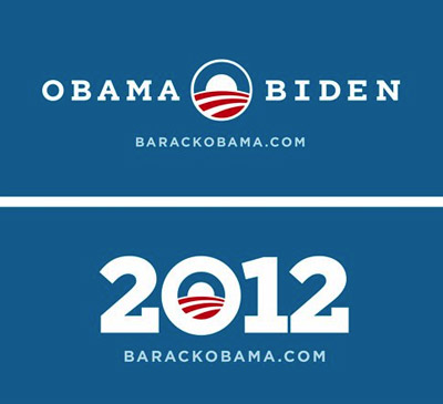
‘Can we add serifs to Gotham?’
One thing I like about Obama: He knows good design.
In 2008, his campaign lifted political propaganda out of the long ass slump it had been in. The fonts of choice were Eric Gill’s Perpetua and Tobias Frere-Jones’ Gotham.
And revealed this week: 2012 graphics featuring a custom slab serif version of Gotham.
So when The President calls wanting a font change, Hoefler & Frere-Jones were ready to oblige.
Found via Hoefler & Frere-Jones
Alexey Brodovitch, good layout

‘There is no recipe for good layout, but what must be maintained is a feeling of change and contrast.’ –Alexey Brodovitch (1898-1971)
Photo by Man Ray, layout by Brodovitch for Harper’s Bazaar, 1934.
Dryden whisky

Canadian Club advertisement, 1928.
The work of commercial illustrator and fashion design pioneer Ernst Dryden (1887-1938).
BERN HARD Fashion in metal
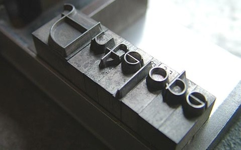
‘Bernhard Fashion. This typeface was designed by Lucian Bernhard and introduced by American Typefounders in 1929.’
Found via Emily McGuiness
