entries Tagged as [logo design]
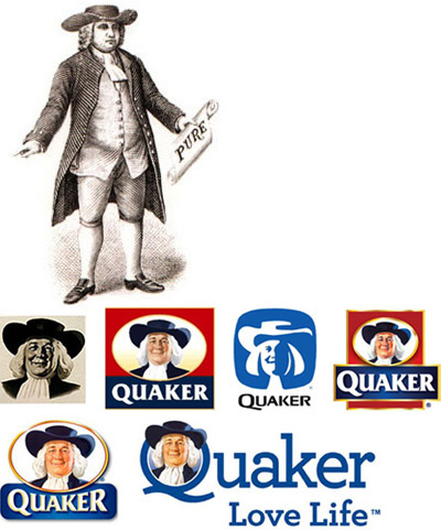
Penney’s logo history
It all boils down to . . . Helvetica.
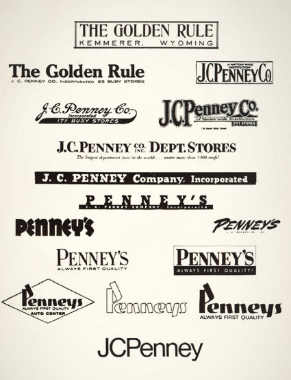
JCPenney started as The Golden Rule store – or so said the literature I read as a kid. Wiki says something else.
My mom worked for JCPenney for 22 years and they had a big anniversary in the 1970s. They had wooden rulers with ‘golden rule’ written on them as part of a anniversary suite of premiums. I remember lots of simple yellow (‘golden’) and black stuff, sort of a 70s take on Victorian style.
And I was fascinated with a logotype history chart that was part of a company history booklet. Above is an old photocopy.
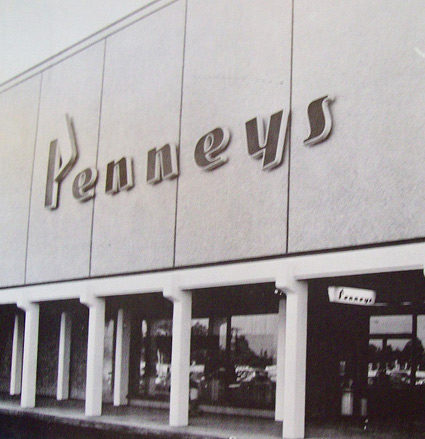
Over the years, the company simply became known as Penney’s – logo treatments reflecting retail trends.
The possessive was dropped and the ‘JC’ was officially re-added in 1971 – the year its founder, James Cash Penney passed away.
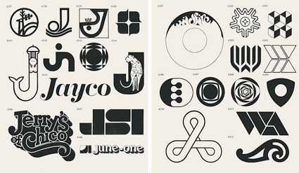
Logo porn
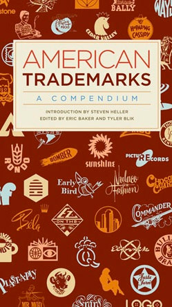
‘With over 1,000 examples in categories such as animals, circles, faces, or science, it’s fun to browse and serves as a curious retrospective of American entrepreneurism.’ -Fast Company
Eric Baker and Tyler Blik wrote one of the first logo books I ever owned. And their latest is the densely-packed American Trademarks: A Compendium.
Snag your copy here. Read the Fast Company review (with related links and a slideshow) here.
Found via Jamal Ahmad
Sacramento, shhhh
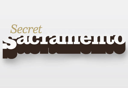
Logotype by mehallo
The secret to being in Sacramento, CA is knowing where the cool stuff is. And a lot of it is just under the radar. The right gallery on Second Saturday, the hole-in-the-wall that has the best burrito, what cool bands are in town.
Mark Bean started Secret Sacramento as a Facebook group. And it’s become wildly popular (over 3,000 followers as I write this) – and it’s spread to Twitter.
And launched recently, the Secret Sacramento website. The new site is kinda sparse – so if you’re local, login and post your own regional finds. Share your secrets.
where i fit in
In addition to designing the logo (above), I will be contributing content from time to time.
But shhhh, it’s all a secret.
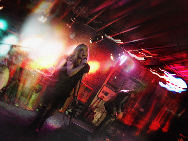
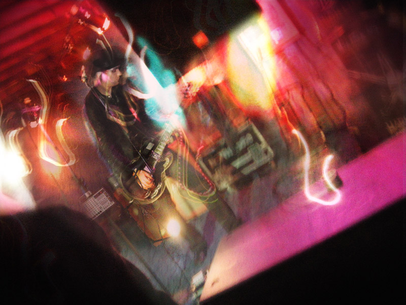
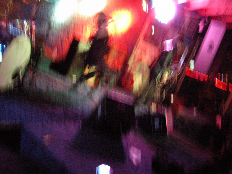
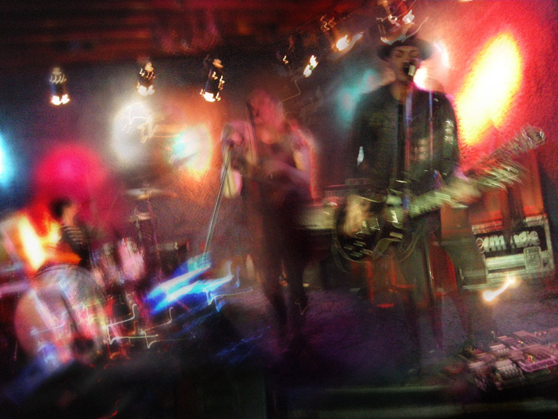
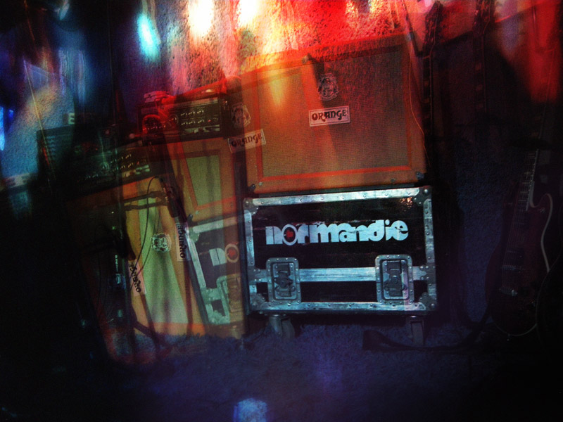
Normandie, Fresno
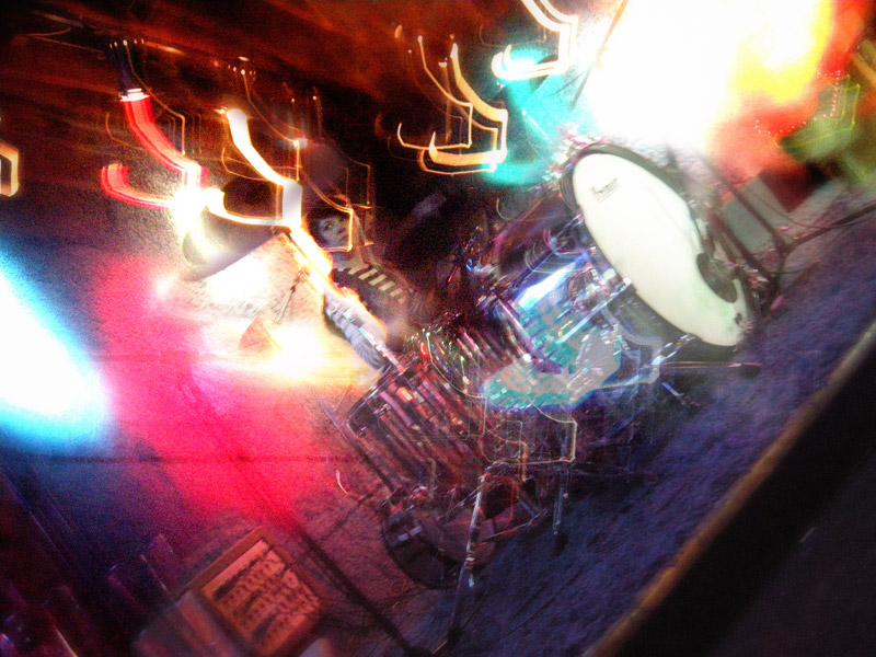
A couple of weeks ago, I took a day off and drove to Fresno, CA to see Normandie. Nice small club, loud music.
Took photos. Click on them to jump/see larger versions.
Trajan: The movie font
‘Try playing the Trajan drinking game’


New identity for Gent

New logo system and identity for the city of Gent in Belgium. What do you think? Article, critique and discussion at Brand New.
![]()
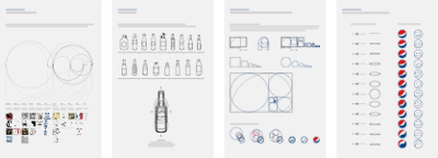
The evolution of the Coke and Pepsi logos
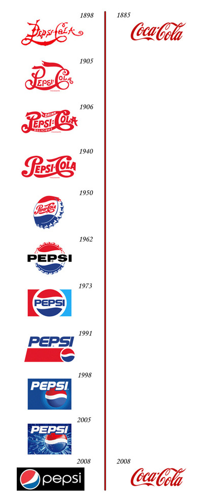
Found via Reserves on TwitPic
Plus, there’s some more Evolution of Logos charts at the Best Ad blog.
And, here’s a link to the ‘official’ Pespi rebrand strategy proposal [pdf]. The most involved snow job in the history of brand design. Worth downloading and . . . reading with awe!

handpicked posts

a piano falls in old manhattan
tetro and typography
it’s typography: film, song and dance
ghosts of gustov klimt
the great times new roman controversy
picking fonts
kapitaal
defining terms: design is not decoration
garcia's 'pure design'
'enhance that image!'
magic highway remixed
the cynic
rad anthem
Brought to you by man dom-


buy my fonts
go shopping
mehalloreads

Divinely Elegant: The World of Ernst Dryden
Jozsef Pecsi: Photo and Advertising
Color: A Natural History of the Palette
Collage: Assembling Contemporary Art
Modern Dog: 20 Years of Poster Art
Gaberbocchus Press: An Experiment in Publishing, 1948-1979
Advertising Art in the Art Deco Style
Googie Redux: Ultramodern Roadside Architecture
Hot Sour Salty Sweet: A Culinary Journey Through Southeast Asia
now playing


the work at the mehallo blog. beta. is licensed under a creative commons attribution - noncommercial - no derivative works 3.0 united states license. if reposting, credit must be given to steve mehallo - and if possible, please provide a link back to the mehallo blog. beta.
i include images for the purpose of critique, review, promotion and inspiration - and always make my best effort give credit/link back to the original source. if i’ve screwed up, please fire me a note.
page layout based on the wordpress 'darkwater theme' by antbag, adapted and redesigned by mehallo. valuable php assistance from bill mead.


