entries Tagged as [graphic design]
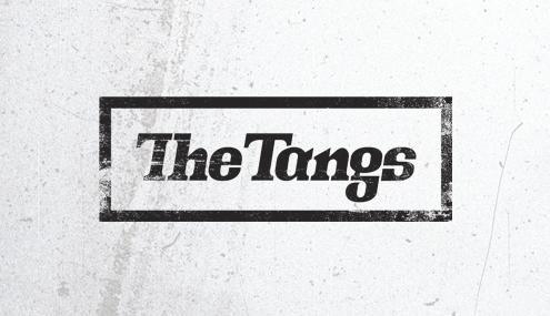
The Tangs
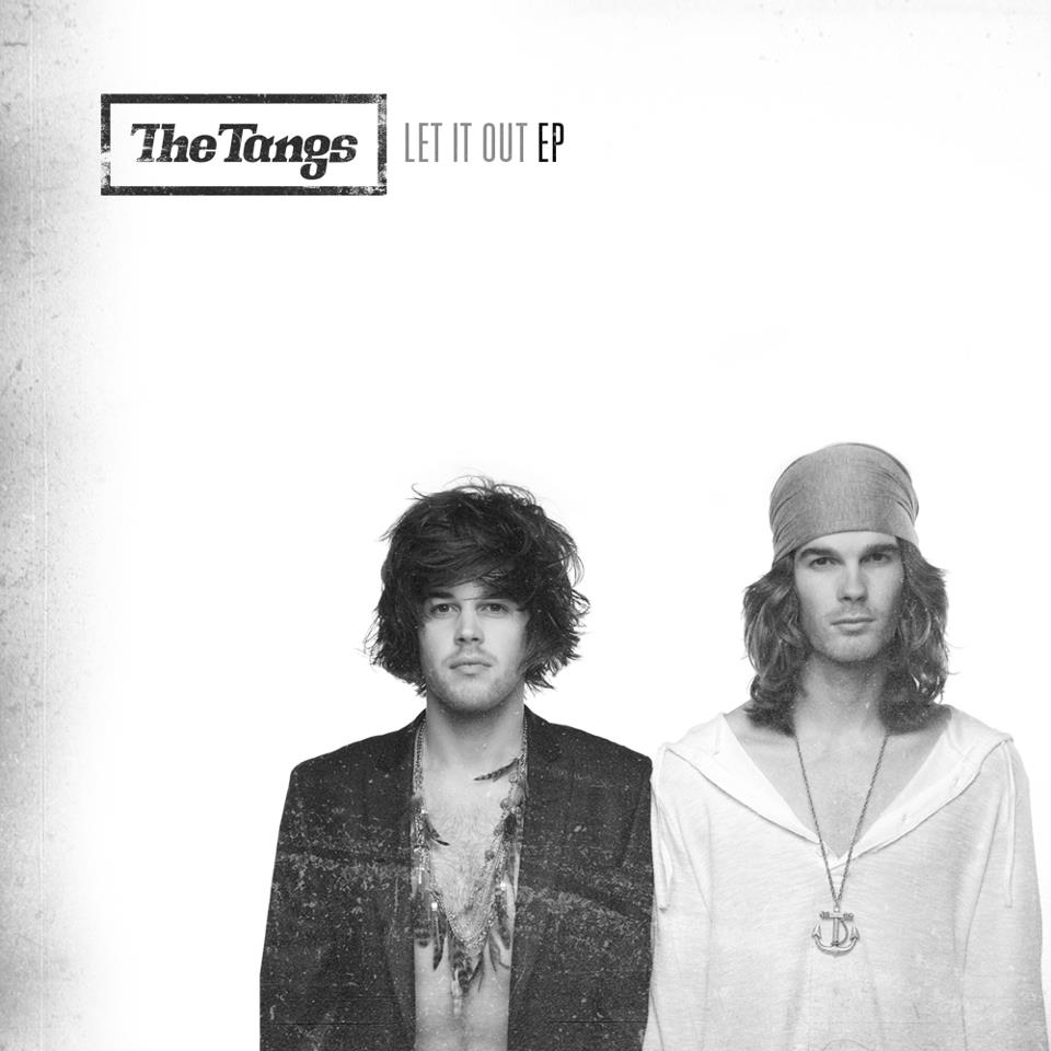
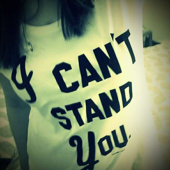
‘Yeah, for the logo the ‘g’ took longer to design than all the other letter forms put together.’ -bb
Former typography student. New band. Custom drawn g.
Brett Berry survived my graphic design courses and recently formed The Tangs with his brother Brandon.
Their debut EP Let It Out can be snagged on iTunes.
Website here, Facebook page here.
The Tangs: Take Me Down
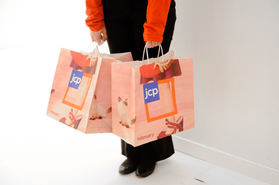
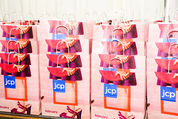
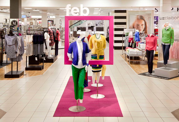
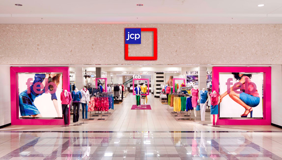
JCPamerica

“Every initiative we pursue,’ starting February 1, reads the press release, ‘will be guided by our core value to treat customers as we would like to be treated — fair and square.”
In just under a year, JCPenney rebrands again. Out is Helvetica, in is Gotham. Also in is a whole new approach to store organization and product pricing.
Brand New article here, press release here.
Changes start tomorrow. Bold design move, bold ad campaign.
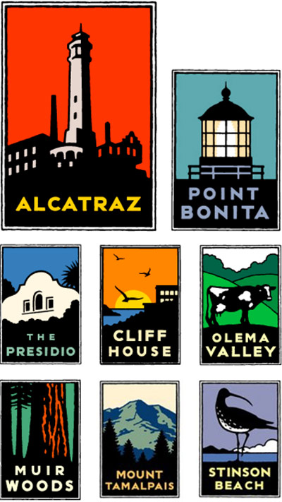
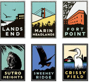
GGNP and Schwab
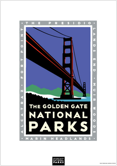
‘The graphic images were an instant success when they premiered in bus shelters around the city. San Franciscans loved them. Too much, in fact, as some of the posters were stolen from the shelters.’
Often copied, Michael Schwab’s posters for Golden Gate National Parks. Brand implementation by Rich Silverstein and Jeff Goodby, circa 1993-7.
Case study here. Parks Conservancy store (Schwab’s art on prints, mugs, shirts, chocolate tins and more) here.
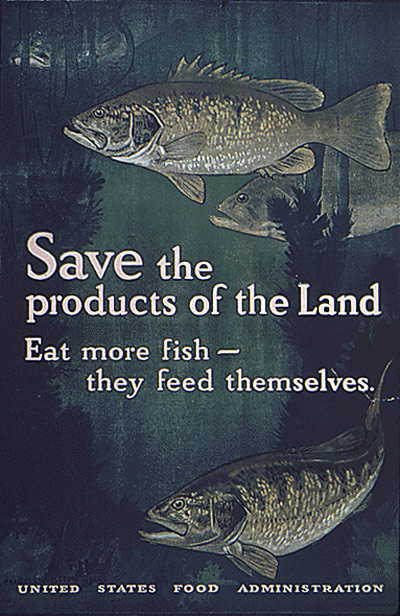
‘Eat more corn, oats and rye products –’
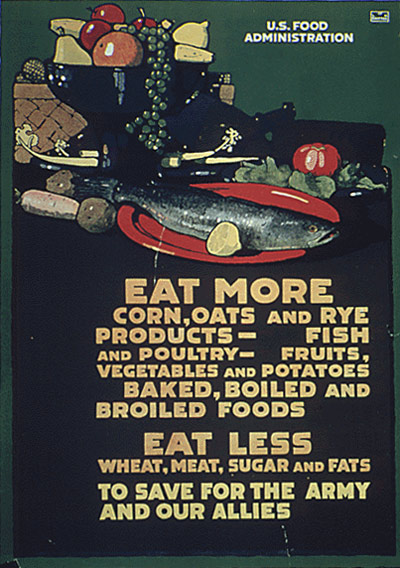
‘This poster was created by L.N. Britton circa 1918. It promotes food and resource conservation.’
Many years ago I found a small brochure at the National Archives building in San Bruno, CA. From it I ordered a bunch of inexpensive reproductions of early 20s century posters (pictured) – direct from the government. Framed, they looked great in my first apartment.
Everything is now online. All around 10 bucks a pop.
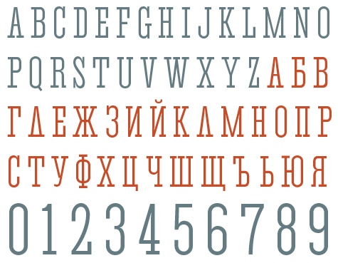
1912 American Type Founders + more
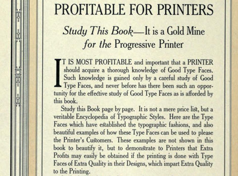
‘Originator of Type Fashions’
American Type Founders’ complete 1912 specimen book. 1348 pages.
Entire book posted online here.
The industrial revolution changed the size of font offerings. What were once posters or broadsheets from small type foundries, ‘type specimens’ became elaborate volumes – today collected as rare editions. [Read more →]


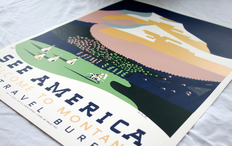
‘See America’
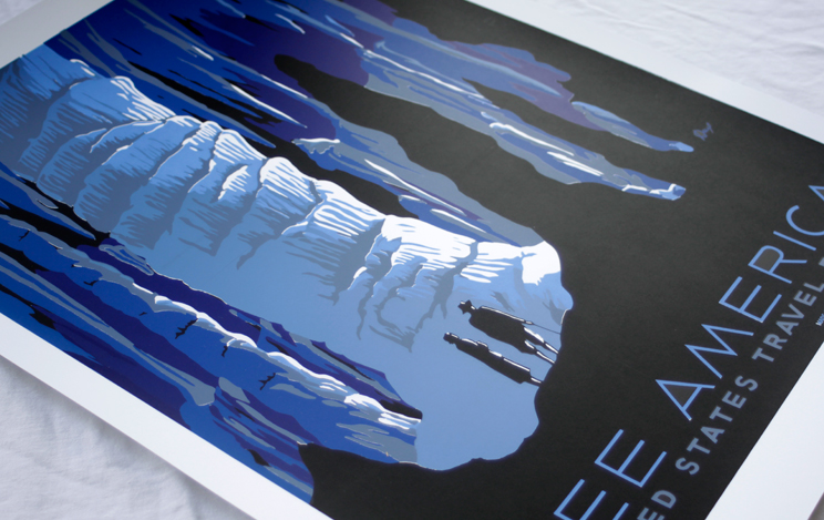
‘A collection of WPA-era US Travel Bureau Posters as reinterpreted and screen printed by Providence’s Head Light Hotel’
Available thru Tiny Showcase: Reproductions of 1930s ‘See America’ poster art.
So much cooler than the current government-sanctioned offerings of Brand USA, Inc.

handpicked posts

a piano falls in old manhattan
tetro and typography
it’s typography: film, song and dance
ghosts of gustov klimt
the great times new roman controversy
picking fonts
kapitaal
defining terms: design is not decoration
garcia's 'pure design'
'enhance that image!'
magic highway remixed
the cynic
rad anthem
Brought to you by man dom-


buy my fonts
go shopping
mehalloreads

Divinely Elegant: The World of Ernst Dryden
Jozsef Pecsi: Photo and Advertising
Color: A Natural History of the Palette
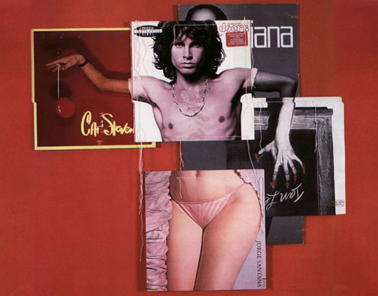
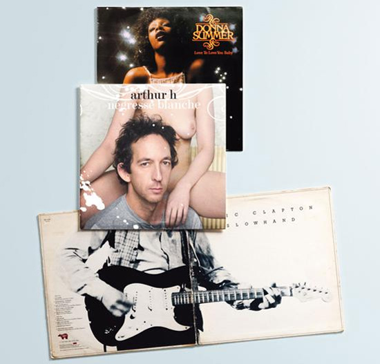
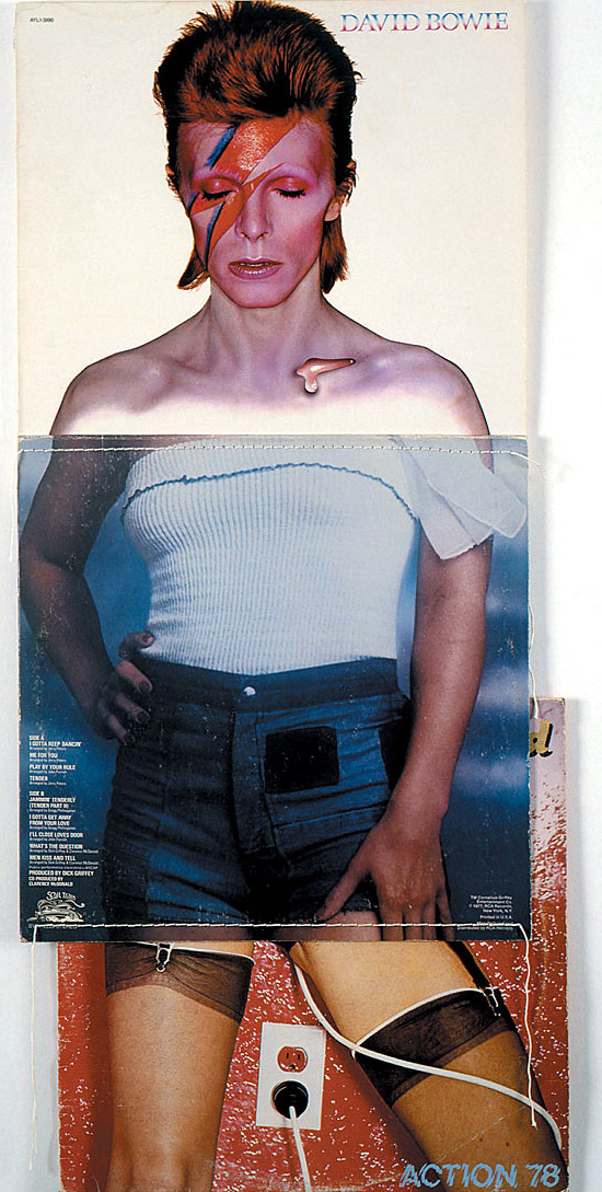
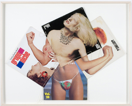
Collage: Assembling Contemporary Art
Modern Dog: 20 Years of Poster Art
Gaberbocchus Press: An Experiment in Publishing, 1948-1979
Advertising Art in the Art Deco Style
Googie Redux: Ultramodern Roadside Architecture
Hot Sour Salty Sweet: A Culinary Journey Through Southeast Asia
now playing


the work at the mehallo blog. beta. is licensed under a creative commons attribution - noncommercial - no derivative works 3.0 united states license. if reposting, credit must be given to steve mehallo - and if possible, please provide a link back to the mehallo blog. beta.
i include images for the purpose of critique, review, promotion and inspiration - and always make my best effort give credit/link back to the original source. if i’ve screwed up, please fire me a note.
page layout based on the wordpress 'darkwater theme' by antbag, adapted and redesigned by mehallo. valuable php assistance from bill mead.


