entries Tagged as [graphic design]

Book gypsies in El Lay

‘They are traveling the country  . . .  join us for the day as they work on producing a unique keepsake with the Museum’s presses and materials – and then have a talk’

This Saturday, April 10, Santa Cruz-based book artists Peter and Donna Thomas will be at the International Printing Museum in Carson, CA. Details here.

More about the Thomases here.


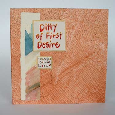
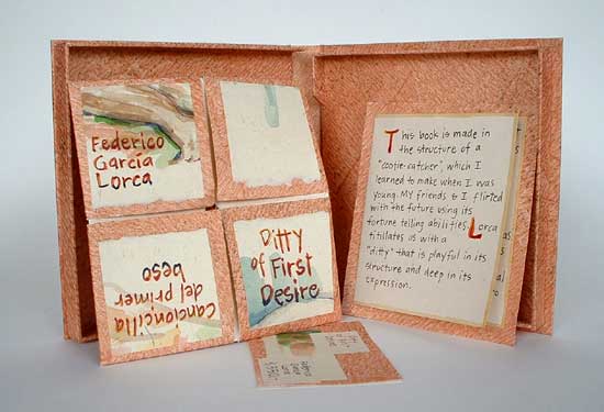
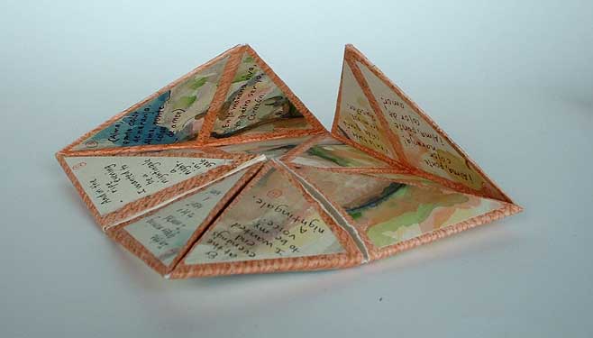
Peter and Donna Thomas’ Ditty of First Desire (2007), a ‘cootie-catcher’ shaped book – with paintings of nudes – showcasing the poem by Federico Garcia Lorca

Dinner at my place

Video for Navigators’ My Place. Designed by Pavel Fuksa.

Matchboxes photoset here.

Found via Ai Buenafe

Creativity Never Sleeps

Creativity Never Sleeps, animated by the minds at Veer.

Found via Gábor Kóthay

New (Square) Coke

‘It’s slick, futuristic and vastly different from Coca Cola’s packaging which would be the reason they wouldn’t pick this up’

so green!
A brilliant bottle concept by an Industrial Design student – Andrew Seunghyun Kim – for helping reduce Coca-Cola’s environmental footprint. Would love to see this implemented. Coke: are you listening?

Details here. More details at Andrew Seunghyn Kim’s blog.

Just don’t tell Raymond Loewy about this.

Found via Designers Couch

The Traffic Calendar

I don’t buy a calendar anymore.

Because, like clockwork, a super cool one will arrive in the mail; typically a bit after the New Year has arrived.

For the past 15 years, Thomas Krug has been mailing me an incredible calendar. It often arrives in a large box and it always dazzles. Elaborate printing techniques, special inks, die cuts – a mesmerizing trip of photography and design.

Thomas is the owner of the Traffic design agency in Winnenden, Germany. And his firm’s self-designed calendar is one helluva promotional item. [Read more →]

Koch Blackletter


‘Kiss my ass! – or, Get stuffed!’ Rudolf Koch c. 1929

Last weekend, I was a guest blogger over at Boxed in Design. Did a write up on the incredible work of lettering artist Rudolf Koch (1876-1934).

Read it here.

Mexican Blackletter

‘The letterform’s characteristics rely on ornaments and contrast, which are both playful and mysterious at the same time. The same as the market engulfs the shopper with its array of stimuli’ -CP

Cristina Paoli’s slim coffee table book Mexican Blackletter takes a look at the importation of blackletter types into the Americas (via Spain) and subsequent vernacular adaptations in Mexico.

My favorite part is the breakout of multiple adapted forms, how they compare with each other (below) and how these forms have evolved into something distinctly Mexican.

Snag the book here. It’s a delightful read.

Harley Beast

The Harley Davidson 2007 Beast campaign. Creative director: Joe Hospodarec, art director/illustrator: Joel Arbez, Agency: WAX.

Found via Ads of the World

Megadeth, reinterpreted

In my intermediate typography course at the California Art Institute Sacramento, students tackle CD packaging design – with a slight twist. Inspired by Project Runway, I like to put limitations on the work to force the student to engage the project where inventiveness will lead to unusual results.

If I could get them to do everything in 24 hours, with Tim Gunn checking in, I’d try that too.

project limits
In this case, students have to work with a band (or recording artist) that they do not know anything about or (preferably) simply do not like. The more they delve into a genre foreign to them, the more interesting the results have been.

Pictured is student Isla Waite’s interpretation of the Megadeth album Endgame. Her decision to reimagine the lyrics into typographic layouts (inspired by the lyrics’ subject matter) led to a unique interpretation of the traditional stylings of Heavy Metal.


Megadeth: Endgame

Blackletter in Mainz

I Love Typography takes a look at the holdings of the library of the Gutenberg Museum in Mainz. More than just Bibles.

Article here.

Few things about type design


Alice Savoie’s Capucine

Here’s a great article by Gerry Leonidas over at I Love Typography.


Creative Commons License

the work at the mehallo blog. beta. is licensed under a creative commons attribution - noncommercial - no derivative works 3.0 united states license.  if reposting, credit must be given to steve mehallo - and if possible, please provide a link back to the mehallo blog. beta.

i include images for the purpose of critique, review, promotion and inspiration - and always make my best effort give credit/link back to the original source.  if i’ve screwed up, please fire me a note.

page layout based on the wordpress 'darkwater theme' by antbag, adapted and redesigned by mehallo.  valuable php assistance from bill mead.