entries Tagged as [graphic design]

Spur of the moment Jeanne Moderno Giveaway

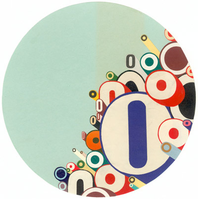
This week I’m giving away a free licensed copy of Jeanne Moderno Geometrique ($32 USD value). Cause I feel like it.

To enter, all you have to do is leave a comment on this post. To comment, just click the ‘comment’ link below (and please fill out all the fields).

I will randomly select one winner from the comments. The winner will be notified by email and the font will be sent via YouSendIt.

Contest ends 11 p.m. (pacific time) Friday, April 16, 2010.

And
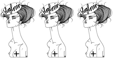
You can also snag a print or greeting card or postcard of the above image. Zazzle does a great job with these – even though their onscreen previews look fuzzy. Been using the greeting cards a lot.
Fontcase contest

Need good font management for your Mac? Fontcase is pretty damn cool. The interface is a lot like iTunes or Adobe Bridge.

And this week only, Fontcase is giving away 3 free licenses. To enter, just go here and follow the directions. Contest ends April 14, 2010.

(And I’m entering too – I just haven’t gotten around to paying for my own license.)

How to set type the Linotype way


Typesetting: Linotype, 1 of 2

Typesetting using the Linotype caster. Film produced sometime around 1960 by Salesian Vocational and Technical Schools, Italy.

I love how he refers to ‘matrices’ as ‘mattresses.’


Typesetting: Linotype, 2 of 2

Found via Linotype

Stefan Sagmeister on life, design and time off


From 2007

TED videos featuring Stefan Sagmeister.


From 2008


From 2009

The Panic Mark

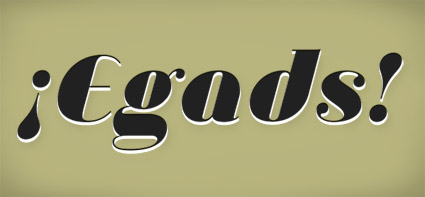
‘Exclamation points are great for things that are exciting and fun, but I’ve always felt they fell a little short when I wanted to express real anger, frustration, or panic.’

Jessica Hische’s proposal for a slight addition to the English Language. Read here.

¡Egads! set in Jeanne Moderno Ultra Italic

Typo Tofu

‘Move over fun, there’s a new sheriff in town, and his name is Typo Tofu. Typo Tofu is also the funnest way to stay healthy and learn to read at the same time. Quite the double whammy.’ -Michael Hines

Designed by Uqam design student Jean-Maxime Landry. Details here and here.

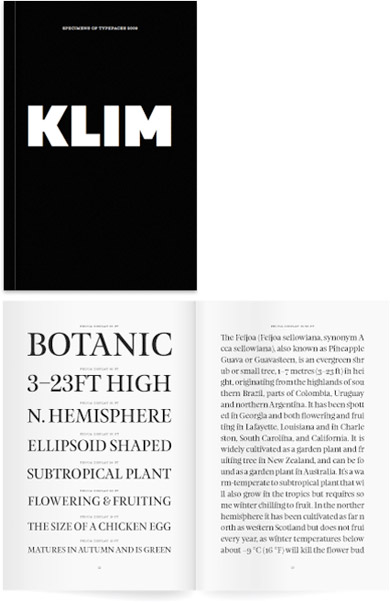
Klim specimen

‘Limited edition 2009 Klim Type Foundry specimen book. 210 × 140mm 96 page book, printed black on 118gsm Mohawk Navajo. Sewn-sections, Otabind binding.’

Great fonts by Kris Sowersby, great specimen book.

(Tho: I always knew Klim as Milk spelled backwards)

Go here.

Found via Stefan Hattenbach

New chill

Here’s some old chill. And (above) some new chill. Bird n cat.

Chat Noir music video. Music composed by Christoph Irniger, animation by Ralph Sonderegger.

Found via Monsieur Bandit

Kapitaal

‘Award-winning Typo-Animation that gives you a clear impression of the enormous amount of visual stimuli that plague us every day.’

Grab a Heine and look around. Type is everywhere.

Kapitaal is a film by Ton Meijdam, Thom Snels, Béla Zsigmond of Netherlands-based Studio Smack. Music by The Exploding Shetland Ponies.

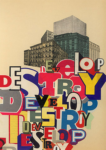
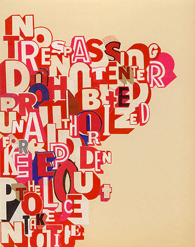
Big ass typography

The collage work of Greg Lamarche.

Found via Designer Daily

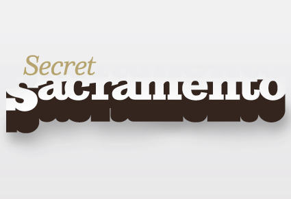
Sacramento, shhhh


Logotype by mehallo

The secret to being in Sacramento, CA is knowing where the cool stuff is. And a lot of it is just under the radar. The right gallery on Second Saturday, the hole-in-the-wall that has the best burrito, what cool bands are in town.

Mark Bean started Secret Sacramento as a Facebook group. And it’s become wildly popular (over 3,000 followers as I write this) – and it’s spread to Twitter.

And launched recently, the Secret Sacramento website. The new site is kinda sparse – so if you’re local, login and post your own regional finds. Share your secrets.

where i fit in
In addition to designing the logo (above), I will be contributing content from time to time.

But shhhh, it’s all a secret.


Creative Commons License

the work at the mehallo blog. beta. is licensed under a creative commons attribution - noncommercial - no derivative works 3.0 united states license.  if reposting, credit must be given to steve mehallo - and if possible, please provide a link back to the mehallo blog. beta.

i include images for the purpose of critique, review, promotion and inspiration - and always make my best effort give credit/link back to the original source.  if i’ve screwed up, please fire me a note.

page layout based on the wordpress 'darkwater theme' by antbag, adapted and redesigned by mehallo.  valuable php assistance from bill mead.