entries Tagged as [graphic design]
Alphabet Truck by Tabuchi
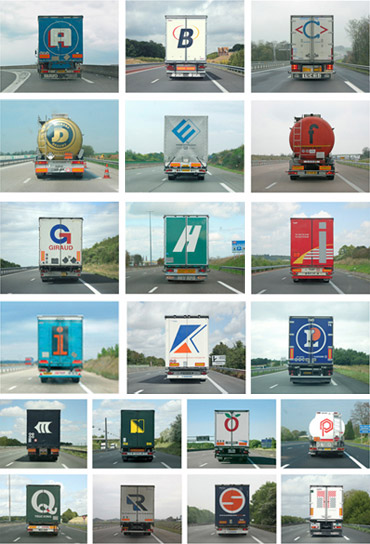
Since Sacramento is a hub for some of California’s major freeways (5, 80, 99), there’s a lot of local truck traffic.
And there’s always some interesting typography to go with them. Yellow is one of my favorites, because it’s not actually yellow. It’s orange.
I also enjoy the typography and colors of the Werner line.
And I do miss the iconic fruit covered Raley’s trucks – no longer seen around town. Artwork by the great Don Birrell of historical Vacaville Nut Tree fame.
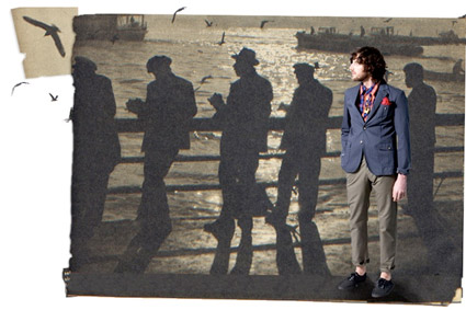
On a related note, here’s images from Paris-based photographer Eric Tabuchi’s Alphabet Truck series (above) volume one and volume two.
Found via Splorp
So you need a typeface

Picking fonts, not the easiest thing to do. But design student Julian Hansen has created a poster that kinda breaks it down into easy solutions.
Click the above image for a full size version.
Are there really easy solutions?
Swiss design uberguru Massimo Vignelli believes so. Here’s I Love Typography’s take on The Vignelli Twelve.
Found via Typekit
talk to me . . .
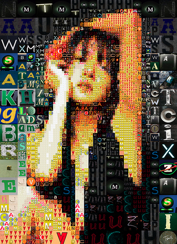
‘A letter mosaic of a japanese idol’
The photomosiac work of Charis Tsevis.
Click image for larger view/jump.


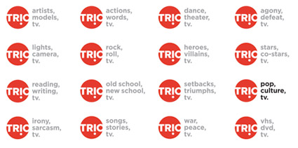
TRIO: cable, web, gone.
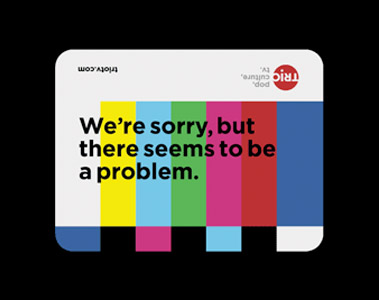
TRIO was a brilliantly odd cable network that sort of ended up being shuffled about and sort of vanished from tee vee in an acquisition by NBC that included similar net Bravo and a bunch of other things. That’s the short way to put it. In all, NBC ended up channeling its money and energy into Bravo.
Some of TRIO’s wares included Brilliant But Canceled, re-airings of great television programs that were too smart for their own good. Today, TRIO lives as a web archive (with a link back to Bravo, of course) – and Brilliant But Canceled is now a web blog.
In all this, Scott Stowell‘s open designed the look of the network, with design studio No.17 creating the logo; filmmaker Chris Wilcha and music supervisors Agoraphone along for the ride.
Official TRIO page here. Open’s portfolio (with videos) here. AIGA TRIO design article here.
They were brilliant, tho canceled.
A couple of Saul Bass mashups
Star Wars vs. Saul Bass (2007)
Star Wars vs. Saul Bass (above) is described as ‘If Star Wars was filmed two decades earlier and Saul Bass did the opening title sequence, it ‘might’ look like this.’ The animation was created as part of a school project.
A more recent mashup is Tron vs. Saul Bass (below).
Tron vs. Saul Bass (2009)
The designer has also made a bunch of matching posters, sort of how Bass used to.
Chatting with Saul Bass
Intro
Here are some highlights from a candid documentary (shot in 1986) on Saul Bass. The doc is available as a 2-DVD set here.
On making money vs. quality work
Advice to design teachers
Advice to students
Thoughts on his legacy
Bass on Titles
‘Bass on Titles presents a comprehensive, well-rounded retrospective of Academy Award-winner, Saul Bass’ film title sequence design.’
With really bizarre dialog screwy sound looping fx. Watch it above. From 1977.

handpicked posts

a piano falls in old manhattan
tetro and typography
it’s typography: film, song and dance
ghosts of gustov klimt
the great times new roman controversy
picking fonts
kapitaal
defining terms: design is not decoration
garcia's 'pure design'
'enhance that image!'
magic highway remixed
the cynic
rad anthem
Brought to you by man dom-


buy my fonts
go shopping
mehalloreads

Divinely Elegant: The World of Ernst Dryden
Jozsef Pecsi: Photo and Advertising
Color: A Natural History of the Palette
Collage: Assembling Contemporary Art
Modern Dog: 20 Years of Poster Art
Gaberbocchus Press: An Experiment in Publishing, 1948-1979
Advertising Art in the Art Deco Style
Googie Redux: Ultramodern Roadside Architecture
Hot Sour Salty Sweet: A Culinary Journey Through Southeast Asia
now playing


the work at the mehallo blog. beta. is licensed under a creative commons attribution - noncommercial - no derivative works 3.0 united states license. if reposting, credit must be given to steve mehallo - and if possible, please provide a link back to the mehallo blog. beta.
i include images for the purpose of critique, review, promotion and inspiration - and always make my best effort give credit/link back to the original source. if i’ve screwed up, please fire me a note.
page layout based on the wordpress 'darkwater theme' by antbag, adapted and redesigned by mehallo. valuable php assistance from bill mead.


