35mm
‘We picked 35 of our favorite movies and tried to simplify them as far as possible. The outcome is a 2 minute journey through the history of film.’
Pascal Monaco’s short film, 35mm.
Found via David Rosales
‘We picked 35 of our favorite movies and tried to simplify them as far as possible. The outcome is a 2 minute journey through the history of film.’
Pascal Monaco’s short film, 35mm.
Found via David Rosales
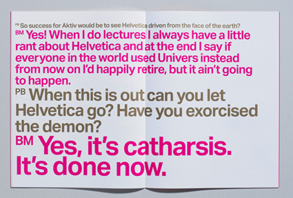
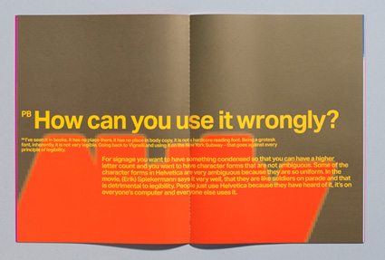
Did Arial kill Helvetica? Or is it just bullshit?
Australia-based Hungry Beast correspondent Marc Fennell thinks it’s an ‘usurping bitch.’
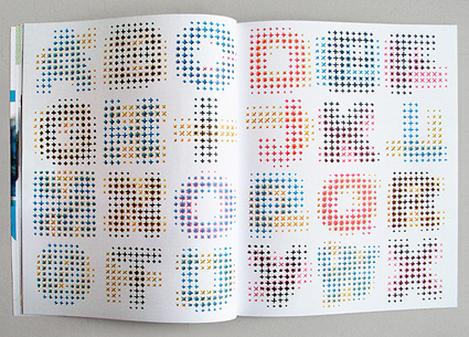
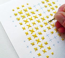
‘CMYK Alphabet is a typographic experiment . . . Each letter is hand embroidered using a combination of two overlapping CMYK colours.’
Evelin Kasikov recreates a process color rosette using thread. Details here.


Edward Johnston (1872-1944) developed the ‘look’ of the London Underground – thru type and image.
These are snaps of the work of student Grady Fike. Grady spent eleven weeks jumping thru many hoops in my experimental typography course at The Art Institute of California Sacramento.

For the class, I’ve set up an evolving work process – where students are assigned a ‘famous typographer’ (one that I pick, so they have to work within these limitations) and interpret their work thru both loose and strict design iterations.
It’s similar to Project Runway, but for much of it, students often only have about an hour to produce their work. And based on the outcome, their solutions dictate what the next homework assignment will be. It’s all very fluid. [Read more →]

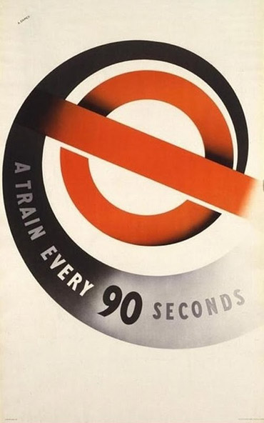
One of the first modern icons of the 20th century, The London Underground’s ‘bullseye’ passed the 100 year mark recently – and to celebrate, 100 artists were brought in to interpret the symbol and its legacy. [Read more →]
‘Constructivism was an artistic and architectural movement that originated in Russia from 1919 onward which rejected the idea of ‘art for art’s’ sake in favour of art as a practice directed towards social purposes . . . this video is part of the ‘Palette’ project and pays homage to Constructivism.’
Bill Hooper’s Never Odd or Even, video by Mark Garvey.
Student-made trailer for a mock exhibition at the MoMA. Featuring Miles Davis’ Bitches Brew.
Bitter:Sweet’s music has been bouncing around commercially the past few years. Above, Dirty Laundry. Animated. With a robot. For Zune.
Below, my fav track, The Bomb (which was used for Lipstick Jungle) . . .
Cool website here. And fun album graphics.
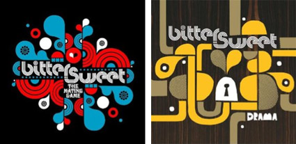
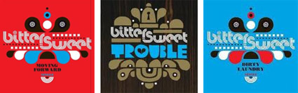
Bitter:Sweet: The Bomb
‘Hi-Fi is a promotional music video for last year’s concert season at the Bellavista Social Pub, one of the best bars in Siena, Tuscany, according to Where’s Cool.’
Hi-Fi video, directed by Bante. More details at The Font Feed.
Found via LookingAroun.D


the work at the mehallo blog. beta. is licensed under a creative commons attribution - noncommercial - no derivative works 3.0 united states license. if reposting, credit must be given to steve mehallo - and if possible, please provide a link back to the mehallo blog. beta.
i include images for the purpose of critique, review, promotion and inspiration - and always make my best effort give credit/link back to the original source. if i’ve screwed up, please fire me a note.
page layout based on the wordpress 'darkwater theme' by antbag, adapted and redesigned by mehallo. valuable php assistance from bill mead.