entries Tagged as [graphic design]

Stephen Fry and the Guttenberg Press


Part one

‘Fry travels across Europe to find out how Gutenberg kept his development work secret, about the role of avaricious investors and unscrupulous competitors and why Gutenberg’s approach started a cultural revolution.’

Stephen Fry loves design. That’s one of the reasons he’s really cool. [Read more →]

Me give talk: Being a teacher, the ‘idle youth’

So I’m pretty much out the door right now – driving down to TypeCon.

And this Thursday morning I’ll be speaking as an ‘icebreaker’ in the Type & Design Education Forum. I’ll be going over a bunch of things I’ve learned while teaching; things that I’ve discovered work very well in a creative classroom. [Read more →]

Copenhagen Mayo

‘I could not be happier about this, or any more proud to live in a city that recognise the importance of preserving this kind of work.’

Vintage signs unearthed and preserved in Copenhagen. Details here.

Found via Martin Klasch

Babel, Aldridge, Fantastic

‘The Who came to see me for a job. Then Cream. Then the Stones. And then The Beatles.’

Pictured, cover for Elton John’s 1975 concept album Captain Fantastic and the Brown Dirt Cowboy by designer/illustrator Alan Aldridge.

Aldridge interview here. Book, The Man with Kaleidoscope Eyes here. Babel track, below.


Elton John: Tower of Babel

TypeCon next week, Wood Type today

‘We’ll explore the hot button topic of web fonts; antique type and lettering of the textile trade; the typography of Disneyland; making smart fonts even smarter; the influence of Charles Eames; liquid typography; west coast ‘Cholo’ style graffiti; and so much more.’

typecon 2010: babel
Big typography conference next week in Los Angeles. Wood Type preview in Carson today. Designer talks, workshops, dealer room, font makers, stuff.

and me
I’ll be giving my first ever TypeCon talk as part of their Type & Design Education Forum. My title is Tell Lies in the Classroom and Get Away With It. It will be as weird as what I normally do in a classroom.

Promise. [Read more →]

Elegy in letterpress

‘The broadside is printed on Mohawk Superfine Eggshell, White, 100t. Everyone attending TypeCon 2010 will receive a copy, courtesy of type quizmaster Allan Haley.’

A broadside tribute to ITC’s new Elegy font – printed in letterpress at Patrick Reagh Printers in Sebastopol, CA. The poster was typeset by the wonderful Ilene Striver – who’s managed to talk me into giving a presentation as part of TypeCon’s Education Forum – next Thursday. More about TypeCon in my next post.

More info about the broadsheet here.

Elegy


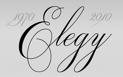
Original ITC logotype handlettered by Ed Benguiat, 1970


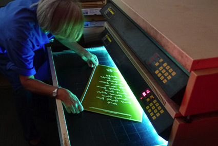
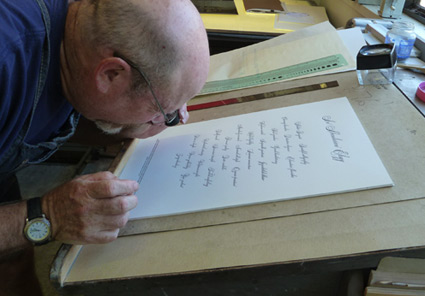
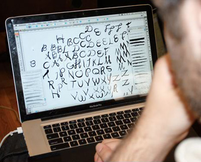
Elegy typeface designed by Jim Wasco, 2010

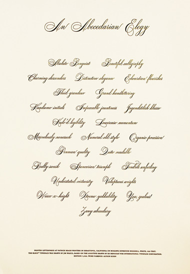
“Where can I get a font of the script used for the ITC logo?’ For almost four decades, this has been one of the most frequently asked questions of ITC. The answer has always been the same: ‘You can’t. The ITC script logo is handlettering and it is not available as a font.”

Now it is. Introducing: ITC Elegy. Two years in production, Jim Wasco took apart Ed Benguiat’s original Spencerian-style script and put it back together with updated spacing and a bunch of stylistic changes.

Detailed article here.


Comparison: Elegy and the original

Found via Delve Withrington

The Ballet Font Project

‘The resulting font is based on the physical movements of two Oregon ballet dancers  . . .  The dancers were fitted with infrared LED lights, which captured their steps in real time as they danced all 26 letters of the alphabet.’

Typography combined with ballet. Details (and final font) here.

Found via Lyndsie Ross

Volcano!

Everyone has their inspirations, their muses. And on the music front, one of mine is the incredible Chelsea Davis. I draw fonts, listen to her tracks. Design some stuff for her. She does a lot.

Chelsea’s classically trained, plays drums for theSTART, Normandie, among a few others. Her personal project is iVellora – and  . . .  great voice.

Her newest project is Volcano Dolls – a collaboration with Suicide Girl Jessica Goodwin (Google Zoli). They’ll be playing LA’s Viper Room this Friday.

Flyer (above) designed by Lux Nova. It features my 2491 font. Volcano Dolls Facebook page here – with new tracks posting soon.

Barcodes

Mannequins and more. Article here.

Norma Kamali’s hitech mannequin

‘Kamali has partnered with ScanLife mobile technology to bring a new dimension to her new mannequin.’

If in NYC, here’s a chance to hook up with a mannequin.

The parade of mannequins is part of The Fashion Center Sidewalk Catwalk show, which runs thru September 3, 2010.

Details about the wired in Kamali mannequin here. Complete mannequin gallery here.


Creative Commons License

the work at the mehallo blog. beta. is licensed under a creative commons attribution - noncommercial - no derivative works 3.0 united states license.  if reposting, credit must be given to steve mehallo - and if possible, please provide a link back to the mehallo blog. beta.

i include images for the purpose of critique, review, promotion and inspiration - and always make my best effort give credit/link back to the original source.  if i’ve screwed up, please fire me a note.

page layout based on the wordpress 'darkwater theme' by antbag, adapted and redesigned by mehallo.  valuable php assistance from bill mead.