Red and blue: The London Underground ‘bullseye’

One of the first modern icons of the 20th century, The London Underground’s ‘bullseye’ passed the 100 year mark recently – and to celebrate, 100 artists were brought in to interpret the symbol and its legacy.
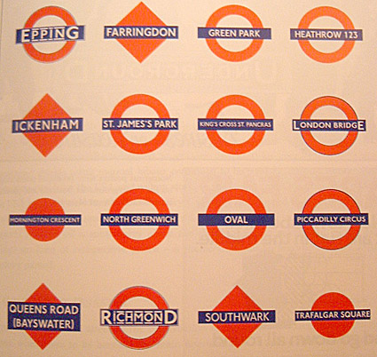
Alternate London Underground bugs, before standardization
tube history
The London Underground’s ‘identity’ is considered one of the world’s first cohesive corporate design systems.
‘Identity’ would become big business over the next 100 years – the Underground’s approach is all about finding one’s way. Look for the circle and line, and you’ll know where the train will be.
Throw in Edward Johnston’s railway typeface (he also developed the bullseye) and Henry C. Beck’s map – and it’s a pretty decent system. Enough to be copied by other transit authorities worldwide.
My personal favorite is this Tube interpretation of the US Interstate system.
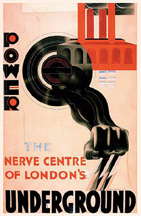
Poster by McKnight Kauffer
tube art
The Underground has a close tie to the art scene – over the years, artists were brought in to create posters showcasing seasonal trips, schedules, sales or the power of the Underground (above).
Even current tube maps continue this legacy – they showcase cover art by Barbara Kruger, Yinka Shonibare, Liam Gillick (below) and others.
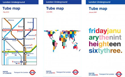
For more info, visit the 100 years site here, selected posters posted below. Going Underground’s article here (Going Underground is a great Tube fan site).
Plus, Tube map cover gallery here and museum site here.





















Garmin Nuvi 1490t…
[…]here are some links to sites that we link to because we think they are worth visiting[…]…
Garmin 1490t GPS…
[…]while the sites we link to below are completely unrelated to ours, we think they are worth a read, so have a look[…]…
Featured…
…These are some featured websites that we choose to honor with a link back to their site……