F is for fail
This one is always a favorite.
This one is always a favorite.
This past Sunday night there was an incredible TypeCon party at at the International Printing Museum in Carson, California – I’ll have photos in a later post.
And in the background of the tinkering of machinery (and grilling of some incredible, Southern California tacos) was the music of longtime friend, DJ (and graphic designer) SeventhSwami.
Download some of Swami’s free mixes here.
Blog here. Debut album (pictured above) also available.
SeventhSwami: Praise and War Ship
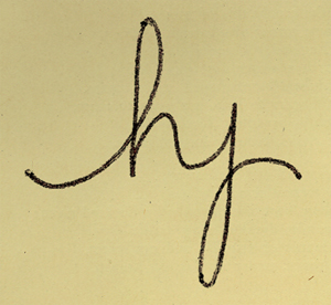
New type concept: The ‘hy’ typographic ligature. Developed by former student Holly Rabayda-Wickland.
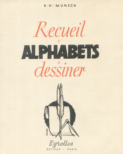
Pages from Recueil d’Alphabets à Dessiner by René Henry Munsch (1951).
More here.
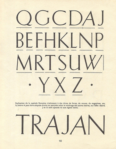
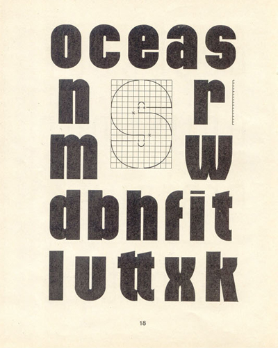
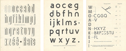
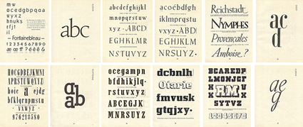
Found via Biggest Apple
‘A video of two people drawing the alphabet.’
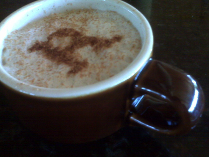
‘Hand sprinkled cinnamon’
Snapshot by student Rikki Morehouse. She went thru several cups of coffee til she got them serifs right.
(Hedline written by former student Devon Cloutier)
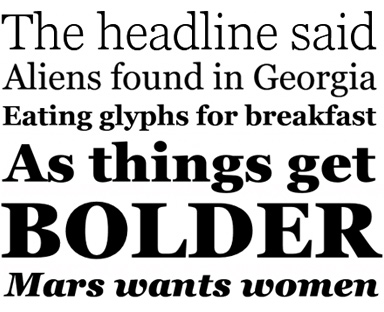
A few fonts from the new Georgia Pro type family
Matthew Carter’s Georgia is among my favorite fonts. And recently, Georgia turned into something a bit . . . more.
I love that Georgia exists, or the interwebs would be Times forever (well, until WOFF kicks in) – and without Georgia, the argument that sans fonts online are more legible (which I think is hooey) sort of wins.
And if you’re reading my blog directly online (without using RSS), you’re reading Georgia. It does what I like it to do. Reads well. [Read more →]
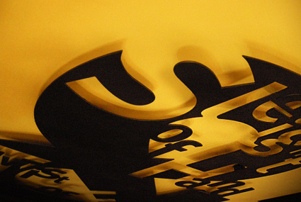
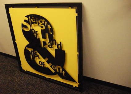
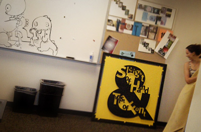
Isla Waite’s extremely heavy, laser cut student final from my most recent experimental typography course. Her research subject was Erik Spiekermann.
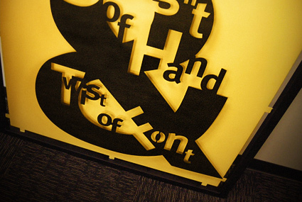
No digitally-made drop shadows here.
Type Munching Dinos by Tiffany Valdez.