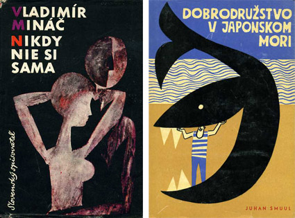
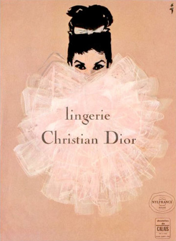
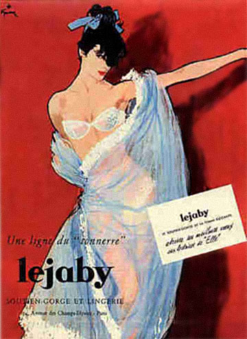
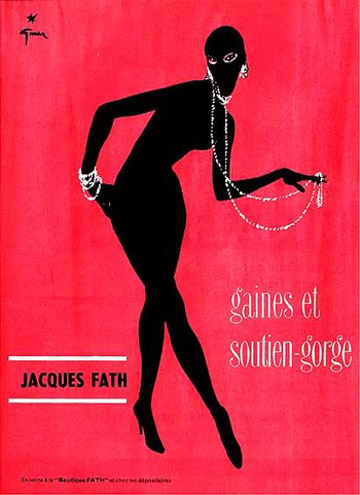
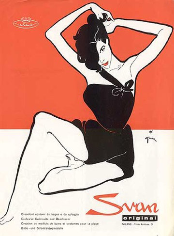
Gruau lingerie
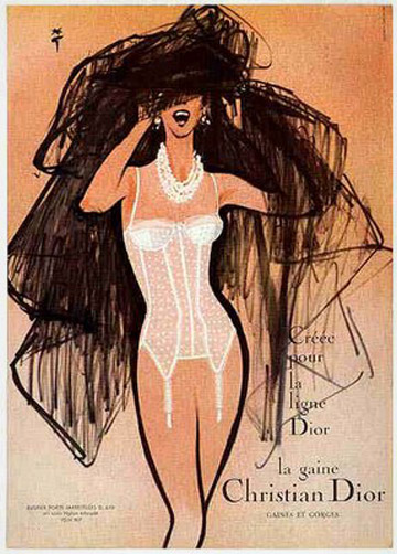
Vintage lingerie ads by René Gruau (1909-2004).
Plus, check out Dior’s pre-Galliano-firing Spring 2011 Gruau tribute.
Vintage lingerie ads by René Gruau (1909-2004).
Plus, check out Dior’s pre-Galliano-firing Spring 2011 Gruau tribute.
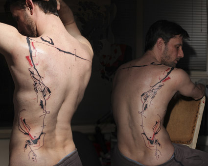
‘one more time’
BBC bird-filled animated version of Count Basie’s version of April in Paris (1957) – the song that just wouldn’t end.
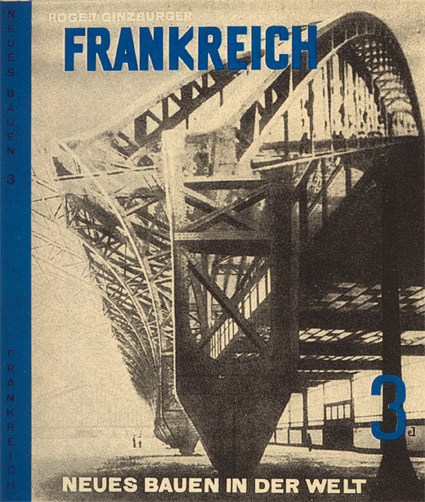
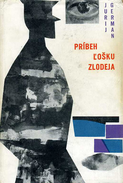
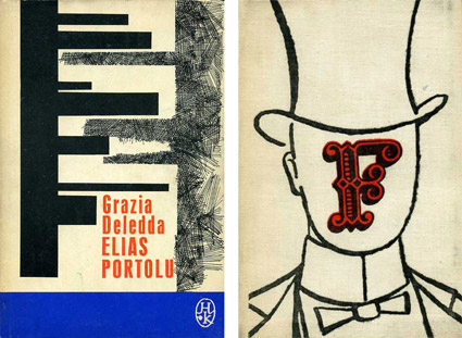
Cover design by El Lissitzky for Roget Ginzburger’s Frankreich (France) 1929.
From Neues Bauen in der Welt, a book series on modern architecture published in Vienna.
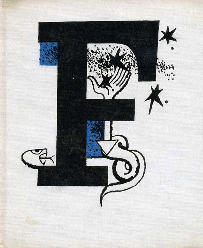
Below, recent release by Brooklyn-based Dream Diary, El Lissitzky.
Dream Diary: El Lissitzky

Nicky Bradwell survived my typography and design history classes and is now making music. Each month, he’ll have a new FLAVOR on Soundcloud.
Facebook page here.
‘Japanese artist Isao Hashimoto has created a beautiful, undeniably scary time-lapse map of the 2,053 nuclear explosions which have taken place between 1945 and 1998.’
Over the years, the US has set off over a thousand nukes. Something I never really knew.
Skip thru to the early 1960s and the multiples of blasts end up looking like Christmas lights.
Found via Marian Bantjes

The work of Lim Heng Swee.
Pink Floyd: Breathe in the Air/On the Run (demo versions)
Found via Robert Boord
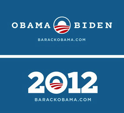
‘Can we add serifs to Gotham?’
One thing I like about Obama: He knows good design.
In 2008, his campaign lifted political propaganda out of the long ass slump it had been in. The fonts of choice were Eric Gill’s Perpetua and Tobias Frere-Jones’ Gotham.
And revealed this week: 2012 graphics featuring a custom slab serif version of Gotham.
So when The President calls wanting a font change, Hoefler & Frere-Jones were ready to oblige.
Found via Hoefler & Frere-Jones


the work at the mehallo blog. beta. is licensed under a creative commons attribution - noncommercial - no derivative works 3.0 united states license. if reposting, credit must be given to steve mehallo - and if possible, please provide a link back to the mehallo blog. beta.
i include images for the purpose of critique, review, promotion and inspiration - and always make my best effort give credit/link back to the original source. if i’ve screwed up, please fire me a note.
page layout based on the wordpress 'darkwater theme' by antbag, adapted and redesigned by mehallo. valuable php assistance from bill mead.