entries Tagged as [graphic design]
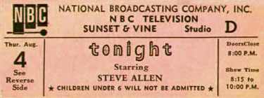
Tee vee tix
I’ve been to a few tapings of television shows. The tapings are free, since tee vee is (supposed to be) free. Getting in, however, can be a struggle. Especially if a show is popular.
I saw a few tapings of The Tonight Show the final year Johnny Carson was hosting. But Carson wasn’t working much, mostly on vacation. His contract gave him Mondays off and several weeks vacation per year. Supplementing as ‘permanent guest host’ was this guy named Jay Leno.
My dad often referred to Jay Leno as ‘Jeno.’ I always liked that.
I remember Jeno was funny. Really funny – when he worked for Carson. Things changed after Carson retired. Today, don’t like that Jeno isn’t really the sweet guy he pretends to be.
Tee vee is pretend. [Read more →]
Graphic design and standup comedy
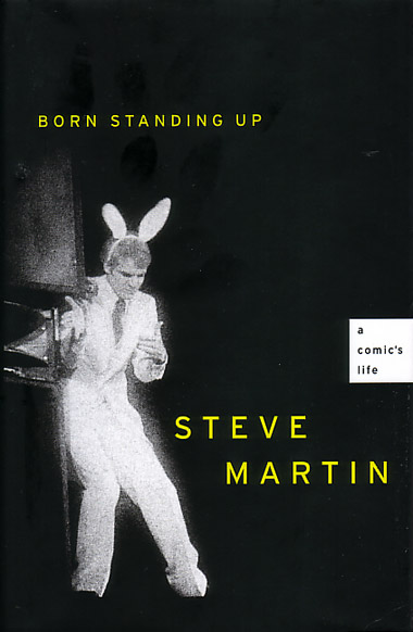
Well, I see it this way. I’ve been using my time listening to the greats and nights spent in comedy clubs as part of my teaching ‘act’ for years now. And after reading Steve Martin’s Born Standing Up and all the insane prep he did to do what he did (never realized how neurotically obsessive he was), it all seems to resonate.
Michael Bierut – who had one of the best lines in the Helvetica film – takes a look at the parallels between hard work as a designer and a comedian. Great read for anyone working in a creative field.
Super Grotesk in Hell
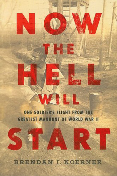
Svend Smital’s Super Grotesk used on the cover of Brendan I. Koerner’s Now The Hell Will Start: One Soldier’s Flight from the Greatest Manhunt of World War II.
Found via The Book Cover Archive
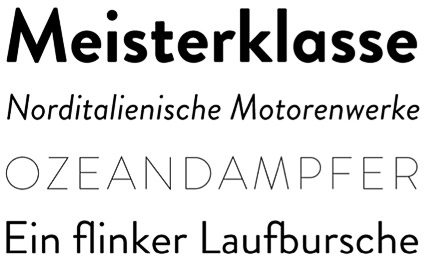
Brandon Grotesque
‘My father gave me some magazines from the 1920s and 1930s’
Hannes von Döhren’s Brandon Grotesque, influenced by early geometric types – available in six weights with true italics.
One of TDC’s 2011 award winners. Available thru HvD Fonts.
Lost in type: Gill Sans
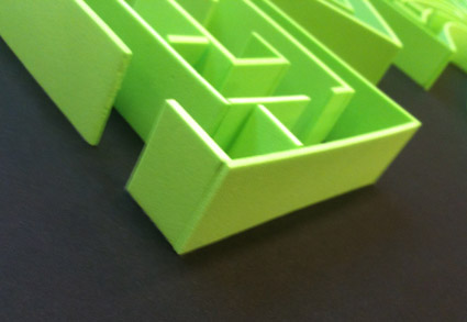
Dmitriy Antropov’s final project was a Gill Sans maze, hand crafted from foam.
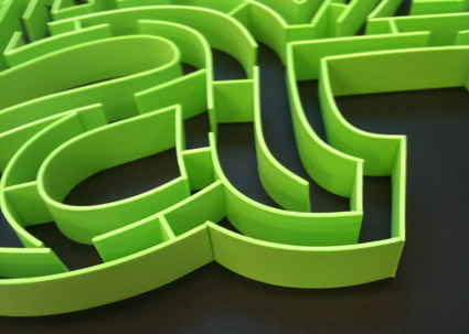
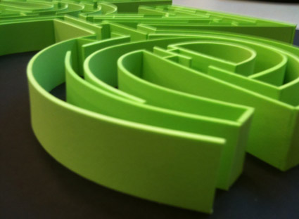
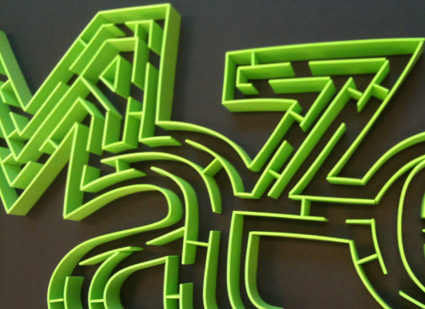
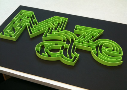
After we tried to actually do the maze (and failed), Dmitriy reached down and carefully removed a small partition – near the bottom of the a – and we were able to complete.
In screen type: Bank Gothic
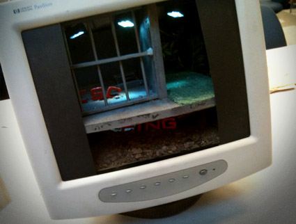
‘escaping the norm’
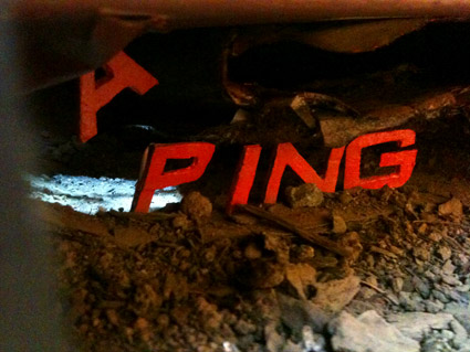
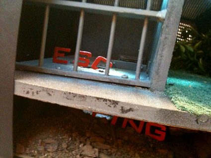
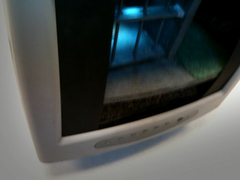
Just finished up my Friday night beginning type course – and final projects can take any form. Last night, Christopher Gianni-Embrey showed up for class with an old computer monitor.
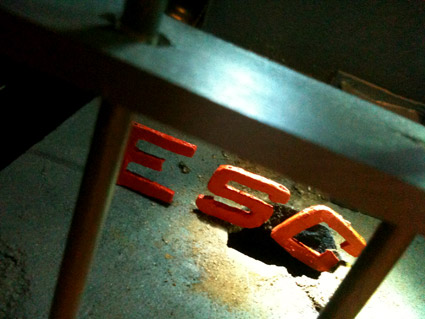
Inspired by a recent viewing of The Shawshank Redemption, Christopher visualized the word ‘escaping’ using Morris Fuller Benton’s Bank Gothic.
Not on screen, but in screen.
The final piece was Christopher’s first ever attempt at model making. It was crafted from mostly found materials. As he put it, ‘driving around town, there’s a lot of stuff people throw away.’
In the process, he ended up with a bunch of dead computer monitors – just in case the first attempt didn’t pan out.
My next Friday night type course is scheduled for Fall 2011 at American River College. Course number: ARTNM 303.
On screen type: Azuro
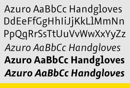
‘Azuro, the first typeface that’s perfect for reading on screens’
FontShop has released Georg Seifert’s Azuro. Humanist in origin, with large counters and oldstyle numerals; Azuro has been tested in all current on screen media, including Apple’s iOS.
Gizmodo review here. FontShop details here.
And Azuro is on sale – 90% off – thru May 31, 2011.
Also check out Seifert’s Graulau Sans, types he started working on while studying at Bauhaus University, Weimar.
