Erik Spiekermann: typomaniac
Designer Erik Spiekermann on what it’s like to be a typomaniac
Extra footage from Gary Hustwit’s Helvetica film. I still use Spiekermann’s Stop Stealing Sheep as the introductory text in my beginning typography courses.
Designer Erik Spiekermann on what it’s like to be a typomaniac
Extra footage from Gary Hustwit’s Helvetica film. I still use Spiekermann’s Stop Stealing Sheep as the introductory text in my beginning typography courses.
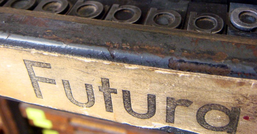
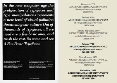
‘Foo-der-ah’ – as one of my students once called it. Paul Renner’s Futura is everywhere – and here’s a write up in idsgn’s ongoing know your type series.
Or – if you really want to get your hands dirty – snag a copy of the expanded edition of Christopher Burke’s wonderful biography of Paul Renner – detailing the creation of Futura – how knock offs were released before he even finished his drawings, his arrest by the Nazis, other fonts, sketches, experiments . . . But even more, the book details philosophy, beliefs and how they contributed to the creation of types that are as fresh today as they were in the 1920s.
Did you hear that IKEA???
Line art by Steve Masseroni
gurus plant ideas
Steve Masseroni is an incredible artist I knew in high school. He was dabbling with working for Marvel Comics at the time, but set out in his own direction. In a afternoon critique in 1985, he gave me his favorite brush and a few tips on being an illustrator. [Read more →]
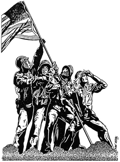
Illustration for my high school yearbook, 1985
Fill out this survey about your senior year of high school!
1. Did you date someone from your school?
No one would date me.
2. Did you marry someone from your high school?
Nope. Married someone whose father went to my high school. Suzanne Somers went to my high school. We all talked about that. Her father was my father’s drinking buddy. She married a guy named Allen. He didn’t go to our school. He was Canadian. [Read more →]

Calligraphy by Marsha Brady, found via the MyFonts Blog

Kalligraphia 12,
an exhibition of hand-lettered art and calligraphy
Runs thru August 23, 2009

A Trip to the Fair, 1939:
The Golden Gate International Exposition in San Francisco
Runs thru August 23, 2009
Both are the main branch of the San Francisco Public Library, 100 Larkin Street (at Grove), sixth floor, San Francisco, CA 94102 [map]
Details here.
I love good information graphics. And bad information graphics make my eyes bleed.
Check out this redesign by Robert Palmer (and strong letter to Rep. John Boehner) of a recent visual attack on the Democratic Health Plan.
This is an excellent example as to why graphic designers (well trained graphic designers) can do a lot more than just push buttons on a computer. Or make a logo look nice. Good graphic design is about good communication – and can be world changing.
(That’s my soapbox for the day. Thank you for reading.)
Found via Twitter.com/angelaglenn
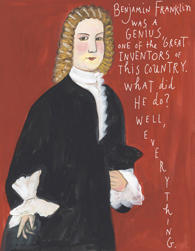
Click the image to read Maira Kalman’s ode to Franklin . . . .
Benjamin Franklin was fun. So much fun, the International Printing Museum has on staff the incredible Phil Soinski.
Soinski portrays Franklin as part of their educational services; and does such a fantastic job, I learned more about Hot Type in one hour with ‘Ben’ than reading thru whatever pile of type books are currently stacked on my desk. Drop by the museum, set up a tour, take a class – their programs, their dedication to the craft of printing can be contagious.
And illustrator Maira Kalman gives us a bunch of really cool things to know about ultramegasuperinventor Ben Franklin in yesterday’s New York Times . . . .
Like Helvetica? Like the Swiss International Style?
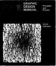
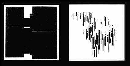
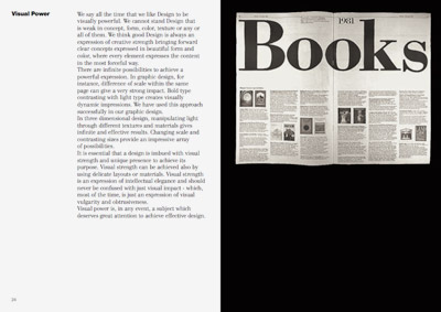
Armin Hofmann’s Graphic Design Manual (1965) is what I learned out of – and if it weren’t out of print, I’d be using it in my basics classes. (right now, I have a few slides made from my dog eared edition as part of a form lecture)
Graphic Design Manual breaks composition into basics: dot, line, confrontation, plus letters and signs. And it shows by example how these basics can be applied to good, clean graphic design: form, composition, typography.
I’ve seen it going for upwards of 90 bucks in some listings. As I write this, there are 22 used available at Amazon starting at $4.10.
Good graphic designers are trained to do amazing things in the realm of communication. And many clients just see the surface: make me a logo, I like yellow, so you should use yellow.
This article really nails it:
How to (and not to) work with a designer by Daniel Will-Harris
(Nails it so well, I’ve posted it as a link as part of the Manifesto at my website)
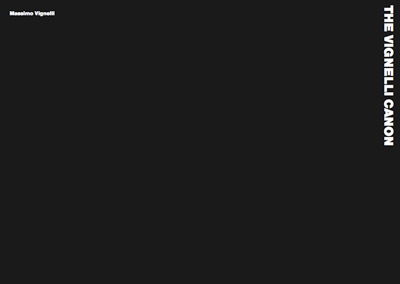
Swiss International Style guru Massimo Vignelli has released a new book on using type in graphic design. In it he explains in concise detail how it’s done. And as with all his work, it’s precise, clean, neat. Also, it’s free.
Download here: The Vignelli Canon [PDF]


the work at the mehallo blog. beta. is licensed under a creative commons attribution - noncommercial - no derivative works 3.0 united states license. if reposting, credit must be given to steve mehallo - and if possible, please provide a link back to the mehallo blog. beta.
i include images for the purpose of critique, review, promotion and inspiration - and always make my best effort give credit/link back to the original source. if i’ve screwed up, please fire me a note.
page layout based on the wordpress 'darkwater theme' by antbag, adapted and redesigned by mehallo. valuable php assistance from bill mead.