entries Tagged as [design]

Typeface: A Documentary

‘Charting the intersection of Rural America and Contemporary Graphic Design’

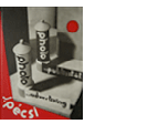
The film about the Hamilton Woodtype Museum is making the rounds.

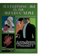
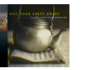
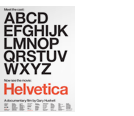
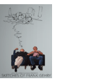
Official site here. Pictured: promo prints for the documentary.

Found via “JE NE SUIS QU’UNE PAUVRE PLUME…”

Slab serif ‘Egyptian’ types: A history

Here’s a detailed history over at Hoefler & Frere-Jones on slab serif typefaces; showcasing their new Clarendon-based Sentinel fonts.

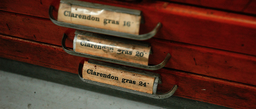
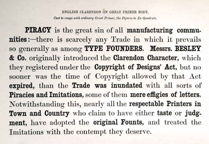
The Clarendon types: A history

The Know your type series at idsgn continues with an overview of Oxford-bred, 19th Century wonder Clarendon.

Seeing stars!

Award-winning magazine designer Jason Malmberg made me a logo.

He said, ‘It’s not quite what I envisioned. I’m still trying to find a way to give a lens flare TO a lens flare.’

If you don’t see the humor, you’re reading the wrong blog.

To see Jason’s real work, check out Sactown magazine, one of the best city/metropolitan magazines in the country. (So good, even local competitor Sacramento Magazine has reformatted to be a bit more like Sactown. I always see that as a nice compliment.)

But if you want the real deal, the October/November 2009 Sactown (above) just dropped. It should be showing up on select newsstands just about now (Sactown is distributed nationally). Or subscribe here.

Annie is Deranged


It’s not often one can write a hedline like that.

Sacramento native Annie Rose runs the Deranged Designs fashion studio – and has been doing it a long time.

Her look is punk, her work is prolific, she’s constantly expanding her collection and her approach comes with your basic underground punk doesn’t take shit attitude. But in her case, a really nice doesn’t take shit attitude. Annie is probably one of the nicest punks I’ve ever met. [Read more →]

Bag: Handmade, reclaimed vintage

Amy Pine makes handmade handbags using vintage fabrics – simple on the outside, action on the inside. Limited editions because once the fabric is gone, it’s gone.

Website here. Facebook fan page here.

Found via Jason Malmberg

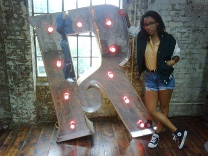
Musicians and the letter R

Above: Remi Nicole tweets ‘Rrrrrrr’
Remi Nicole on MySpace.

Below: Lisa of The Veronicas tweets, ‘My favorite letter of the alphabet… ;)’
The Veronicas on MySpace.

NYT: Turkish edition


Advertisement for the launch of the Turkish Edition of the New York Times, created by Istanbul-based studio Imago New Media

More typographic details via The Font Feed here.

‘The Aim of Design is to Define Space’

The aim of design is to define space is a concept I was talking about earlier today in my graphic design history class, tied in with Frank Lloyd Wright’s ‘rectilinear approach to spatial organization.’ [Meggs’, 2006, p. 221]

The Aim of Design is to Define Space is also a German progressive pop band. MySpace page here.

Tho

’twas the shirt that lured me in. Shirts (and hoodies) here.


‘Vulgarize !!! Buy !!! + Porn + ! Or Die !’ -Chymer

MySpace can get very obnoxious and loud rather fast. And if you’re into it, all the better. If you’re not, go read a government pamphlet or something.

Jérémie Burguiere is Chymer. And his MySpace page was the first one that SCREAMED at me with animated gifs flashing and flashing and flashing. In your face, take no prisoners. Here’s his MySpace presence. His site is here.

And what’s been cool, over the past few years it’s been fun seeing his work evolve into something very sophisticated. He’s one to watch. Portfolio here.

And, as a bonus  . . .

Here’s some ‘dirty disco’ from Japan. It’s a remix of many things I grew up with (I do remember disco when disco was disco – got some old 12″s in the garage to prove it). DJ Munoz, a.k.a. The Disco Infiltrator, maintains the London Calling MySpace page here. Website here.

MySpace isn’t quiet nor clean. Deal.

Typembrya


Typembrya by Oded Ezer on Vimeo

Typembrya is a personal homage to Herb Lubalin’s famous Mother & Child logo (seen below). This is the third experimental project in the ‘Biotypography’ series by Israel-based designer Oded Ezer. For more info, please visit his site here.


Creative Commons License

the work at the mehallo blog. beta. is licensed under a creative commons attribution - noncommercial - no derivative works 3.0 united states license.  if reposting, credit must be given to steve mehallo - and if possible, please provide a link back to the mehallo blog. beta.

i include images for the purpose of critique, review, promotion and inspiration - and always make my best effort give credit/link back to the original source.  if i’ve screwed up, please fire me a note.

page layout based on the wordpress 'darkwater theme' by antbag, adapted and redesigned by mehallo.  valuable php assistance from bill mead.