More Swiss design
Congress Hall in Biel, Switzerland. Not Photoshop, it’s real. Responsible party: Sabina Lang and Daniel Baumann. Details here.
Click image for larger version/jump.
Found via Twitter.com/Typegirl
Congress Hall in Biel, Switzerland. Not Photoshop, it’s real. Responsible party: Sabina Lang and Daniel Baumann. Details here.
Click image for larger version/jump.
Found via Twitter.com/Typegirl
Interesting article over at Web Designer Depot on the differences between art and design.
As I like to reiterate in my classes, ‘Graphic design isn’t an art field, though it can contain elements of art. It’s a communication field.’
Big difference.

Claudia Pungaru, one of my students, turned me on to the work of Dr. Hyunju Lee. Lee’s work is typographic and she uses the Korean script Hangul as a starting point for expressive interpretations – about Korean life and culture.
Ongoing right now is Typographic Exploration in Hangul: An Exhibition of work by Hyunju Lee and Phil Choo (work pictured above) at the UC Davis Design Museum. In the show, letters evoke emotions – all tied to the tradition and sounds of the Hangul writing system.
For more information about the show, go here. The Design Museum’s site is here.
The museum is open limited hours Monday thru Friday, and on Sunday afternoons. Show ends December 6, 2009.
Image found via design in society
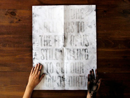
Dirt Poster by Roland Reiner Tiangco
One can’t see the message in the poster unless one’s hands are dirty. See how it works here.
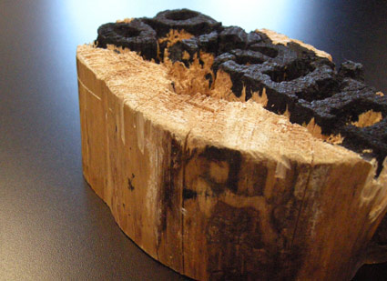
Experimental final project from my beginning typography course. Carved by student Rikki Morehouse.
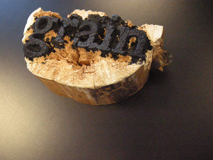
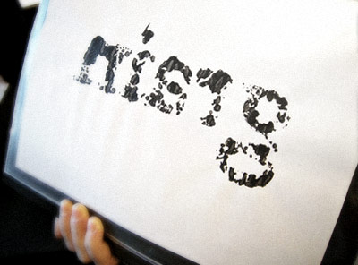
First print . . .
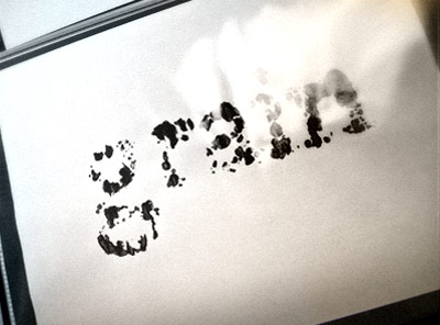
Offset print made from first print