Vena Cava
‘A surreal commercial for Viva Vena. A collaboration between LT and Co and the broadcast design studio Gretel. Music by Copilot.’
Found via Ashley Simko
‘A surreal commercial for Viva Vena. A collaboration between LT and Co and the broadcast design studio Gretel. Music by Copilot.’
Found via Ashley Simko


Before and after
I was thinking.
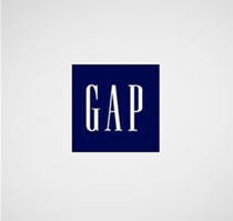
The recycle symbol we’ve been using all these years could use an update. Something simpler, more modern, earth-friendly and all that.
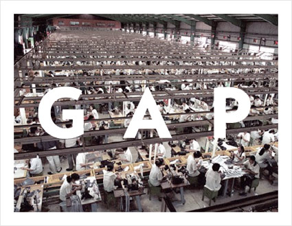
And what better way to update than looking to the most legible of the legibles, Helvetica. With all the Gap hoohaw this past week, I’d noticed that the G actually has an arrow in it. Not a perfect arrow, but redrawing Helvetica – that would take too much time. No one’s gonna notice an arrow that’s a bit off, right?
G is for garbage, of course. Turning it backwards means sending things back. For recycling. And the gradiated avocado green box, it just says green better than anything else can say green.
Because people really like avocados.
Before and after
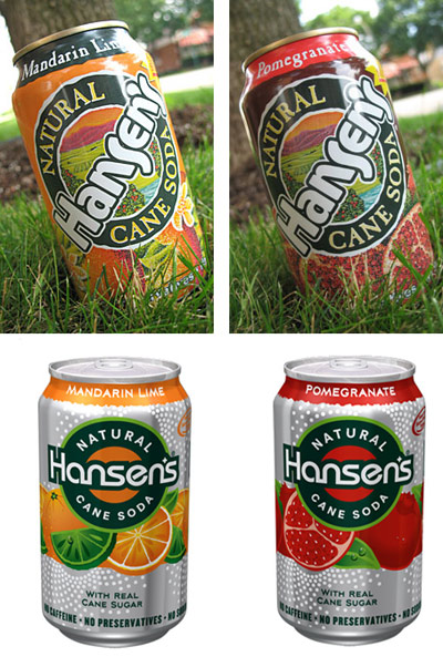
This hit last year, redesign of soda cans for Hansen’s Natural Sodas by Deutsch Design Works.
The look just seems very . . . techno to me.
Garbage: I’m Really Into Techno, B-side from Shut Your Mouth 3
Photos found via BevReview
Before and after
Another company’s gone and done it.
Desperate times call for . . . logo changes. If a company’s not doing well, they have to do something. Forget the pressure of product marketing, pricing, supply and demand – all too tough to deal with. Instead: Let’s change the logo.
K-Mart has done it a few times.
Not quite getting to the root of things. But changing a logo to solve a major problem is like saying, I have cancer, so – I’m going to go get my hair done.
When exactly did this become the rule of the day? Is a logo change what it takes to shore up a failing brand? Gap seems to think so and if that’s how they’re managing things right now, they probably should fail. [Read more →]
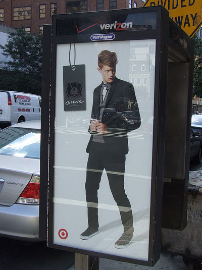
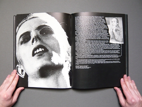
In 2008, punk rocker turned fashion designer Keenan Duffty did his own interpretation of David Bowie – for Target – leading to an incredible, understated, sophisticated line.
Starting with Bowie’s Thin White Duke persona, Duffty’s collection featured tuxedo jackets, thin ties, skinny jeans, shirts with lyrics and lightening bolts, pea coats and more. Peppered throughout were tiny details, hidden buttons and subtle edging that amped things up a bit (see video below). It all were complemented with some alpaca clothing accessories, which by the way you can get for you at that link.
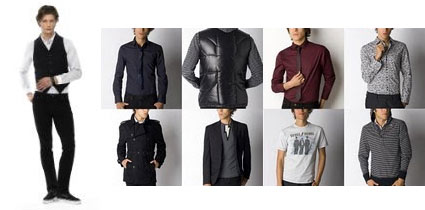
Target’s rollout was a bit spotty – not all stores carried the complete line. Tho this did give things an exclusive edge. And unfortunately, final construction wasn’t always great (it appeared to be the same tailors as Target’s Merona line) – but for 25 bucks for a well designed shirt, one should be willing to sew a few buttons back on.
An interesting follow up happened the next year, as Duffty came up with additional looks as part of his already established Target England’s Dreaming brand. It was cool to watch Duffty go from worn punk to a whole other level in a short amount of time.
I still have (and wear) clothes from the collection (I also love blacks and grays). David Bowie was always about good fashion just outside the mainstream – with Duffty the musician/designer – it was a great mix.
David Bowie: TVC 15
Street photo via Harley Sears
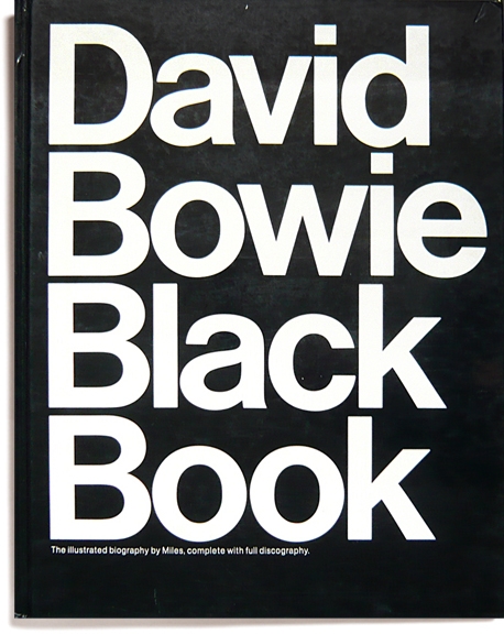
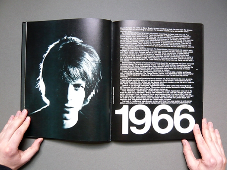
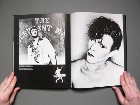
‘The Illustrated Biography by Miles and Chris Charlesworth’
Designed by Pearce Marchbank, published 1980.
David Bowie: All The Young Dudes
Found via Gábor Kóthay, Counter-Print
‘Donald nos enseña la magia que se esconde en los números y la naturaleza’
‘The Golden Rectangle’ explained in Spanish. Challenged by Donald Duck in Spanish.
(Here’s an English version – though I prefer it in Spanish)
Found via Menosunocerouno


the work at the mehallo blog. beta. is licensed under a creative commons attribution - noncommercial - no derivative works 3.0 united states license. if reposting, credit must be given to steve mehallo - and if possible, please provide a link back to the mehallo blog. beta.
i include images for the purpose of critique, review, promotion and inspiration - and always make my best effort give credit/link back to the original source. if i’ve screwed up, please fire me a note.
page layout based on the wordpress 'darkwater theme' by antbag, adapted and redesigned by mehallo. valuable php assistance from bill mead.