Free Hero fonts!
Fontfabric’s free sanserif Hero fonts. Two weights, multiple language support.
Grab em here. Fontfabric has a great section of other freebies too.
Fontfabric’s free sanserif Hero fonts. Two weights, multiple language support.
Grab em here. Fontfabric has a great section of other freebies too.
Pictured: Cap Z from Penabico, a new font based freely on ‘the copperplate script styles to be found in the Universal Penman.’
Available at MyFonts. And currently trending as one of their best sellers.
More detail here.

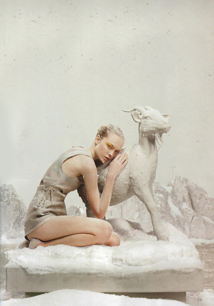
Leo in Lanvin
British Vogue takes a look at astrology.
Photography by Tim Gutt, styling by Kate Phelan, sets built by Shona Heath and at the center of it all, model Siri Tollerod.
More signs here.

Virgo in Christopher Kane

Aries in Alexander McQueen

Capricorn in Chloe

Sagittarius in Givenchy
The Paul Smith-designed Dr. Who shirt.
Re-issued last month, snag it here while it’s still available.
Or you can take your chances on Ebay. Or try to find something close.

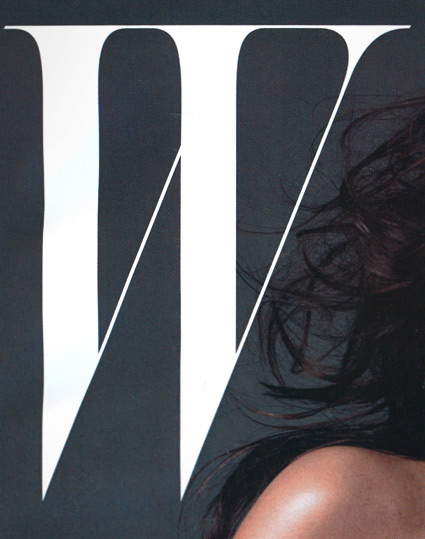
‘The last logo ran for 20 years’
A few months back, Stefano Tonchi jumped over from singular letter T magazine to reboot singular letter W magazine. And the results are quite elegant. [Read more →]
‘Originally used on hand-cranked Vandercook Proof Presses, each piece of type used in these necklaces were worn out ever so slightly by normal printing use . . . These obsolete pieces (each measures a little under 1 inch long) have been rescued, plated in silver, and hung from a 22 inch silver-plated brass figaro chain.’
Erica Weiner’s Double Letterpress Necklace.
Also available in Gold. And brass chain options [Silver and Gold].
‘T shirts that were designed to have the silhouette of 5 famous typefaces; Helvetica, Caslon, Baskerville, Courier and Cooper Black.’
Masashi Kawamura makes type into clothing. Details here.
Found via Tiffany Valdez

‘Orzechowski modeled his lettering on the Flash Gordon newspaper strips of the 1930s. Another influence was Robert Crumb’s Zap Comix: Orzechowski recognized that Crumb’s title work was clearly derived from the brush techniques of that same era, the 1920s and 30s.’ –Wiki
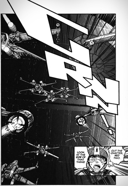
One of the first times I really became aware of hand lettering in comic books came with Marvel Comics’ 1977 Star Wars movie adaptation. From issue #2 thru #5, the lettering had this smooth, compact quality to it. With cool titles up top.
Behind the scenes was lettering artist Tom Orzechowski – working for the Mighty Marvel Bullpen. [Read more →]
‘It’s just a shame they couldn’t have used just the original font, because [Comic Sans is] a real mess.’ -Dave Gibbons, interview in The Guardian
Sick of Comic Sans? Why not try something more authentic . . . .
Vincent Connare based the design of his Comic Sans fonts on the lettering work of comic book illustrator Dave Gibbons. With infamous results.
But the comic book lettering gurus at Comicraft have something a bit better: Real Dave Gibbons fonts.
They won’t come preloaded free on your PC. But if you want to put your money where your mouth is, the ‘DaveGibbons’ fonts – available in upper, lowercase, international, journal and splash page titling versions – should be up to the task at hand.
Snag em here. Multiple purchase options available, including some ‘Gibbous Packs.’
‘The installation consists of a paint-bucket and a reversed, continuous world map cut from polyester-coated aluminium.’
This piece by Jørgen Craig Lello and Tobias Arnell illustrate the disconnect. See more of their work here.
Aside from the breasts, ‘Reverse View’ is one of the main images used for The 28th Biennial of Graphic Arts in Slovenia.