entries Tagged as [design]
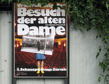
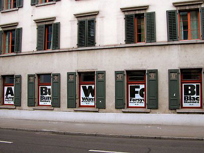
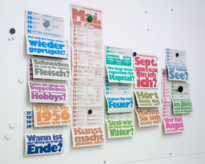
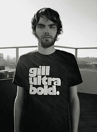
Gill on stage
‘The Swiss firm boldly embraced the face’s strong character, making it the singular voice of the Schauspielhaus, a theatre in Zürich’
The work of Raffinerie – theatre branding using the oft-maligned Gill Kayo typeface.
Detailed article by Stephen Coles here.
Christmas Merry

These vintage Santas are just a tad older than me.
Them, with their cartoony script lettering, would grace the table every year – with or without the requisite salt, pepper, for which they were created. Made in Japan.
Below, track from the ultimate 1960s Christmas album.
Ray Conniff: Twelve Days of Christmas
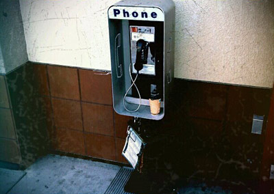
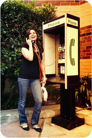
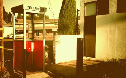
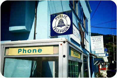
Pay Phoned 2
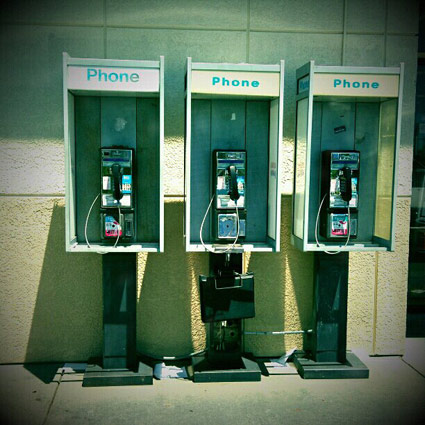
‘These things are becoming harder to find these days and I wish to have a record of their fine existence.’
Photographs from Sam Platz’s Pay Phone Tribute Album (on Facebook).
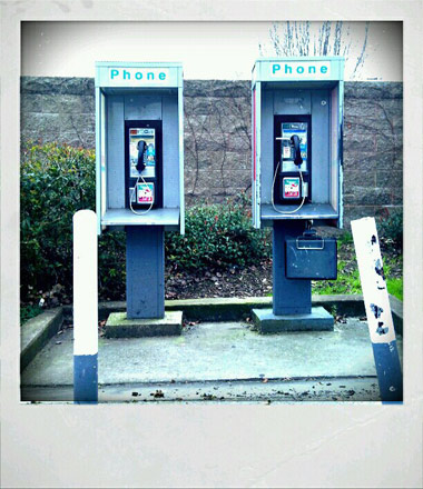
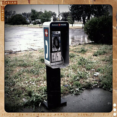


Pay Phoned 1
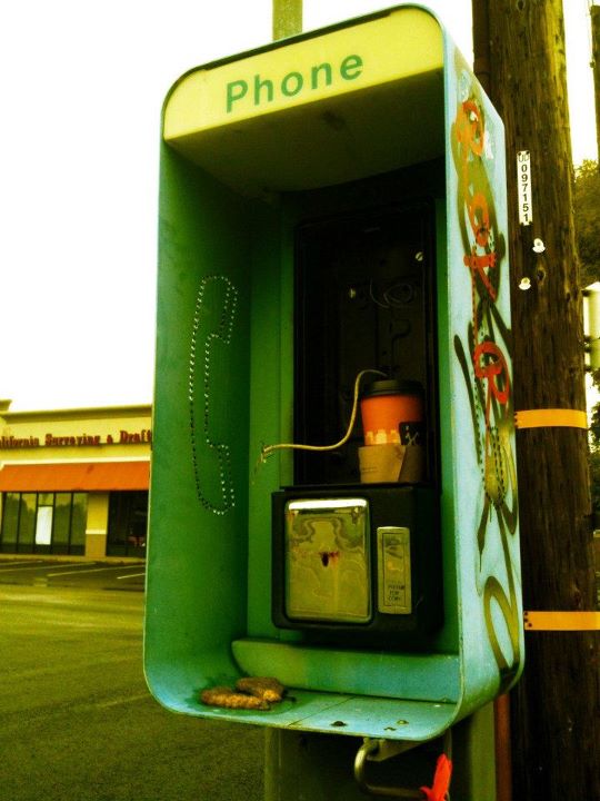
‘next door to Cricket’s Cafe off Auburn Blvd . . . in Citrus Heights, CA’
Photograph by Ian Webb.
‘Saul Bass pitches the new Bell System logo’
‘This film was made by his company as a presentation to AT&T executives. It would have extended to be shown to the public, but a number of his ideas in the film were not ultimately adopted, like his phone booth designs, and men’s and women’s uniforms.’
Complete pitch by the master. It’s everything anyone ever wanted to know about how good logos and visual identity systems work. From 1969. Historical details here.
Found via Scott Stowell
‘The architect and the painter’
‘Watch the definitive documentary on the husband-wife design icons’
A new biography on Charles and Ray Eames is airing on PBS this week. Powerful and unflinching, more than just chairs. Playful optimism, powerful clients, amazing budgets, odd obsessions. Narrated by James Franco, titles feature the incredible Eames fonts.
Watch it online here.
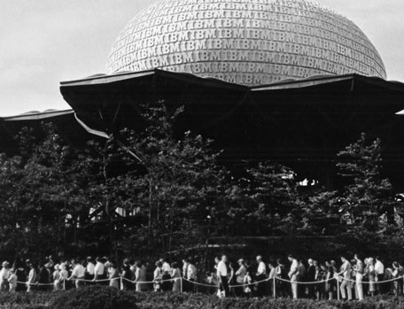
Above, the IBM Pavilion at the 1964 Worlds Fair.
Below, Eames’ complete short film The Information Machine. Commissioned in 1958 by IBM, it was designed to get a fearful population to trust this perceived-dangerous, unknown mechanical variable: Computers!
‘Futurist’
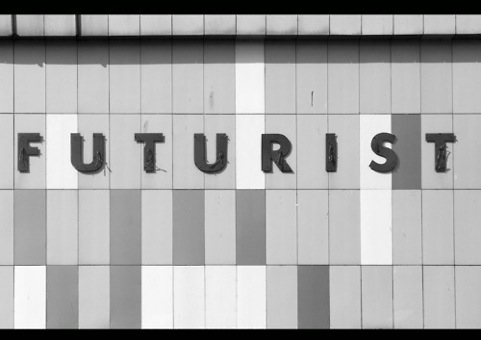
Found via Kristian Goddard
