Kafka Chandler 42
Even more free wallpapers by Arno Kathollnig . . .
Franz Kafka Trilogy – featuring my own Chandler 42 fonts (with some pointing hands from Alta California).
Even more free wallpapers by Arno Kathollnig . . .
Franz Kafka Trilogy – featuring my own Chandler 42 fonts (with some pointing hands from Alta California).
‘inspiring homes with heart’
Magazines are great sources for inspiration. Not as permanent as a logo – or brand – periodicals have a timer on them. After a few months, they’re gone.
A good newsstand is a treasure trove of the experimental, conservative, international, concise, good, bad, ugly. I drop by whatever I can find – even the Barney Noble chain if one is not nearby – just for a shot in the arm.
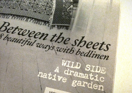
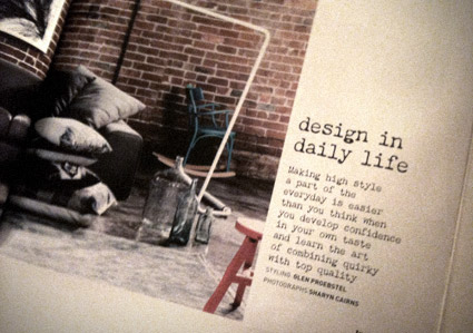
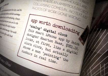
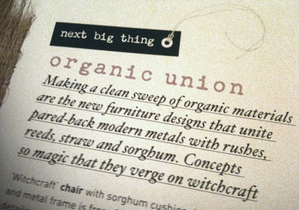
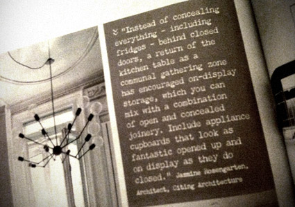
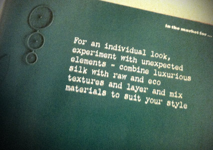
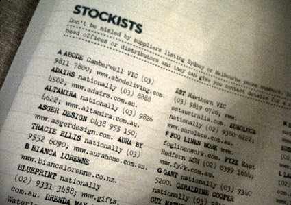
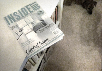
Earlier this year I spotted Chandler 42 being used in an Australian interiors pub. Alexendria-based Inside Out is using my typewriter type as a nice accent throughout their pages.
Here’s a few snaps (taken in my new home office – sleepy dog in background).
‘Another inspiration was the film MAX (2002), written and directed by one of Emigre magazine’s founders, Menno Meyjes . . . I decided Jeanne would be a fictional typeface that was released in 1918, the timeframe from the movie.’
Ascender is running a little sale on some of my fonts. 25% off until March 5, 2011. Offer only available thru Ascender’s website. For details, go here.
(and watch the trailer for MAX here)
A few months back, Claudia Chandler Brocato of the Chandler Family Association contacted me about Chandler 42 – my 1994 contribution to the ‘messy typewriter’ font genre.
And they ended up giving me a really nice write up in their quarterly newsletter. Just click the above image to read/download a one page PDF.
My wife is a Scrabble phenom. And one of her hush-hush strategies is the legal two letter words one can use in play.
For one of my specimens for my Chandler 42 fonts (above), she created a connected word chart listing these and a few others.
Chandler 42 was one of my first typefaces – and one of the earliest ‘grunge’ typewriter font packages to hit the market.
It has details in it one won’t see in other autotraced typewriter adaptations. Eight fonts in the complete package. Snag your copy here.
Click on the above image to read/jump. Mood music below.
Randy Brooks And His Orchestra: Harlem Nocturne
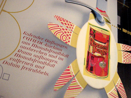
I don’t buy a calendar anymore.
Because, like clockwork, a super cool one will arrive in the mail; typically a bit after the New Year has arrived.
For the past 15 years, Thomas Krug has been mailing me an incredible calendar. It often arrives in a large box and it always dazzles. Elaborate printing techniques, special inks, die cuts – a mesmerizing trip of photography and design.
Thomas is the owner of the Traffic design agency in Winnenden, Germany. And his firm’s self-designed calendar is one helluva promotional item. [Read more →]
It’s the type that’s sexy.
If it were one of my fonts, that’d made it even sexier.
Make The Girl Dance is Campana & Perrin, aka Greg & Pierre. This is their MySpace page.
Found via Ashley Simko’s blog