entries Tagged as []
Arthur Baker and my type classes
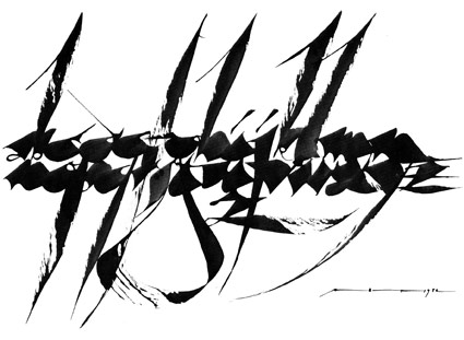
It started with the advice: ‘You have to go back to the broad edge pen. It’s all there.’
Brilliant calligrapher Arthur Baker gave me direction when I first set up my beginning typography course. And I’m still using the same approach today. [Read more →]
Vogue Italia illustrated
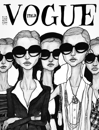
‘If I could gave my way . . . one of my goals in life is to illustrate a Vogue Italia Cover’
The work of Igor + André.
Illustration also available as a tee.
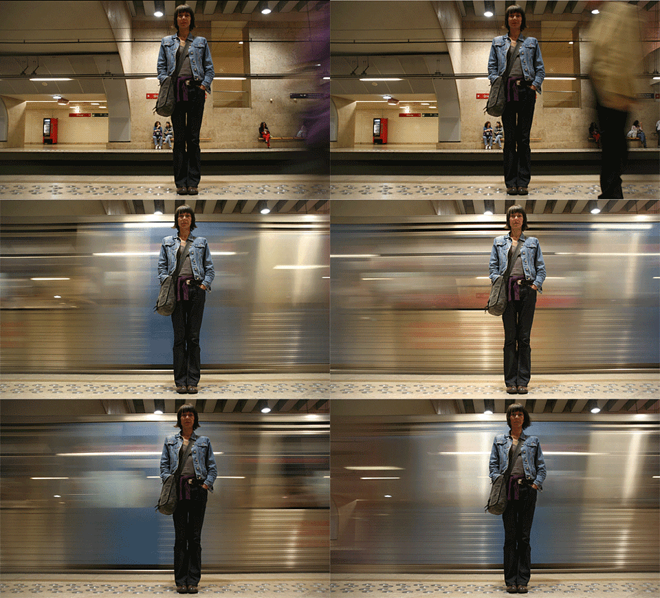
Paris Metro Fashion, 1959
News footage from a fashion show held the Saint-Michel Metro station, September 9, 1959.
And here’s some music to go with the footage:
Dicky Doo & The Don’ts: Vive L’Amour
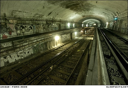
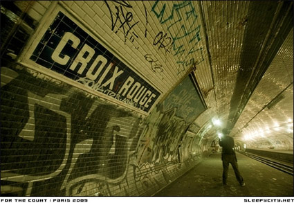
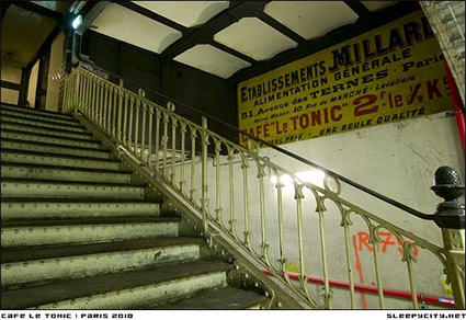
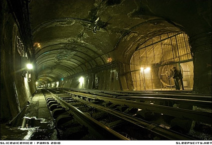
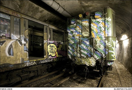
Lost Paris Metro
‘Photo essay of the Paris Metro including all the stations you probably know about, many you don’t, and some that have not been accessed by the outside world for more than 50 years.’
Sleepycity’s photos and history here.
Found via Boing Boing
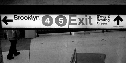
Helvetica Subway
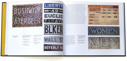
‘Legend has it that Helvetica came in and vanquished the competition. Paul Shaw shows that it didn’t happen that way’
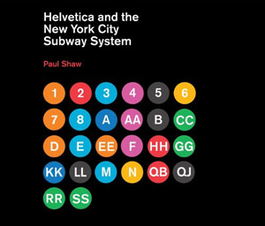
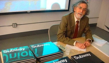
In his new book, Helvetica and the New York City Subway System: The True (Maybe) Story, designer and historian Paul Shaw (below) takes a look at some Swiss type and the trains of the MTA.
Pre-order your copy here (book drops March 11, 2011). Official site here. Idsgn interview with Shaw here.
Found via Delve Withrington
