entries Tagged as []
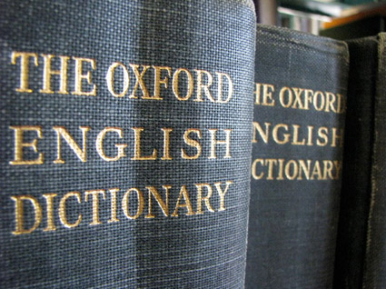
MoMA and the history of @
‘MoMA’s announced what might be its boldest acquisition ever. And it didn’t even cost anything: The ‘@’ symbol is now a part of the museum’s permanent design collection.’
Article here.
Pictured above, the @ symbol from Goudy’s Bertham font.
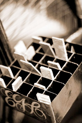
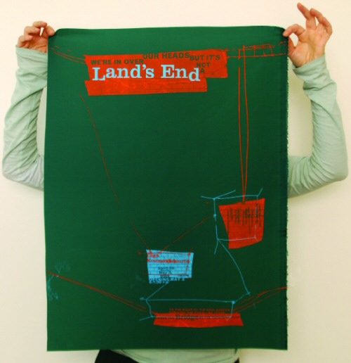
Retro modern stationery
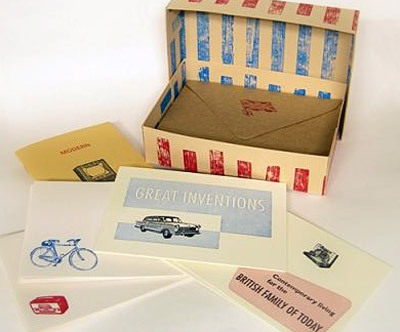
‘SORT stands for Society of Revisionist Typographers and, as their name suggests, they use typography and printing techniques of the past but marry them up with a contemporary design aesthetic’
SORT’s Modern Living stationery set is available thru the Southbank Centre. Other sorts from SORT are available thru their Etsy store.
The official SORT website is here.
Found via Retro To Go
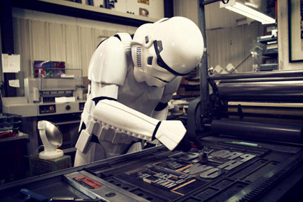
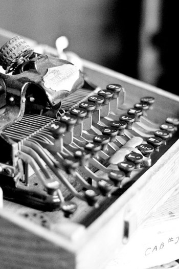
Making Metal Typefaces in the 21th Century
‘This project has a dual goal of documenting the almost-lost skill of creating metal fonts and of capturing the personality and work process specifically of practitioner the late Canadian graphic artist Jim Rimmer (1931–2010)’
Richard Kegler’s long-delayed documentary, Making Faces: Metal Type in the 21st Century, has just secured just enough funding for completion.
For more about the film, go here and here.
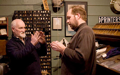
Rimmer and Kegler
McGrew is back
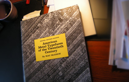
‘Mac McGrew’s 1993 2nd, revised edition is an important book for any printer, collector, student or aficionado of letterpress type. Equally valuable as a typeface reference and an insightful history of the typemaking industry in America.’ –Letterpress Type
THE book on metal typefaces cast in America (hint: not all of them have been digitized) is Mac McGrew’s American Metal Typefaces of the Twentieth Century.
Long out of print, this 398 page resource is available once again. Snag your copy here.
Pictured: my dog eared, Post-It note filled edition.
Found via Steve Matteson
The International Printing Museum: New logo, new site
One of the coolest printing history finds in the Los Angeles area is The International Printing Museum in Carson.
Tucked away in an industrial section and run by the incredible Mark Barbour, the museum hosts an amazing collection of rare equipment, The Book Arts Institute (Hi Rachelle!), The Wayzgoose Gazette, a gallery, library and more.
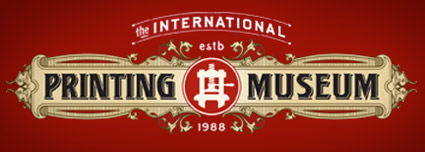
And now they have a new RSS-friendly blog-based website – sporting a new logotype (above) created by Gina Pirtle Simpson.
Click on any image to visit the museum’s website/jump.
Museum photographs by April Rocha
Support St Bride
‘The St Bride Library is the largest library for printing, publishing and the graphic arts in the English-speaking world.’
The St Bride Library now has a shop. Limited edition type/printing books, snag em here.
The Clarendon trend
Jason Munn
Just had a discussion – and major test question – involving 19th Century wonder Clarendon in my history class. As a type, Clarendon has been popping up all over the place for a bunch of years now.
I use it (paired with Jenson) for handouts in my introductory type course at ARC, up until recently, it was the corporate font for Starbucks . . . it just boldly says, read me.
New article (and cool samples) posted by SOTA’s Tamye Riggs here.
Jessica Fleischmann
Madeleine Eiche
Simon Dovar and Nils Davey
Picking fonts
‘Is there a way to know what fonts will work together? Building a palette is an intuitive process, but expanding a typographic duet to three, four, or even five voices can be daunting.’ –H&FJ
‘how do I pick the right font?’
. . . is the most common question I’m asked in my type courses. And my answers aren’t usually simple. I liken it to picking the right suit, tie and shoes.
What handbag will work best, nail polish, lipstick, gloss or none, which eye liner will simply look great . . .
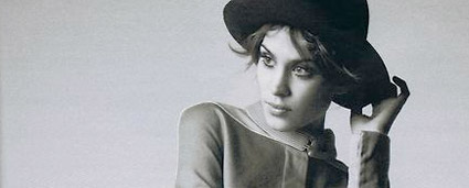
One learns by doing. [Read more →]

handpicked posts

a piano falls in old manhattan
tetro and typography
it’s typography: film, song and dance
ghosts of gustov klimt
the great times new roman controversy
picking fonts
kapitaal
defining terms: design is not decoration
garcia's 'pure design'
'enhance that image!'
magic highway remixed
the cynic
rad anthem
Brought to you by man dom-


buy my fonts
go shopping
mehalloreads

Divinely Elegant: The World of Ernst Dryden
Jozsef Pecsi: Photo and Advertising
Color: A Natural History of the Palette
Collage: Assembling Contemporary Art
Modern Dog: 20 Years of Poster Art
Gaberbocchus Press: An Experiment in Publishing, 1948-1979
Advertising Art in the Art Deco Style
Googie Redux: Ultramodern Roadside Architecture
Hot Sour Salty Sweet: A Culinary Journey Through Southeast Asia
now playing


the work at the mehallo blog. beta. is licensed under a creative commons attribution - noncommercial - no derivative works 3.0 united states license. if reposting, credit must be given to steve mehallo - and if possible, please provide a link back to the mehallo blog. beta.
i include images for the purpose of critique, review, promotion and inspiration - and always make my best effort give credit/link back to the original source. if i’ve screwed up, please fire me a note.
page layout based on the wordpress 'darkwater theme' by antbag, adapted and redesigned by mehallo. valuable php assistance from bill mead.


