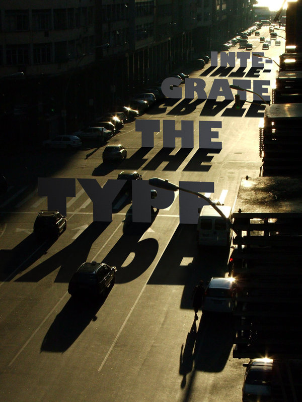
entries Tagged as [typography]


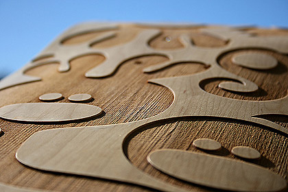


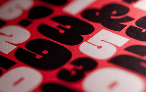
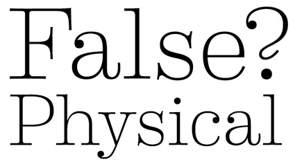
Eames Century Modern catalog
‘A look at printing the of House Industries’ Eames Century Modern catalog.’
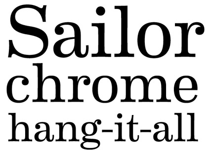
Eames fonts
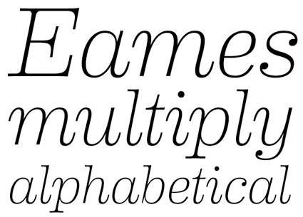
‘Charles and Ray Eames did not design a typeface. They did, however, leave a philoshophical template for a font collection worthy of their name.’
House Industries has created Eames Century Modern – a rethinking of the original Century types – with a midcentury modern update. Details here.


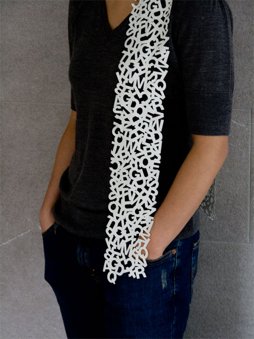
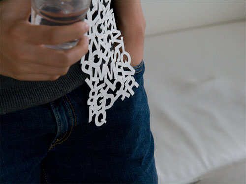
Fonts from the World of Tomorrow!

The mid-century stylings of Charles and Ray Eames were a major influence on my Martini at Joe’s fonts. Snag em here.
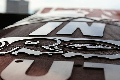
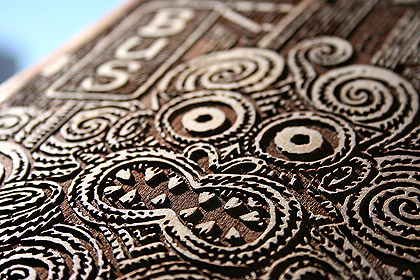
Alphabet Truck by Tabuchi
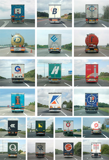
Since Sacramento is a hub for some of California’s major freeways (5, 80, 99), there’s a lot of local truck traffic.
And there’s always some interesting typography to go with them. Yellow is one of my favorites, because it’s not actually yellow. It’s orange.
I also enjoy the typography and colors of the Werner line.
And I do miss the iconic fruit covered Raley’s trucks – no longer seen around town. Artwork by the great Don Birrell of historical Vacaville Nut Tree fame.
On a related note, here’s images from Paris-based photographer Eric Tabuchi’s Alphabet Truck series (above) volume one and volume two.
Found via Splorp

handpicked posts

a piano falls in old manhattan
tetro and typography
it’s typography: film, song and dance
ghosts of gustov klimt
the great times new roman controversy
picking fonts
kapitaal
defining terms: design is not decoration
garcia's 'pure design'
'enhance that image!'
magic highway remixed
the cynic
rad anthem
Brought to you by man dom-


buy my fonts
go shopping
mehalloreads

Divinely Elegant: The World of Ernst Dryden
Jozsef Pecsi: Photo and Advertising
Color: A Natural History of the Palette
Collage: Assembling Contemporary Art
Modern Dog: 20 Years of Poster Art
Gaberbocchus Press: An Experiment in Publishing, 1948-1979
Advertising Art in the Art Deco Style
Googie Redux: Ultramodern Roadside Architecture
Hot Sour Salty Sweet: A Culinary Journey Through Southeast Asia
now playing


the work at the mehallo blog. beta. is licensed under a creative commons attribution - noncommercial - no derivative works 3.0 united states license. if reposting, credit must be given to steve mehallo - and if possible, please provide a link back to the mehallo blog. beta.
i include images for the purpose of critique, review, promotion and inspiration - and always make my best effort give credit/link back to the original source. if i’ve screwed up, please fire me a note.
page layout based on the wordpress 'darkwater theme' by antbag, adapted and redesigned by mehallo. valuable php assistance from bill mead.


