entries Tagged as [typography]
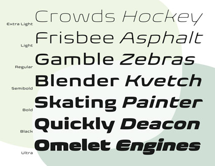
So you need a typeface

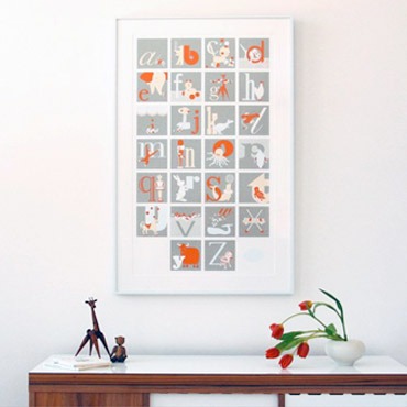
Picking fonts, not the easiest thing to do. But design student Julian Hansen has created a poster that kinda breaks it down into easy solutions.
Click the above image for a full size version.
Are there really easy solutions?
Swiss design uberguru Massimo Vignelli believes so. Here’s I Love Typography’s take on The Vignelli Twelve.
Found via Typekit
talk to me . . .
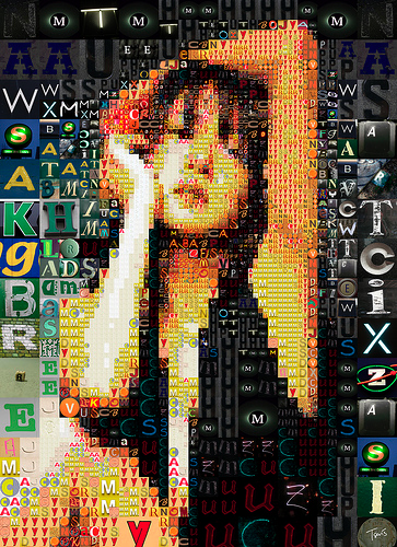
‘A letter mosaic of a japanese idol’
The photomosiac work of Charis Tsevis.
Click image for larger view/jump.


Type fades
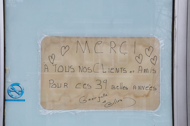
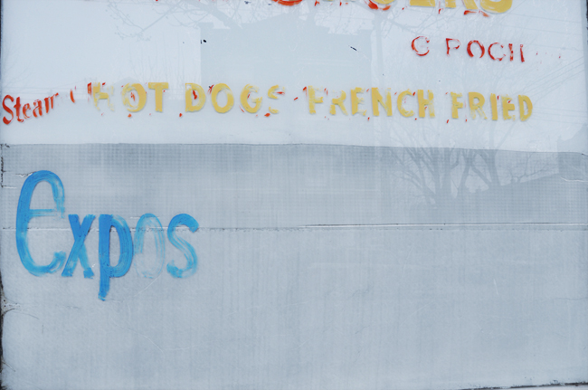
‘I heard there will be a bigger restaurant in their place. I never been to Di Lalla. I must say, it wasn’t very inviting. But it was there and now it’s not. I wish Georgette and Gilles to have a very happy retirement. On their last message, written on a paper place mat, they said : Thank you! To all our customers and friends for those beautiful 39 years. For some reason, I find this very moving.’ -nathalie
Photos by nathalie et cetera of a now abandoned restaurant that’s about to be updated by progress. More details here.

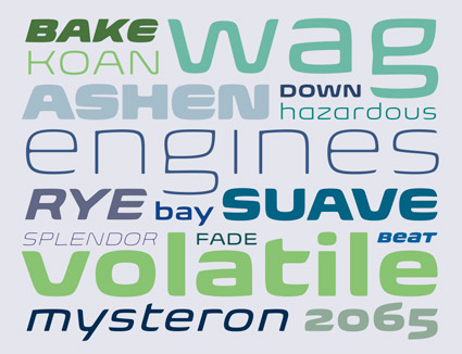
Biome
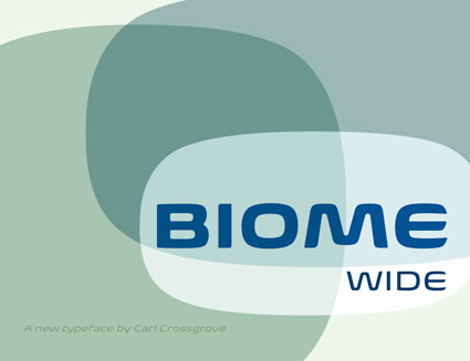
‘A retro-futuristic, soft display sans in seven weights’
Check out Carl Crossgrove’s fantastic new Biome Wide fonts. Details here.
Available thru fonts.com (and a few others).
The Endeavor, 1979
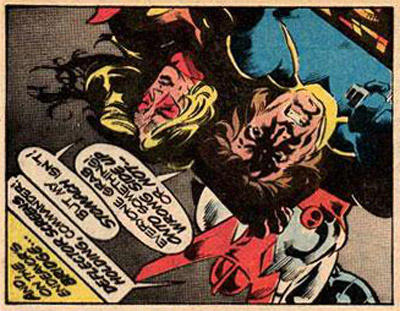
‘Pursued by the relentless minions of the cruel despot Baron Karza, the freedom-fighting crew of the Endeavor breach the Space Wall and emerge on a strange and dangerous new world – a planet known as Earth.’
In 1979, a comic book series quietly appeared at the local drug store. At the time, comic book stores were not common – and if one wanted each issue, they had to hunt it down.
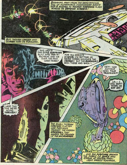
The Micronauts was a sleeper. And contained story and artwork years ahead of what was going on in mainstream comics at the time. [Read more →]
Congratulations Rebecca!

The randomly-picked winner of my under-the-radar, spur of the moment Jeanne Moderno giveaway contest thing from this past week is Rebecca Spencer, who posted the comment:
rebecca spencer// Apr 10, 2010 at 4:25 pm
I really like the Jeanne Moderno faces… hope I win!!
The winning font has been emailed using YouSendIt. Thanks to everyone for the great comments and entries!
Please keep reading. More to come.
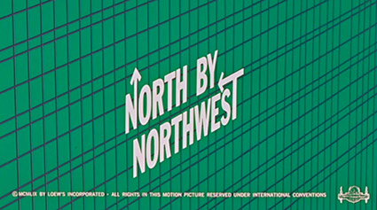
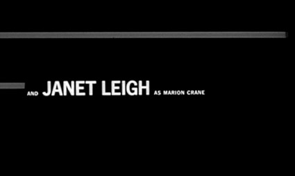
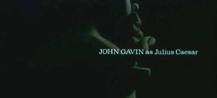
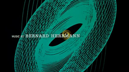
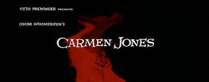

Bass on Titles
‘Bass on Titles presents a comprehensive, well-rounded retrospective of Academy Award-winner, Saul Bass’ film title sequence design.’
With really bizarre dialog screwy sound looping fx. Watch it above. From 1977.

handpicked posts

a piano falls in old manhattan
tetro and typography
it’s typography: film, song and dance
ghosts of gustov klimt
the great times new roman controversy
picking fonts
kapitaal
defining terms: design is not decoration
garcia's 'pure design'
'enhance that image!'
magic highway remixed
the cynic
rad anthem
Brought to you by man dom-


buy my fonts
go shopping
mehalloreads

Divinely Elegant: The World of Ernst Dryden
Jozsef Pecsi: Photo and Advertising
Color: A Natural History of the Palette
Collage: Assembling Contemporary Art
Modern Dog: 20 Years of Poster Art
Gaberbocchus Press: An Experiment in Publishing, 1948-1979
Advertising Art in the Art Deco Style
Googie Redux: Ultramodern Roadside Architecture
Hot Sour Salty Sweet: A Culinary Journey Through Southeast Asia
now playing


the work at the mehallo blog. beta. is licensed under a creative commons attribution - noncommercial - no derivative works 3.0 united states license. if reposting, credit must be given to steve mehallo - and if possible, please provide a link back to the mehallo blog. beta.
i include images for the purpose of critique, review, promotion and inspiration - and always make my best effort give credit/link back to the original source. if i’ve screwed up, please fire me a note.
page layout based on the wordpress 'darkwater theme' by antbag, adapted and redesigned by mehallo. valuable php assistance from bill mead.


