entries Tagged as [typography]

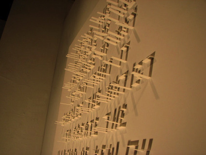
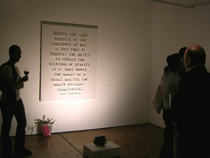
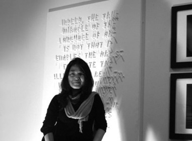
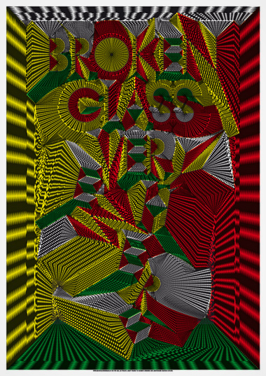
It’s Typography: Big screen premiere this Friday

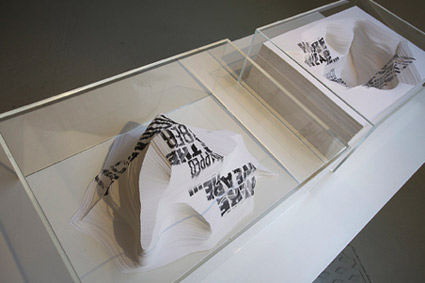
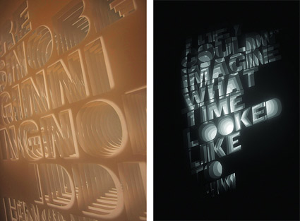
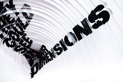
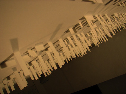
The Sacramento International Film and Music Festival is underway – and this Friday night, my students’ type film (above) will be shown as part of the Art Institute’s Student Showcase, 6 p.m., July 30 at The Crest.

Festival details here.

Official It’s Typography website here.

Emigre, picking fonts and the war in California

‘The pairing and combining of different typefaces has always been a particular graphic design challenge  . . .  Emigre has its own take on this typographic technique. But instead of providing rules, which often render safe but bland results, we believe that ultimately any font can be successfully combined with any other font. It’s not so much a matter of which font combinations to pick, it’s a matter of how you use the fonts in combination.’

The latest Emigre font catalog – Historia – is a bit like an old issue of Emigre magazine. Strong concept, interesting point of view, wonderfully designed.

The 64-page specimen highlights battlefield locations of the Mexican-American war, 1846-48; specifically, the battles that took place in what is now California. [Read more →]

California Imagination

A bunch of years back – amidst a bunch of projects – the type for this PSA came off of my laserprinter and was hand trimmed by then student Xing Xiong.

Making of video here.

Free AGE font

Fontfabric’s new retro font, AGE. Snag it free here.

Ransom note generator

Make your own  . . .  here.

Found via Bill Mead

‘There is No Why’

The work of Alida Rosie Sayer, now on exhibition in London.

Articles here and here. Blog here.

‘Shadow Typography’

The work of Seree Kang. More work here.

Michiel

The work of Michiel Schuurman.

Gift to White House: Ben Eine’s graffiti typography


Ben Eine: Twenty First Century City, spray paint and black gloss on canvas

‘Ben Eine (real name Ben Flynn) is a street artist in London who has recently gained a whole lot of recognition in the states. British Prime Minister David Cameron presented his work to President Barack Obama for his first official visit to the U.S.’ –Global Grind

Article here. Check out Eine’s official site here.

Found via Chank Diesel

Public Gothic goes international

Antrepo‘s Public Gothic fonts are now available in 42 languages. Details here.

Letterman

‘Stronger than silent e, able to leap capital T in a single bound’

Before David Letterman had a show, I used to watch Letterman.

Joan Rivers narrated the Letterman spots with Gene Wilder as the voice of the hero.

These shorts were from the original Electric Company (1972-77), which was the coolest childrens show ever. Even had Morgan Freeman, Rita Moreno, Mel Brooks and Spider-man.

And
In an odd jump back to my childhood, Libby the Kid and The Electric Company ended up influencing some of the design stuff I’ve done for Normandie.


Creative Commons License

the work at the mehallo blog. beta. is licensed under a creative commons attribution - noncommercial - no derivative works 3.0 united states license.  if reposting, credit must be given to steve mehallo - and if possible, please provide a link back to the mehallo blog. beta.

i include images for the purpose of critique, review, promotion and inspiration - and always make my best effort give credit/link back to the original source.  if i’ve screwed up, please fire me a note.

page layout based on the wordpress 'darkwater theme' by antbag, adapted and redesigned by mehallo.  valuable php assistance from bill mead.