abcdefg . . . vw
One more.
One more.
The classic Sesame Street Typewriter Guy. From 1978.
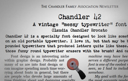
A few months back, Claudia Chandler Brocato of the Chandler Family Association contacted me about Chandler 42 – my 1994 contribution to the ‘messy typewriter’ font genre.
And they ended up giving me a really nice write up in their quarterly newsletter. Just click the above image to read/download a one page PDF.
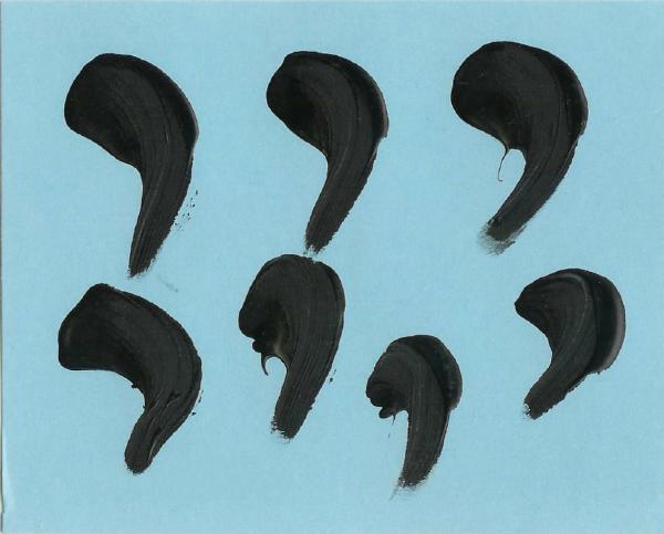
‘an excerpt from the poem Ursonate (Sonata in primitive sounds) by Kurt Schwitters (1887-1948)’
Created by Ed Ackerman and Colin Morton, 1986.
Found via Typophile
‘Momento repetido, Intersticio impalpable, Formas sinuosas, Insignias a tus aventuras, Momento contemplativo.’
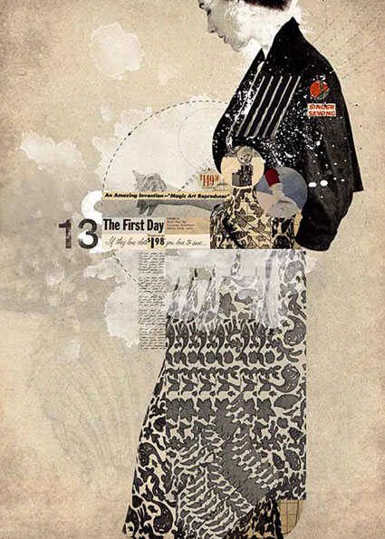
The work of Alexander Cano.
Depeche Mode: Precious
Found via beauty comma
‘Do it for Frank’ -set in Cooper Black
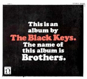
The Black Keys’ Tighten Up, from the album Brothers.
Found via David Rosales
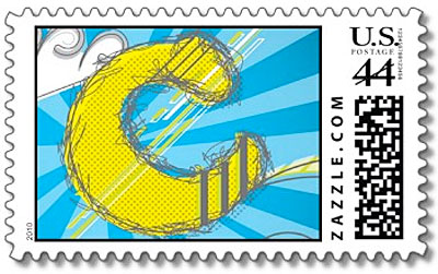
Oswald Cooper’s most famous typeface gets a US postage stamp!
Well, sort of. But it is legal, usable US ‘Zazzle’ postage. Snag your’s here.
Designed by David M. Anderson.
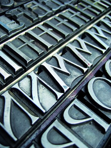
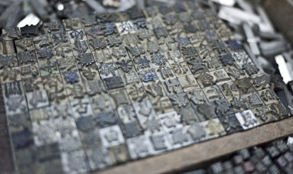
‘Tipoteca Italiana is a private foundation that was founded in 1995 to advance printing knowledge and preserve venerable printing technologies. Its founder, Silvio Antiga, a 65-year-old printer who owns a printing firm in the Veneto region, has collected more than 20 vintage presses and typesetting machines, along with hundreds of wood and metal type ‘fonts”
From T Magazine, Steven Heller looks at the incredible Tipoteca (tif) and where the term ‘font’ comes from.
I haven’t been there, but a friend visited several years ago – and brought me a whole bunch of really cool ephemera.
Found via Campbell BrownKorbel


the work at the mehallo blog. beta. is licensed under a creative commons attribution - noncommercial - no derivative works 3.0 united states license. if reposting, credit must be given to steve mehallo - and if possible, please provide a link back to the mehallo blog. beta.
i include images for the purpose of critique, review, promotion and inspiration - and always make my best effort give credit/link back to the original source. if i’ve screwed up, please fire me a note.
page layout based on the wordpress 'darkwater theme' by antbag, adapted and redesigned by mehallo. valuable php assistance from bill mead.