entries Tagged as [typography]
‘Close Your Bank Accounts’
This seems obvious but it isn’t.
I’ve been using credit unions for about 15 years, have free checking and there’s no fees on my debit cards – unless BofA (or another ‘out of network’ teller) decides to charge me one.
For more info about credit unions (or simply banking local), visit the Move Your Money Project website.
Image found via Don Button
Occupy, the posters
‘I’ve been doing posters for tons of cities across America’
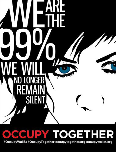
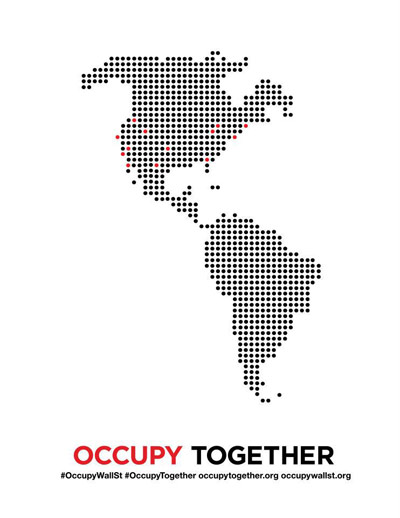
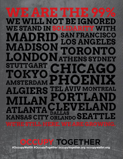
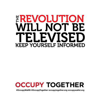
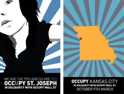
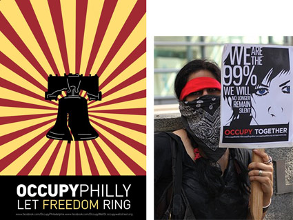
In the past few weeks, one of my former students has found herself cast as the visual heart of the Occupy movement. Raina Dayne started with offering to do a poster and it’s blossomed into something much bigger.
Raina’s images can be downloaded for use at the Occupy Together website. Facebook page here, shirts here.
Jobs: Making the world a better place
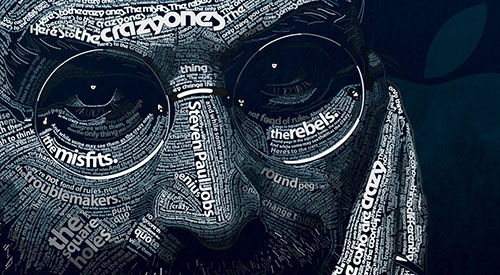
‘Your time is limited, so don’t waste it living someone else’s life. Don’t be trapped by dogma – which is living with the results of other people’s thinking. Don’t let the noise of others’ opinions drown out your own inner voice. And most important, have the courage to follow your heart and intuition. They somehow already know what you truly want to become. Everything else is secondary.’ –Steve Jobs
Intuition is very powerful, once one knows how to trust it. It involves turning off the insecurities of ego and concentrating on pure feeling. And it works wonders.
The news of Steve Jobs’ passing came in via social media. I saw a Facebook post right after I gave a design history lecture on early modern artists and how they’d managed to change the world.
I was fortunate enough to both go to school and work in and around Silicon Valley where Jobs’ approach reverberates and inspires. Playing it safe, following the status quo will not lead to new things, will not improve life as we know it – and Jobs knew how to get the best work out of Apple’s creative team.
He knew that details are excruciatingly important. Leveraging design, using good typography, giving us what we really want – instead of what we think we need – was all part of the package.
Thinking different makes the world a better place. That’s the legacy he leaves.
Image by Dylan Roscover, using Apple’s suite of fonts from over the years
Audi typography
‘Function in an Elegant Form’
Rubber, steel, leather.
Animated type for the Audi Q3 by Why Not Associates.
Found via Creative Review
Schelbert, West, Rietveld
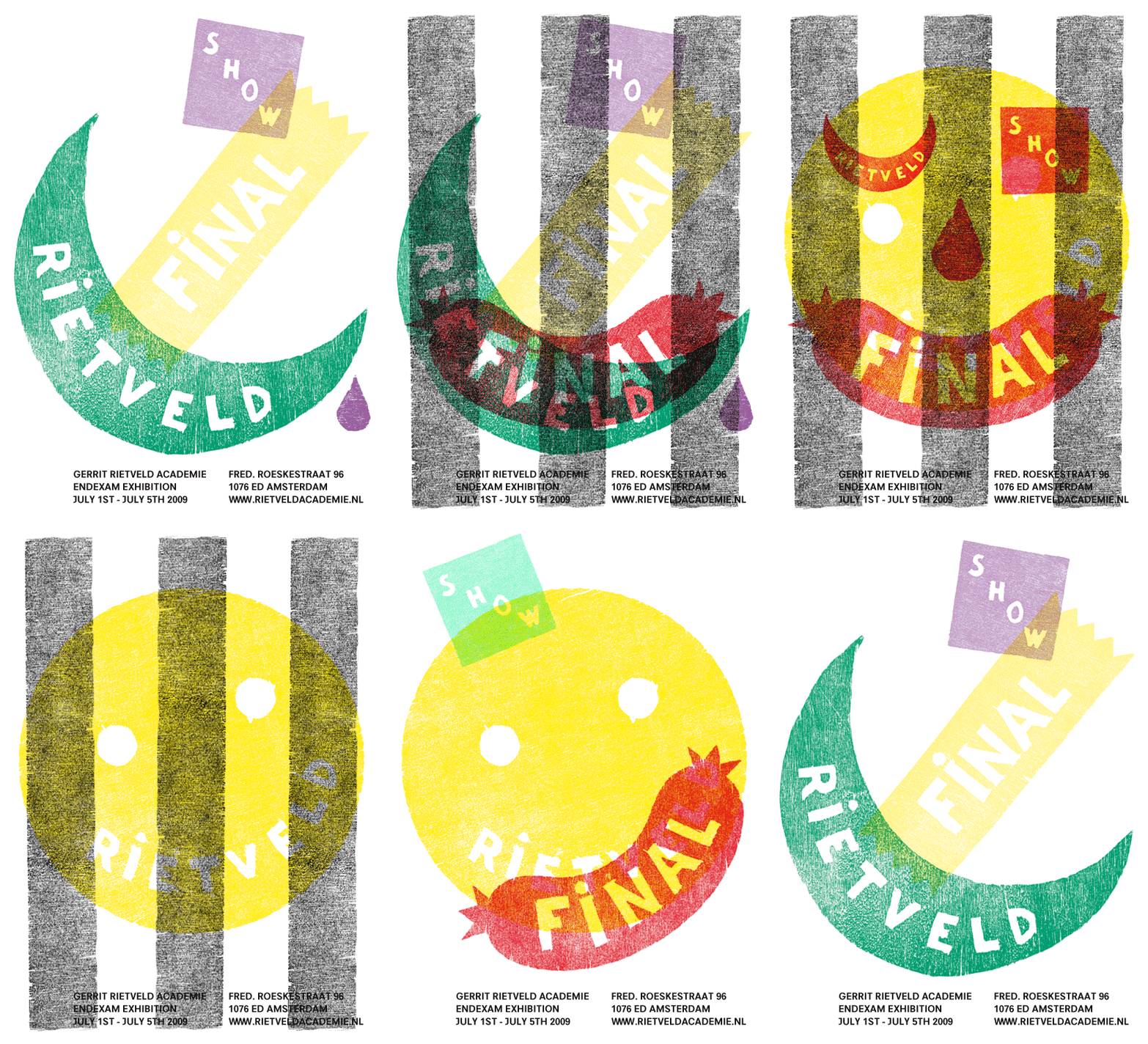
‘handprinted and unique posters in A0 format, printed and digital invitations and adverts in various Dutch magazines . . . woodcut printed.’
E-flyer for Alban Schelbert and Christopher West’s End Exam Show at the Gerrit Rietveld Academie. From 2009.
Found via manystuff
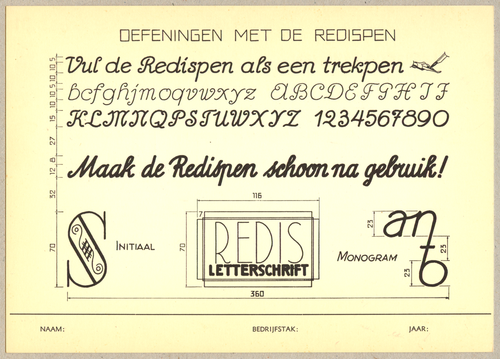
Leerstof Tekenen alphabets
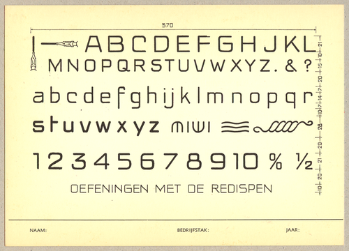
‘From Leerstof Tekenen, a collection of assignments and exercises for graphic design students . . . Rescued from the Gerrit Rietveld Academy library in Amsterdam’
Genghis Kitchen
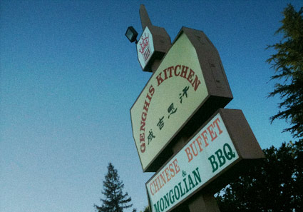
Up until a few months ago, I was living down the road from this place. I love the name, the food: not so good. Which may explain its recent closure.
Mongolian BBQ has nothing to do with Mongolia, but is a cuisine unto itself. Not anywhere near highbrow, not exactly a real BBQ. It’s a Taiwanese invention, a greasy, interactive meaty experience; the best I ever had was somewhere in Denver. The sport is all about getting as much slammed into the bowl as possible (flattening out the meat) so the food is plentiful and the trips to the grill are few.
Places with extra ingredients (such as shrimp, lamb, tofu) and seasonings (Italian herbs, Cajun spices and Rooster Sauce) are special. Ginghis (Khan) Kitchen, unfortunately, had neither. But – cool name, cool sign.
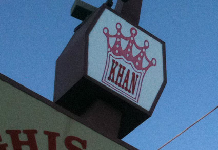
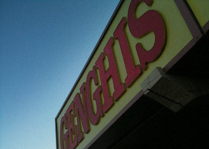
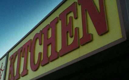
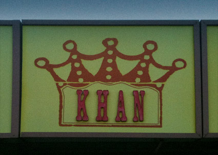
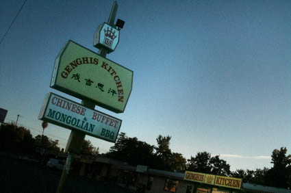
Photos by mehallo
Chank, for Target
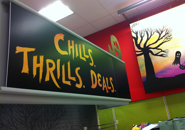
While everyone’s gone Missoni for Target crazy, Chank Diesel and Anne Ulku snuck a little custom font into this year’s Target Halloween promos.
Details here.


