entries Tagged as [typography]
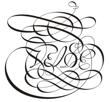
Swooshy! Van den Velde Script
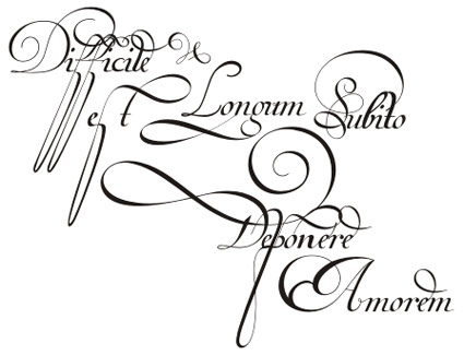
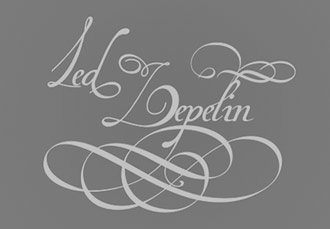
The newest font package from Brazil-based Iza and Paulo W of Intellecta Design is pure pen magic: A loose interpretation of the work of Dutch calligrapher Jan van den Velde, 1568-1623.
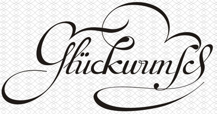
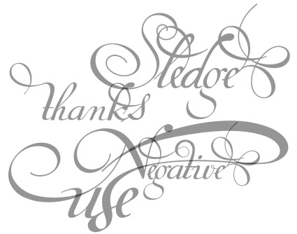
The Van den Velde fonts feature a bunch of stylistic alternatives, ligatures, swooshes, swashes and other strokes that say woooooooo!
Two frilly fonts are available – one with letters, alternates and fleurons – and a ‘words’ version that features a set of customized words to make any decorative communiqué become the domain of an expert penman.
Snag your own thru MyFonts. Both fonts are on sale thru September 27, 2011.
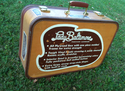
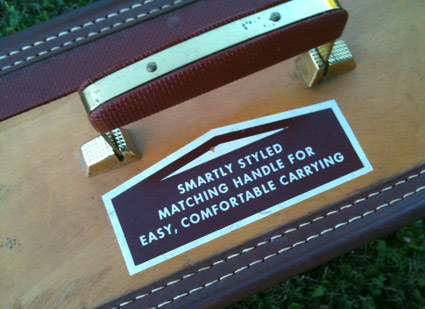
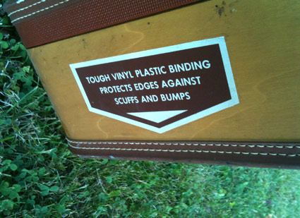
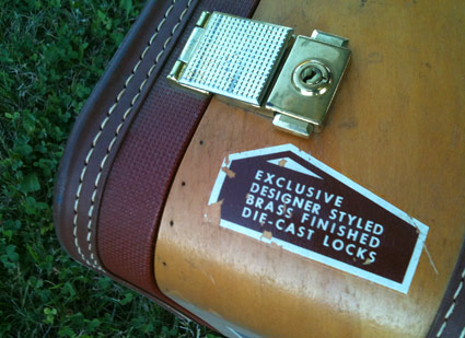
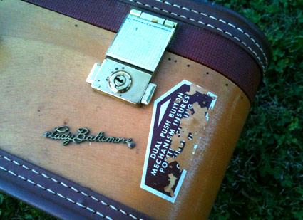
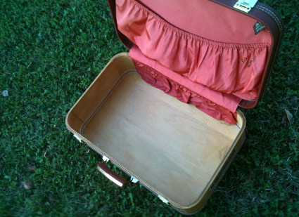
Lady Baltimore Fashion Luggage
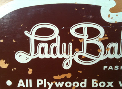
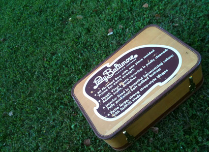
‘Exclusive designer styled brass finished die-cast locks’
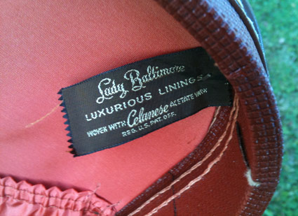
We found this on our honeymoon back in 1995.
We’d picked up a bunch of trinkets in Seattle and needed an extra piece of luggage – so a few hours before our trip home, we ran across this luxuriously lined Lady Baltimore display model in a small shop.
Been a part of the family ever since.
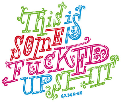
‘Fucked Up Shit’
Handlettered type for GAMA-GO by the great Ray Fenwick.
Ray is the author of one of my favorite typographic comic panels, Hall of Best Knowledge – now available in convenient book form.
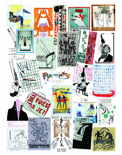
The Danny J. Gibson Show
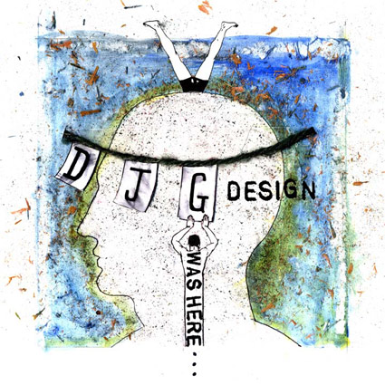
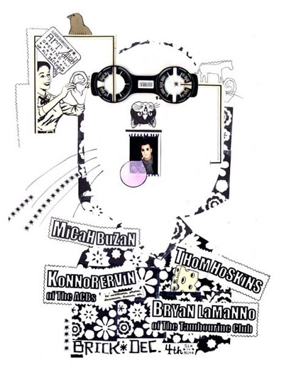
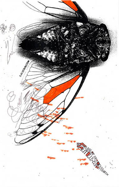
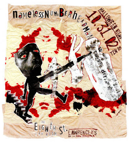
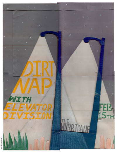
‘For a decade, Danny created art for musicians – album covers, event posters, and logos, among others. Now those artists are paying tribute to Danny with a free, downloadable 35-song album titled ‘DJG Was Here.”
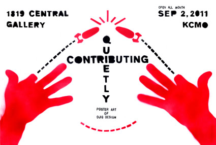
Danny J. Gibson’s been a friend for years – and he’s one of the most prolific, experimental artist/designers I know. In a few days Quietly Contributing – Poster Art of DJG Design will open at the 1819 Event Space + Gallery in Kansas City.
More details here. Snag the free album here (please use the tip jar).
Article here. And visit Danny’s site here.
Project Runway 9, Forever Darling 4
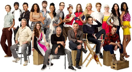
‘One of them just walked off the show and the other just dropped dead.’ -said my wife, Thursday night
Something interesting happened this week on Project Runway. And it wasn’t Cecilia throwing in the towel or Oliver collapsing on a track at the Armory. Nor was it the general bitchiness from teams Joshua or Anthony Ryan.
Heidi Klum actually gave the designers MORE TIME to complete their work. And for the first time this season, I was able to see what I came for: Some good fashion design. Not great, but good.
(Okay, the first challenge was really good, but there was a drop off after that)
A dark cloud of schadenfreude seems to be the Project Runway modus operandi this time out – and frankly, I’m not enjoying it very much. Sadism on tee vee, not a big draw for me.
The Project Runway formula is the same as usual: Take some great talent, surprise them with challenges within a quick time frame, and see what they can do.
Only so far, all we’ve been able to really see are some harebrained stunts for the designers to work with (models on stilts, really??), insane time limits, near nervous breakdowns, panic attacks, Nina saying ‘no’ a whole lot. This show that has become legendary for showcasing incredible designers and pushing careers forward had devolved into Project Sweatshop. Workflow of getting things done over getting things done well. [Read more →]
Eastern Block
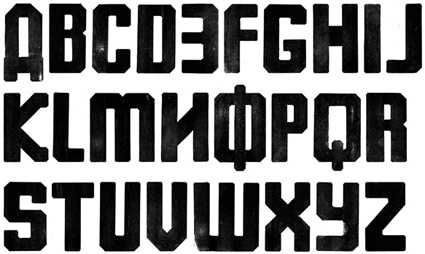
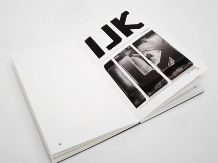
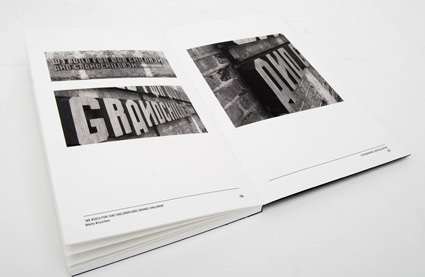
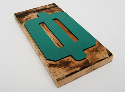
‘A typeface designed to reflect the aesthetic qualities of Soviet Union product design and manufacture. The typeface uses a unilateral x-height, cap height and faux Cyrillic to create a blocky, angular and awkward response. To allude to the dated methods of production, I produced the entire face as printing blocks.’
Andy Barnes’ Eastern Block typeface. Website here.
Found via Arts Thread
‘Trojan’ tees: Neo-Nazis punked
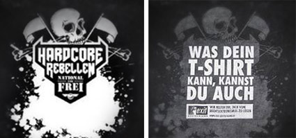
‘Germans at an ultra-nationalist rock concert snapped up free T-shirts bearing nationalist flags and the slogan ‘hardcore rebels,’ only to find a very different message after the shirt had been washed. ‘If your T-shirt can do it, you can do it too – we’ll help you get away from right-wing extremism,’ the 250 ‘Trojan horse’ T-shirts read after their first washing.’
The stunt was about raising awareness among ‘the young and less committed.’ Details here.
Found via newser
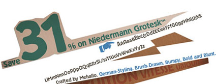
Niedermann Grotesk: My new, old font
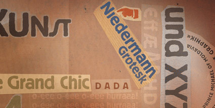
Niedermann Grotesk is my newest font and it’s been sitting in the hopper for awhile.
It became a side project that appeared while I’d been working on my update to Jeanne Moderno (which is Jeanne Texte, which has been in a little limbo due to other projects) (I plan on getting back to it next month).
Along the way I fell in love with types that were part of the German Sachplakat (object poster) style pioneered by the great Lucian Bernhard – a lot of which can be seen (as backgrounds) in their original zeitgeist settings in the 1927 Ruttmann film I posted on Sunday.
Plakat lettering was drawn as needed, typically painted. For my adaptation, I went back to brush – and included a handful of alternative characters, ligatures, plus a few dingbats.
Grab your copy here.
And . . . Save 31%! Niedermann Grotesk is on sale right now at MyFonts. Sale ends September 22, 2011.
