Beautiful
‘Uninhabited islands, red light district, bloody family disassembly, lovers and husbands, cuckolds, sinking ships and search of treasure, love and pigeons’
Opium Project‘s video for Beautiful.
Found via Oksana Zhuravel
‘Uninhabited islands, red light district, bloody family disassembly, lovers and husbands, cuckolds, sinking ships and search of treasure, love and pigeons’
Opium Project‘s video for Beautiful.
Found via Oksana Zhuravel
I’ve known Marian Bantjes a few years – mostly thru emails and online notes. I found her work years ago, it blew me away so I put it in an exhibition.
And in watching her recent TED video (above), I’ve noticed some career parallels. Though I’m not looking at a parallel of work (not even close), what I see is a parallel of thinking.
design rut
I’ve been a designer working ‘behind the scenes’ for over two decades.
I was a paste up artist and I have the scars to prove it. My first graphic design courses were part of a drafting program – no computers – and today I’m shocked at how important work habits developed during that time have become. I don’t consider my work innovative or new – simply bulletproof. And I’ve made a lot of money for a lot of other people. And mostly, I’ve never quite fit in with my contemporaries. And the battles that come from this have raged on for a long time.
A few years ago I had to ask myself this tough question:
Why the fuck do I no longer enjoy what I do??
The answer was telling. And not very simple. Part of it involves the temporary nature of my field. Most of what I’ve designed, doesn’t exist anymore.
But most of the problems I saw came from letting too many other people have control over what I do and how I do it. Working within perceptions of how others see my field – graphic design – really took the wind out of my sails. For this simple reason:
Graphic design can be so much more than people who work in our field think it is.
I seem to see this. But not many others do.
turnaround
About two years ago I made the conscious decision that I will only work on jobs that I enjoy.
This is a key decision, in that I’d reached a bottomed out, enough is enough point in my career. I had some serious work and financial setbacks and had to put a stop to the . . . bleeding. For lack of a better term.
And the work I have in right now, I love doing.
I love teaching, so I just took on SEVEN classes (all typography, one design history course) and this was one of the most fun quarters/semesters I’ve had. And in my spare time, I draw fonts, design really goofy stuff and post whatever inspires me to this blog. Because I love it.
Will it lead to something else? Who knows? Who cares?
But enough about me. Watch Marian’s talk. She’s figured it out, mostly. And what she does – what all visual artists do – is very important.
Don’t let anyone ever tell you otherwise.
Check out krystian ‘junkyard dogs’ kujda’s photostream at Flickr.
Reminds me of things in my garage.

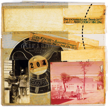
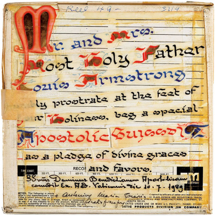
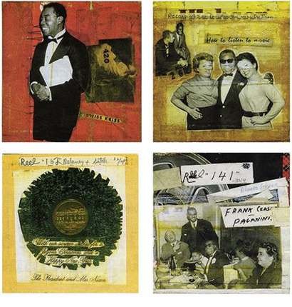
‘Well, you know, my hobbie (one of them anyway) is using a lot of scotch tape . . . pick out the different things during what I read and piece them together and [make] a little story of my own.’
Collages made by Louis ‘Pops’ Armstrong, from reel tape boxes, photos and other ephemera. More info here.
Happy Fathers Day everyone!


Louis Armstrong: La vie en Rose
Found via The Paris Review and Oscar Grillo
‘Real time: 1 hour 28 minutes, footage was recorded nonstop in one sitting. I was going as fast as I could so there are some imperfections here and there.’
Student Tony Wang’s final project from my experimental typography course at The Art Institute of California Sacramento. Tony spent the past eleven weeks doing a multifaceted study of the work of Hermann Zapf.
It culminated in the above video – vector-based drawings/tracings of Zapfino caps.
Each drawing was hand rendered (no live trace) in Adobe Illustrator. (For my beginning courses, students have to draft letterforms by hand with pencil/compass. Tony’s beautifully realized final is the next logical step in the process.)