Moderne Benz
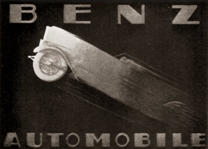
Advertisement for Benz Automobiles by Adalbert Roth, 1928.
Found via Advertising Art in the Art Deco Style

Advertisement for Benz Automobiles by Adalbert Roth, 1928.
Found via Advertising Art in the Art Deco Style
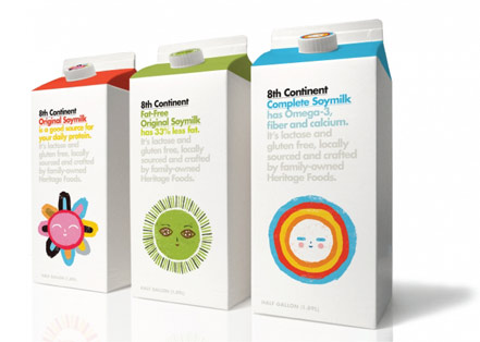
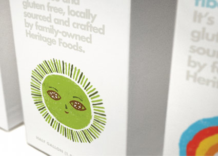
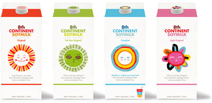
‘The sun icons identify flavors and serve as a reminder that soymilk is a healthy, plant-based drink’
Joe Miller turned me on to this stuff. Smooth flavor, tons of protein.
Last year, Bob Dinetz and BBDO West updated 8th Continent’s packaging with Yoplait-like illustrations by Ben Javens.

‘It starts to feel a bit like TETRIS’
Australian James Gulliver Hancock is drawing every building in NYC. But it’s a bit more than that. Blog here.
In the video (at bottom) he explains his approach.
Found via Flavorwire
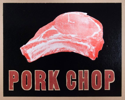
‘It’s hand printed in black, red, and white inks on 100% post-consumer recycled kraft cardstock. Super glossy double hit o black.’
Letterpress meat poster, part of YeeHaw’s Butcher Shop Series – which also includes porterhouse, ribeye and New York strip. Order up here.
Pink Floyd’s Pigs (Three Different Ones).
JCPenney last ‘officially’ updated their logotype in 1971 – changing from a custom script (seen above) to Helvetica, set clean and neat (below).

1971
And last night – in a series of Academy Awards spots – jcp unveiled its new moniker (at bottom). Red box (retained from originally, their ‘it’s all inside’ campaign), lowercase helvetica, still clean and neat.
‘The winning design was provided by Luke Langhus, a third-year graphic design student at the University of Cincinnati.’
I do like when a redesign keeps the flavor of the original – here’s the official press release. Although this update does beg a few questions:
Doesn’t this look a lot like what GAP abandoned last year? And is the connection to Target’s brand a bit too obvious? And is ‘crowd sourcing’ how they went about this?
‘Participants included the Company’s associates, several design agencies and two art schools – University of Cincinnati and Rhode Island School of Design – that collectively submitted over 200 designs for consideration.’
I hope on the labor front, logo development participants were not as crowdsourced as is becoming commonplace. And it is a risky move to go this route – some could say jcp is running with what GAP chose to reject.
Though in the end, good merch behind the logo will determine what happens next. ‘What’s inside’ is still more important than not.
1964 Penneys architectural drawing found via Vintage Seattle, click image to view larger, more/jump