Karbon: Rethinking Futura
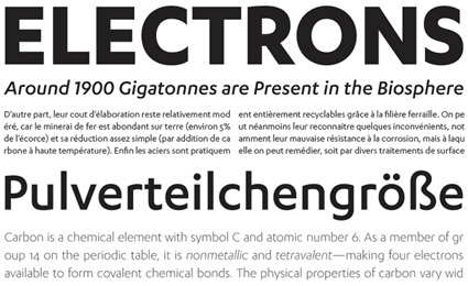
‘Karbon is an open, geometric sans serif with a contemporary spartan finish.’
Kris Sowersby’s beautiful Karbon fonts. Purchase thru Village.
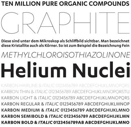
Found via Mark Milic

‘Karbon is an open, geometric sans serif with a contemporary spartan finish.’
Kris Sowersby’s beautiful Karbon fonts. Purchase thru Village.

Found via Mark Milic
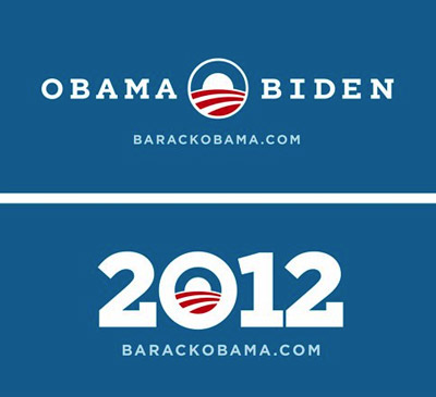
‘Can we add serifs to Gotham?’
One thing I like about Obama: He knows good design.
In 2008, his campaign lifted political propaganda out of the long ass slump it had been in. The fonts of choice were Eric Gill’s Perpetua and Tobias Frere-Jones’ Gotham.
And revealed this week: 2012 graphics featuring a custom slab serif version of Gotham.
So when The President calls wanting a font change, Hoefler & Frere-Jones were ready to oblige.
Found via Hoefler & Frere-Jones
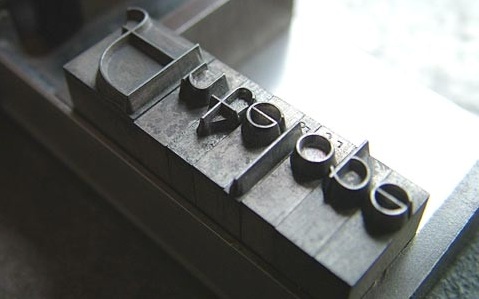
‘Bernhard Fashion. This typeface was designed by Lucian Bernhard and introduced by American Typefounders in 1929.’
Found via Emily McGuiness
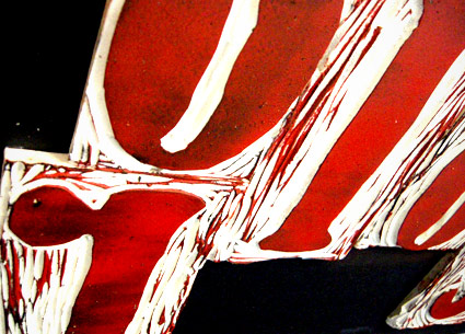
‘I was working on maintaining the quality of Bernhard’s handdone type while taking a new and different approach to it’
Student Lesley Gaesser’s large scale final project from my experimental type course at The Art Institute of California Sacramento.
Lesley did an 11 week study on the work of designer Lucian Bernhard (1883-1972) – which culminated in a final linocut-inspired project.
Bernard’s Antiqua type was traced onto Speedball carving blocks, cut by hand, inked and printed on large sheets of watercolor paper.
My next experimental course begins April 8.
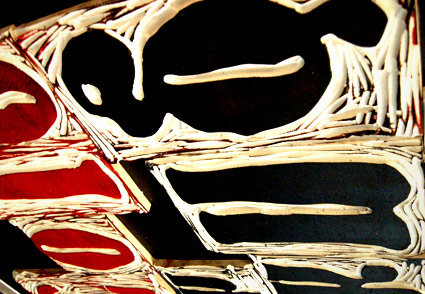
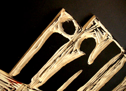
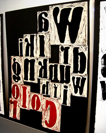
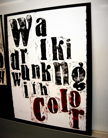
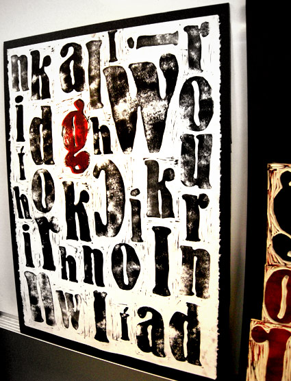
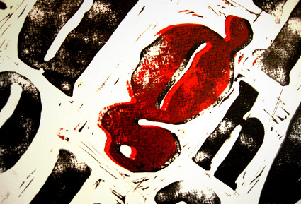
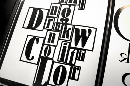
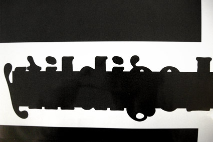

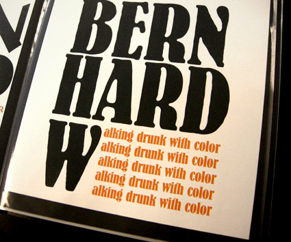
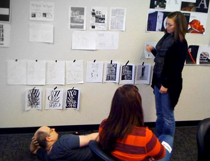
If student hangs roughs low on the wall, one can only critique if lying on the floor; Photo by Daniel Mendez
Rare Jan Tschichold book design, featuring his use of an early prototype of the Alta Calfornia font.
Cloth cover for Das lustige Buch (The Funny Book), Verlag der Bücherkreis GmbH, Berlin, 1931.
‘This is an experiment in carving one linocut letter per day in an attempt to complete an entire alphabet by March 31st. Chosen typeface: Champion Gothic by Hoefler & Frere-Jones. Lightweight was chosen based on a deep rooted affection with its ampersand.’
And so concludes Aymie Spitzer’s March of Letters. Blog here. Calendar archive here.
Found via Campbell BrownKorbel
Helvetica cookies, Helvetica cookie cutters.
The work of Beverly Hsu.
Found via Pardeep’s Design Blog
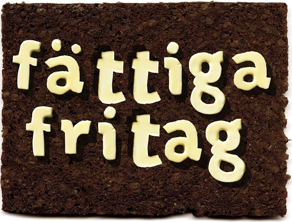
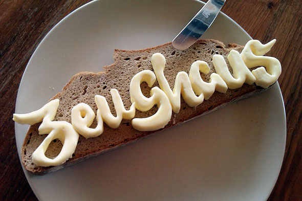
Was recently discussing with a culinary instructor that it’d be interesting if some of her students took one of my type classes. Imagine what would happen to plated up food with type knowledge floating thru young cooks’ brains.
Then I saw Zeughaus’ butter letters, above.
Original type by Typejockeys, butter cut by Nadine Ruhm. Info here.