entries Tagged as [fonts]
Super Grotesk in Hell

Svend Smital’s Super Grotesk used on the cover of Brendan I. Koerner’s Now The Hell Will Start: One Soldier’s Flight from the Greatest Manhunt of World War II.
Found via The Book Cover Archive
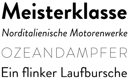
Brandon Grotesque
‘My father gave me some magazines from the 1920s and 1930s’
Hannes von Döhren’s Brandon Grotesque, influenced by early geometric types – available in six weights with true italics.
One of TDC’s 2011 award winners. Available thru HvD Fonts.
Lost in type: Gill Sans
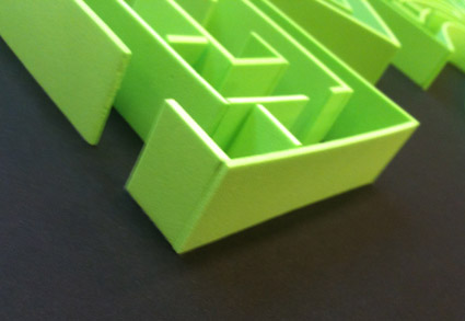
Dmitriy Antropov’s final project was a Gill Sans maze, hand crafted from foam.
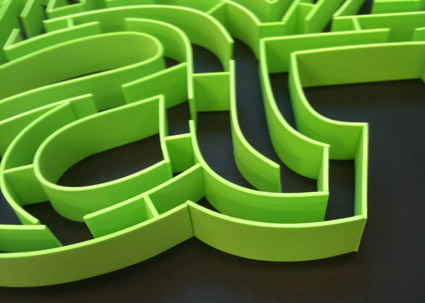
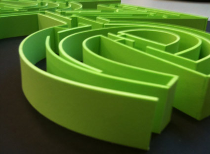
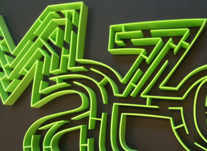
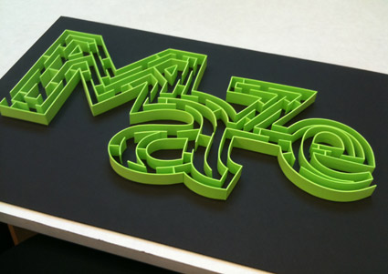
After we tried to actually do the maze (and failed), Dmitriy reached down and carefully removed a small partition – near the bottom of the a – and we were able to complete.
In screen type: Bank Gothic
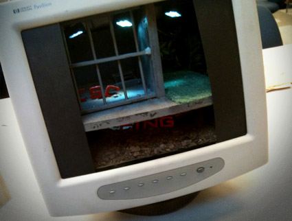
‘escaping the norm’
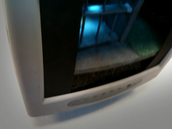
Just finished up my Friday night beginning type course – and final projects can take any form. Last night, Christopher Gianni-Embrey showed up for class with an old computer monitor.
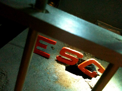
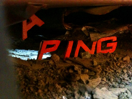
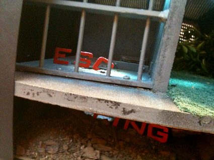
Inspired by a recent viewing of The Shawshank Redemption, Christopher visualized the word ‘escaping’ using Morris Fuller Benton’s Bank Gothic.
Not on screen, but in screen.
The final piece was Christopher’s first ever attempt at model making. It was crafted from mostly found materials. As he put it, ‘driving around town, there’s a lot of stuff people throw away.’
In the process, he ended up with a bunch of dead computer monitors – just in case the first attempt didn’t pan out.
My next Friday night type course is scheduled for Fall 2011 at American River College. Course number: ARTNM 303.
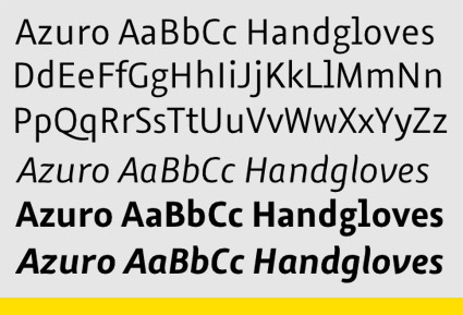
On screen type: Azuro
‘Azuro, the first typeface that’s perfect for reading on screens’
FontShop has released Georg Seifert’s Azuro. Humanist in origin, with large counters and oldstyle numerals; Azuro has been tested in all current on screen media, including Apple’s iOS.
Gizmodo review here. FontShop details here.
And Azuro is on sale – 90% off – thru May 31, 2011.
Also check out Seifert’s Graulau Sans, types he started working on while studying at Bauhaus University, Weimar.
Font Swapper
In addition to eating pizza, Nick Sherman designs cool interactive stuff.
Over at MyFonts, Nick’s incredible interface is not only for buying fonts, but a jumping off portal for font cataloging and research. At the bare minimum, I like to use my own RSS feed for previews.
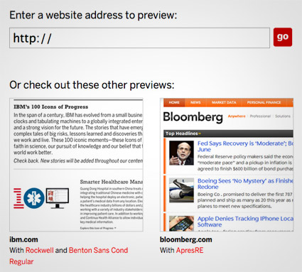
Nick’s latest idea: Webtype’s Font Swapper (pictured above).
Type in any (CSS-coded) website, see what it looks like with types from the Webfonts library.
Twelve Fingers
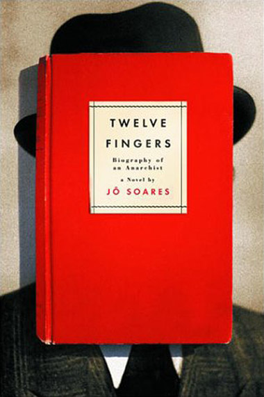
Jo Soares’ Twelve Fingers: Biography of an Anarchist. Cover designed by Evan Gaffney (with Futura doing the type honors).
Found via The Book Cover Archive
Handmade Futura
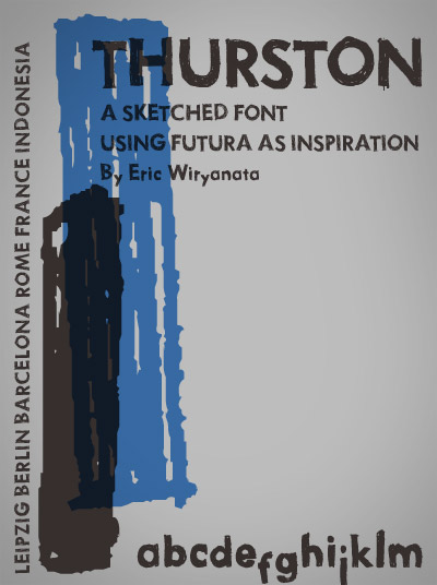
‘i named this masterpiece after Thurston Moore from Sonic Youth’
Funky, Futuraesque Thurston font, sketched by Eric Wiryanta.
Free download here.
Sonic Youth: Becuz
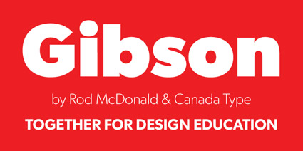
Gibson: For students
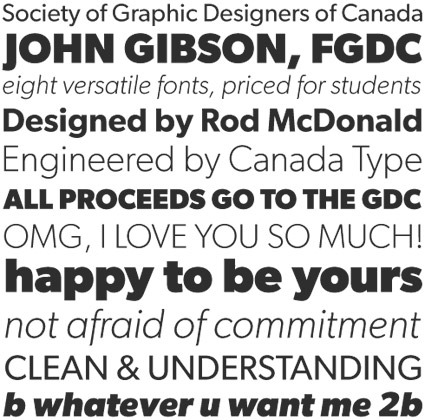
‘For less than the price of a design textbook, a student can now have a sturdy and contemporary humanist sans serif family that fits pretty much any design application, and will remain useful long after academic studies and well into a professional career in design.’
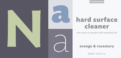
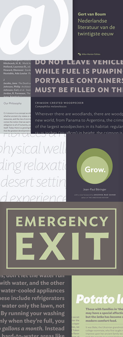
Gibson is a humanist sans serif honoring designer John Gibson, designed by Rod McDonald and digitized by Patrick Griffin and Kevin King.
And it’s available at student pricing: Eight complete fonts for $48 (that comes out to six bucks a font). With revenues benefiting The Society of Graphic Designers of Canada (GDC).
