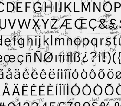
Örjan Nordling’s Dagny, now at FontShop

All about FF Dagny: Evolution of a newspaper type font, interview and post at GarciaMedia.
FF Dagny is now available thru FontShop.
All about FF Dagny: Evolution of a newspaper type font, interview and post at GarciaMedia.
FF Dagny is now available thru FontShop.

Calligraphy by Marsha Brady, found via the MyFonts Blog

Kalligraphia 12,
an exhibition of hand-lettered art and calligraphy
Runs thru August 23, 2009

A Trip to the Fair, 1939:
The Golden Gate International Exposition in San Francisco
Runs thru August 23, 2009
Both are the main branch of the San Francisco Public Library, 100 Larkin Street (at Grove), sixth floor, San Francisco, CA 94102 [map]
Details here.

John Downer doing his thing, via The FontFeed
An Exhibition of Hand Lettered Posters by John Downer
Opening Reception Thursday, August 13, 2009 from 8 to 11 p.m.
At RESERVE, 420 N. Fairfax Avenue, Los Angeles, CA 90036
(directly across from Canter’s Delicatessen) [map]
Details here.
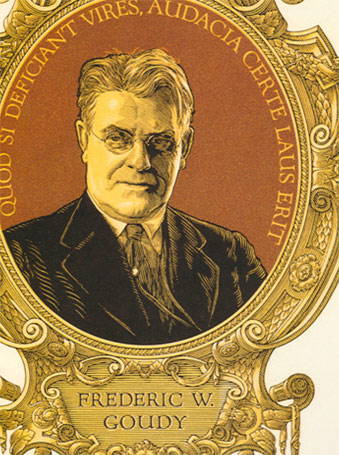
F.W.G. portrait by Clarence P. Hornung
from Leslie Cabarga’s Logo, Font & Lettering Bible
Frederic W. Goudy (1865–1947) was considered one of the most prolific type designers of the early 20th Century. Not to be confused with Antonio Gaudi, F.W.G. is mostly known for Copperplate and Goudy Oldstyle that show up on most font menus. But that’s just the beginning.
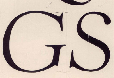
Goudy’s ‘quick sketch’ drawings for Kennerley Italic
from D.J.R. Bruckner’s Frederic Goudy
Goudy was self taught. And his font career really didn’t take off until he was in his 40s. Legend goes, Goudy could draw a font in about a week. [Read more →]

TONS of vintage printing stuff and ephemera.
Want to volunteer or sponsor? Give them a hollar.
There’s also a some vendor highlights posted on their blog.

Lyon’s Coffee Shop, San Bruno, CA 1962. Found via Googie Art.
I grew up around Googie Architecture. It was just there. Space age-looking buildings, funky decor and rocks in the walls. Lots of rocks. Flintstones-like, but where the Jetson’s were running the quarry.
The 24 hour Lyon’s in San Bruno (see above) was the high school hangout. Long weird nights. In college, those weird nights spread to the other Lyon’s in San Mateo, San Carlos and Daly City. Denny’s was the alternative.
The style’s roots can be traced back to Frank Lloyd Wright and Tallesin West. Architect John Lautner designed the first Googie structure in 1949 and it was panned by critics. The firm of Armet and Davis designed most of the rest. [Read more →]
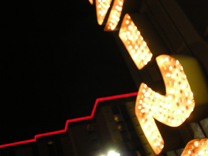
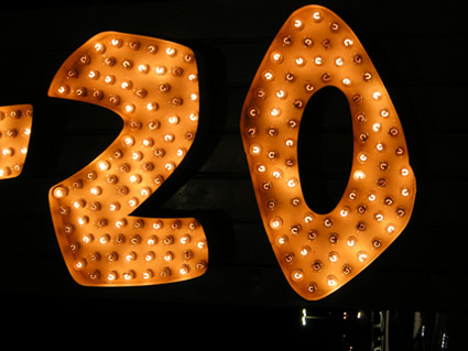
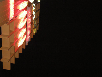
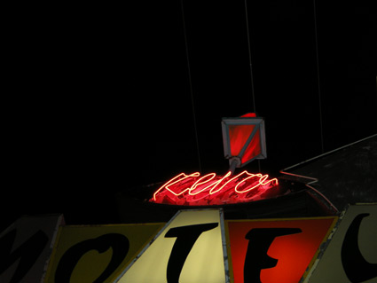
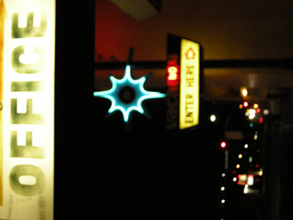
Snapped these while in Reno a few weeks back. Love 1950s vernacular typography, I’ve built an entire font family around this.
Drove the guy at the motel front desk crazy with my flash.
A really nice drug dealer tried to sell me his wares.
I’m not being sarcastic, he was really, really nice.
Took me a long moment before I realized what he was up to.
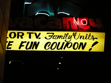
It’s the type that’s sexy.
If it were one of my fonts, that’d made it even sexier.
Make The Girl Dance is Campana & Perrin, aka Greg & Pierre. This is their MySpace page.
Found via Ashley Simko’s blog
A few images from ttv : testify! and houndstooth heels, two of many contrasted photo sets posted on juxtapositioning.


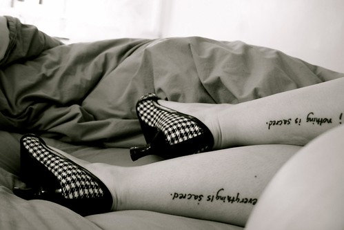
Found via Twitter.com/morganirene


the work at the mehallo blog. beta. is licensed under a creative commons attribution - noncommercial - no derivative works 3.0 united states license. if reposting, credit must be given to steve mehallo - and if possible, please provide a link back to the mehallo blog. beta.
i include images for the purpose of critique, review, promotion and inspiration - and always make my best effort give credit/link back to the original source. if i’ve screwed up, please fire me a note.
page layout based on the wordpress 'darkwater theme' by antbag, adapted and redesigned by mehallo. valuable php assistance from bill mead.


