entries Tagged as [cool finds]

New life for dead type

‘These pieces of typography are all unique design objects, why should they be demolished?’ – Aleksi Hautamäki, Character
In Finland, the Character company is salvaging dismantled signage and repurposing the individual letters. Find out more here.

Found via Yatzer
Akzidenz Grotesk and industry

Köln-based graphic designer Tobias Battenberg projects Akzidenz Grotesk (the forerunner of Helvetica) onto industrial surfaces.


Found via Flores en el Atico
Building

Building design by Giulio Cittato
From Basic Typography: Design With Letters (1974) by Ruedi Ruegg
In order for the Swiss International Style to actually work, it needs a sense of drama. Imagine how interesting our industrial zones could have been with this sort of design thinking.

Even more type . . .

Via design*sponge
Words and Eggs has posted a bunch of cool type images, linking to some really cool design blogs. (Yes, I’ve been in quite the type mood this week – with a little bit more on the way)


Via Typoretum
Fonts: The Secret History
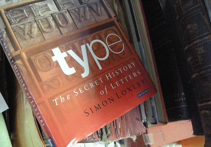
Behind every well-made font is, typically, an obsessive individual who is out to make the world a beautiful place. And individuals, human beings, can be rather screwy. And here’s a book (now in paperback) about all the screwiness.
Simon Loxley’s Type: The Secret History of Letters blows the lid off of William Caslon’s wicked right cross; Stanley Morison and the Wardes; Frederic Goudy’s tarnished shining star, M.F.Benton’s ulcers and what really happened with John Baskerville’s dead body. And Eric Gill, religious sex junkie. Don’t even know where to start with that.
If you don’t think type is anything more than what’s on the font menu, stay away from this book. Because it’ll drag you into a world of intrigue, ego and dalliances with God and dog.
(Okay, that was a good sentence, but truth be told, the dog stuff isn’t in this book. You’ll need other sources for that)
The Great Times New Roman Controversy
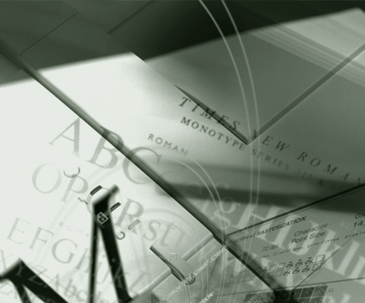
Photo composition by mehallo for Agfa Monotype, 2000
seeds
Mike Parker’s been in the news lately, mostly about the origins of Times New Roman. [Read more →]
Keeping calm, carrying on

Designer Steven Shearer’s update of the iconic British Keep Calm and Carry On poster – typeset in one of my fonts, Jeanne Moderno. Available now on some nifty Cafe Press items.
Sort of reminds me of the revisionary 1930s British history portrayed in this version of Shakespeare’s Richard III (1995).
It’s okay, it’s alright, don’t worry

Released just a few days ago: Jackson Cavanaugh’s Alright Sans
Alright Sans is a really nice contemporary update of early 20th century grotesk types. With roots related to the wonderful ATF gothics (which exist today in the form of the Knockout group and Benton Sans), but with a humanist twist. Sixteen styles designed by Jackson Cavanaugh, it can be found at MyFonts here. And it’s on sale right now: 20% off.
Follow Jackson on Twitter here. Visit his foundry, Okay Type & Design here.
Found via Twitter.com/Typegirl

handpicked posts

a piano falls in old manhattan
tetro and typography
it’s typography: film, song and dance
ghosts of gustov klimt
the great times new roman controversy
picking fonts
kapitaal
defining terms: design is not decoration
garcia's 'pure design'
'enhance that image!'
magic highway remixed
the cynic
rad anthem
Brought to you by man dom-


buy my fonts
go shopping
mehalloreads

Divinely Elegant: The World of Ernst Dryden
Jozsef Pecsi: Photo and Advertising
Color: A Natural History of the Palette
Collage: Assembling Contemporary Art
Modern Dog: 20 Years of Poster Art
Gaberbocchus Press: An Experiment in Publishing, 1948-1979
Advertising Art in the Art Deco Style
Googie Redux: Ultramodern Roadside Architecture
Hot Sour Salty Sweet: A Culinary Journey Through Southeast Asia
now playing


the work at the mehallo blog. beta. is licensed under a creative commons attribution - noncommercial - no derivative works 3.0 united states license. if reposting, credit must be given to steve mehallo - and if possible, please provide a link back to the mehallo blog. beta.
i include images for the purpose of critique, review, promotion and inspiration - and always make my best effort give credit/link back to the original source. if i’ve screwed up, please fire me a note.
page layout based on the wordpress 'darkwater theme' by antbag, adapted and redesigned by mehallo. valuable php assistance from bill mead.


