entries Tagged as [cool finds]


Procrastination
This is dedicated to my students, who’ve been working their asses off all weekend.
A few hours ago, I saw the online complaints about Kinko’s now legendary horrible customer service (was it always like this, or just after the FedEx buyout?). Typography 4 final crit is at 9 a.m. today.
Found via Utrecht Sacramento on Facebook
Jeanne Moderno detergent

I was told when I released my Jeanne Moderno fonts, they’d probably end up being used on a cereal box.
Instead, I’ll settle for this cool laundry detergent box designed by Bootleg.
Jeanne Moderno type samples
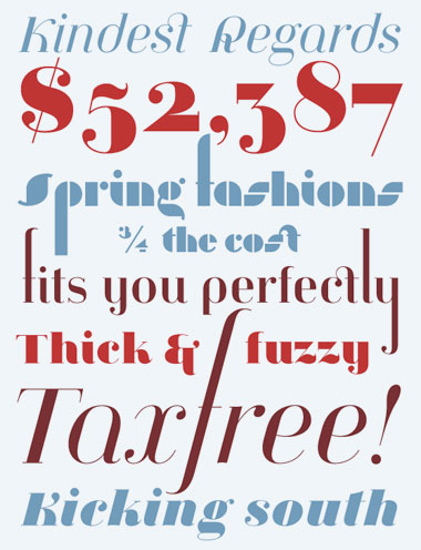
. . . And when MyFonts did a write up of my Jeanne Moderno fonts for their Rising Stars newsletter – they spent some time digging thru so they could show some of my telescoping ascenders, alternates and ligatures (above). I like to hide things in my fonts, fill the blank slots as it were.
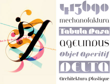
(Below) Psy/Ops new type sample for Jeanne Moderno. Psy/Ops also carries the Jeanne fonts, they did the final OpenType mastering before release (and without their support, Jeanne could possibly still be sitting in the 10 year limbo that was part of my process).
Making a type sample
The Making of a Type Sample from FontShop on Vimeo
Once a font is completed, showing the letters and glyphs in their best light is a tricky exercise. FontShop does it right and in this video shows some of the decisions made when creating a good type sample – in this case, the sample for Matthew Carter’s beautiful Miller typefaces, which I used for The Sacramento Union Magazine.
In the 1800s, type foundries used to set their samples in Latin – following the belief that our alphabet looks best in its original language. Marcus Tullius Cicero’s first speech against Lucius Sergius Catilina (below) was popular for samples.
Today, graphic designers use Lorem Ipsum for placeholder text.
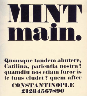
Robert Thorne’s Fat-Face type sample, 1821
Paperbag Parachute
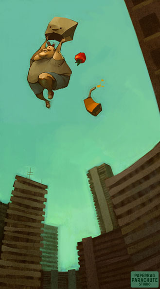
Paperbag Parachute by Lois van Baarle; print available here
Follow the Paperbag Parachute blog here
From a conversation on Facebook . . .
Laura Hohlwein:
you may say I’m a dreamer, but I’m not the only one.
Chris Demas:
Wait no, im pretty sure you are the only one.
Laura Hohlwein:
ha. yeah. could be.
Steve Mehallo:
Nope. There’s more of us. And if you think we’re freaks, you’re right. But we know how to change the world. We invented the ipod, aerosol cheese, disco and the escalator. See if you can do that you non-dreamers you!
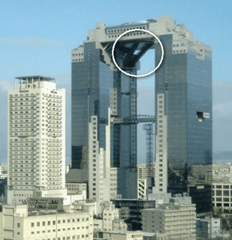
Escalator, Osaka City, Japan; details here

Really seksi spam buttons – for charity
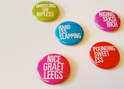
As I write this, there are 2,728 items in my spam folder; most of them involve some form of penis renovation, ‘The Big Pink,’ ‘urgent and confidential business’ inquiries from deposed royal family members that need my help – and on my blog, 2,201 spam posts sitting in what I call my ‘hey asshole, don’t spam my blog’ folder.
Designer Floyd Hayes has decided to turn annoying spam into money – for a good cause. Since a lot of spam is about freaky misspelled sex stuff, every four weeks Hayes will be issuing the best subject lines as buttons and donate all the profits to a sexual health charity. Details here.
Oh and wait – ‘The Big Pink’ is actually a cool new band, it’s an email I’m actually subscribing to. Here’s their debut album, A Brief History Of Love. Drops September 22nd.
I really wish spam filters worked better.
Buttons found via PSFK
Information design: Life, death, taxes and spam
‘Le Grand Content examines the omnipresent Powerpoint-culture in search for its philosophical potential. Intersections and diagrams are assembled to form a grand ‘association-chain-massacre’ which challenges itself to answer all questions of the universe and some more.
‘Of course, it totally fails this assignment, but in its failure it still manages to produce some magical nuance and shades between the great topics death, cable tv, emotions and hamsters.’
For more about the work of Clemens Kogler, go here.
Redesinging the threat level
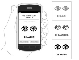
‘To mark the return to sanity, The New York Times asked four graphic designers to imagine a new warning system. Their designs range from the cheeky to the possibly useful. Kurt Andersen provides commentary and explains why the current system is a joke.’ -Andrew Price, GOOD
Legendary SPY magazine was one of my favorites – and founding editor Kurt Andersen is still making snarky commentary. Click either the image or the quote link to read more.
For more from Kurt, check out his weekly radio program Studio 360 and ‘Get inside the creative mind.’
And for the record, I am really glad the Obama administration recognizes the value of good graphic design. Makes me all warm and fuzzy inside just knowing this.
Found via GOOD

handpicked posts

a piano falls in old manhattan
tetro and typography
it’s typography: film, song and dance
ghosts of gustov klimt
the great times new roman controversy
picking fonts
kapitaal
defining terms: design is not decoration
garcia's 'pure design'
'enhance that image!'
magic highway remixed
the cynic
rad anthem
Brought to you by man dom-


buy my fonts
go shopping
mehalloreads

Divinely Elegant: The World of Ernst Dryden
Jozsef Pecsi: Photo and Advertising
Color: A Natural History of the Palette
Collage: Assembling Contemporary Art
Modern Dog: 20 Years of Poster Art
Gaberbocchus Press: An Experiment in Publishing, 1948-1979
Advertising Art in the Art Deco Style
Googie Redux: Ultramodern Roadside Architecture
Hot Sour Salty Sweet: A Culinary Journey Through Southeast Asia
now playing


the work at the mehallo blog. beta. is licensed under a creative commons attribution - noncommercial - no derivative works 3.0 united states license. if reposting, credit must be given to steve mehallo - and if possible, please provide a link back to the mehallo blog. beta.
i include images for the purpose of critique, review, promotion and inspiration - and always make my best effort give credit/link back to the original source. if i’ve screwed up, please fire me a note.
page layout based on the wordpress 'darkwater theme' by antbag, adapted and redesigned by mehallo. valuable php assistance from bill mead.


