entries Tagged as [education]

Designing fonts: Shaping, kerning, tools

I’ve been drawing some form of type since the 1980s. And have been teaching type for several years now.

It’s hard to ‘go digital’ when introducing typography, since letterform history goes back hundreds (and thousands) of years.

So I still use 15th century era handtools in my introductory type courses.

Good fonts still contain elements from long ago – and today, all we really do is recreate what was once done with broad pens – using digital tools.

font games!
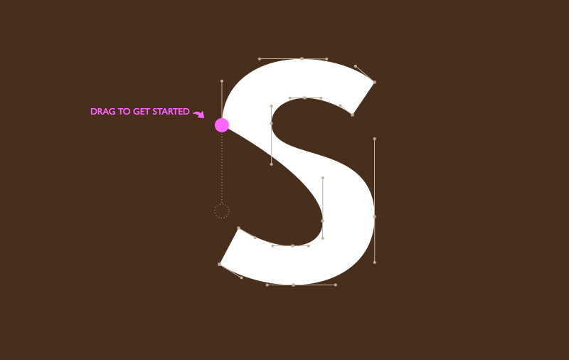
To get a taste of how ‘us professionals’ render type these days, check out Mark MacKay’s brilliant Shape Type (pictured above) and Kern Type. Both are nutshell adaptations of today’s process – kerning being a majorly overlooked, but necessary typesetting skill.

digital type tools
Fonts today are vector-based, so a mastering the basics of Adobe Illustrator is the start.

Beyond this, there are a bunch of applications on the market for drawing fonts. FontLab is the big one, Fontographer is the old one with the easy interface – and TypeTool is a barebones student-discounted alternative. Unlike Illustrator, these font tools take into account how letters are drawn, with built ins that make it easy to adjust edges. Karen Cheng’s Designing Type is also a must resource to have.

And I do all my logo drawings directly in FontLab – after multiple sketches in pen and ink. It’s just easier that way.

Shape Type found via Mark Nutini

So what really happened

Change to Win’s animate of ‘The End of the American Dream?’ – done in the style of RSA Animate.

Found via Occupy San Francisco

Tibor, trubblemaker

‘What role we are playing. Making the filthy oil company look ‘clean,’ making the car brochure higher-quality than the car, making the spaghetti sauce look like it’s been put up by grandma, making the junky condo look hip. Is all that okay, or just the level to which design and many other professions have sunk?’ –Tibor Kalman

I first discovered Tibor Kalman’s work sometime around 1990.

He was doing something that most everyday graphic designers seemed to be avoiding. Questioning things.

His adeptness at social change – being a responsible human being, helping others – happened by working within the system. First at Barnes & Noble, M&Co., then Interview, Colors magazines. And as a teacher.

Before he passed in 1999, Kalman was the facilitator of what I see as a great awakening in our industry. And those who were part of his circle – such as his wife Maira, Stefan Sagmeister, Scott Stowell, Alexander Isley – have made graphic design much more than pretty brochures and generic logotypes.

Good design for good purposes is good. Making shitheads lots of money thru questionable practices is bad. Seems simple, right?

It isn’t.

I posted this because the rest of the world is waking up just about right now. And this past week, Steven Heller wrote up a great piece on Kalman.

Pictured from top down, advertisements and promotions for NYC’s Restaurant Florent. With Alexander Isley, from 1985–88. Found via Tibor Kalman: Design and Undesign and MoMA

Stenciled mehallo

‘Drop caps not bombs’

An anonymously-created stencil interpretation of myself – spotted last quarter on the wall at the Art Institute of California Sacramento.

(Okay, I know which student made it, but I ain’t tellin)

Occupy, the posters

‘I’ve been doing posters for tons of cities across America’

In the past few weeks, one of my former students has found herself cast as the visual heart of the Occupy movement. Raina Dayne started with offering to do a poster and it’s blossomed into something much bigger.

Raina’s images can be downloaded for use at the Occupy Together website. Facebook page here, shirts here.


Jobs: Making the world a better place

‘Your time is limited, so don’t waste it living someone else’s life. Don’t be trapped by dogma – which is living with the results of other people’s thinking. Don’t let the noise of others’ opinions drown out your own inner voice. And most important, have the courage to follow your heart and intuition. They somehow already know what you truly want to become. Everything else is secondary.’ –Steve Jobs

Intuition is very powerful, once one knows how to trust it. It involves turning off the insecurities of ego and concentrating on pure feeling. And it works wonders.

The news of Steve Jobs’ passing came in via social media. I saw a Facebook post right after I gave a design history lecture on early modern artists and how they’d managed to change the world.

I was fortunate enough to both go to school and work in and around Silicon Valley where Jobs’ approach reverberates and inspires. Playing it safe, following the status quo will not lead to new things, will not improve life as we know it – and Jobs knew how to get the best work out of Apple’s creative team.

He knew that details are excruciatingly important. Leveraging design, using good typography, giving us what we really want – instead of what we think we need – was all part of the package.

Thinking different makes the world a better place. That’s the legacy he leaves.

Image by Dylan Roscover, using Apple’s suite of fonts from over the years

Schelbert, West, Rietveld

‘handprinted and unique posters in A0 format, printed and digital invitations and adverts in various Dutch magazines   . . .   woodcut printed.’

E-flyer for Alban Schelbert and Christopher West’s End Exam Show at the Gerrit Rietveld Academie. From 2009.

Found via manystuff

‘Wtf are you eating?’

‘Having many food and chemical sensitivities has been a largely trial-and-error process for what can be tolerated and what can’t, and has resulted in many creative kitchen science experiments’

Web designer/cartoonist (and former student of mine) Annie Hero has developed some major health problems. Recently, she’s taken to blogging about her approach to reclaiming her life from years of processed food intolerance.

Annie’s WTF are you eating? can be found here.

Rooster Sauce typography

‘Spice up your design’

Hanging on the walls at Ai Sacramento: AIGA poster, designed and photographed by student Devon Cloutier.

At one point, there was a text change and in lieu of starting over, Devon fixed it – orally, swallowing a lot of the saucy rooster.

Designers do suffer for their art.

Missoni, tour

From earlier this year: Behind the scenes with third generation heiress/model/designer Margherita Missoni. Includes footage of Missoni’s famed knitting equipment and production processes.

Found via Vogue Russia

Russian Coke

Art Nouveau meets Russian Constructivism. Motion design by Matt Duplessie.


Creative Commons License

the work at the mehallo blog. beta. is licensed under a creative commons attribution - noncommercial - no derivative works 3.0 united states license.  if reposting, credit must be given to steve mehallo - and if possible, please provide a link back to the mehallo blog. beta.

i include images for the purpose of critique, review, promotion and inspiration - and always make my best effort give credit/link back to the original source.  if i’ve screwed up, please fire me a note.

page layout based on the wordpress 'darkwater theme' by antbag, adapted and redesigned by mehallo.  valuable php assistance from bill mead.