The Great Times New Roman Controversy
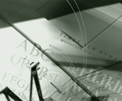
Photo composition by mehallo for Agfa Monotype, 2000
seeds
Mike Parker’s been in the news lately, mostly about the origins of Times New Roman. [Read more →]

Photo composition by mehallo for Agfa Monotype, 2000
seeds
Mike Parker’s been in the news lately, mostly about the origins of Times New Roman. [Read more →]
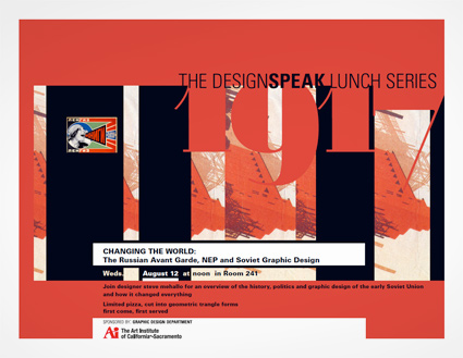
I’ll be giving a talk Wednesday as part of The DESIGNSPEAK Series at The Art Institute of California-Sacramento:
Changing the World:
The Russian Avant Garde, NEP and Soviet Graphic Design
An overview of the history, politics and graphic design of the Soviet Union and how it changed everything.
Wednesday, August 12, 2009 at noon
at The Art Institute of California-Sacramento, 2850 Gateway Oaks Drive, Room 241, Sacramento, CA 95833 [map]
Free admission
and limited ‘first come, first served’ pizza, cut into geometric triangle forms.

Calligraphy by Marsha Brady, found via the MyFonts Blog

Kalligraphia 12,
an exhibition of hand-lettered art and calligraphy
Runs thru August 23, 2009

A Trip to the Fair, 1939:
The Golden Gate International Exposition in San Francisco
Runs thru August 23, 2009
Both are the main branch of the San Francisco Public Library, 100 Larkin Street (at Grove), sixth floor, San Francisco, CA 94102 [map]
Details here.
TONS of vintage printing stuff and ephemera.
Want to volunteer or sponsor? Give them a hollar.
There’s also a some vendor highlights posted on their blog.
I love good information graphics. And bad information graphics make my eyes bleed.
Check out this redesign by Robert Palmer (and strong letter to Rep. John Boehner) of a recent visual attack on the Democratic Health Plan.
This is an excellent example as to why graphic designers (well trained graphic designers) can do a lot more than just push buttons on a computer. Or make a logo look nice. Good graphic design is about good communication – and can be world changing.
(That’s my soapbox for the day. Thank you for reading.)
Found via Twitter.com/angelaglenn

‘Sarah’ by Annie Purpura, silver gelatin print
The brain child of Vincent de Sarthe, CollegeArtOnline is a one stop source for starting a reasonably-priced art collection.
Featuring work by recent college grads or professors (only these two groups can sell at the site) – CollegeArtOnline can be a career launching pad or cultured resource for a lonely wall. Drop by, see what catches your fancy/matches your credenza.

‘No, I Don’t Even Know Your Name’ by Josh Bernstein, india ink & digital print
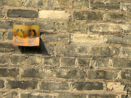
‘29’ by Becca Ahlf, digital photography
Found via Nylon, August 2009
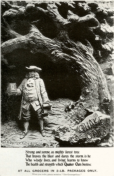
Photographic Quaker Oats advertisement, 1897
I always thought the Quaker Oats guy was Benjamin Franklin.
He actually started as a printer’s cut – clip art, in today’s terms – that was selected to go on the Oats packaging to show ‘purity.’ Quakers always looked pure, let’s sell some oats with that in mind.
Benjamin Franklin was really smart, not quite pure though.
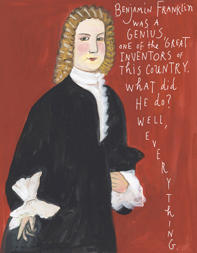
Click the image to read Maira Kalman’s ode to Franklin . . . .
Benjamin Franklin was fun. So much fun, the International Printing Museum has on staff the incredible Phil Soinski.
Soinski portrays Franklin as part of their educational services; and does such a fantastic job, I learned more about Hot Type in one hour with ‘Ben’ than reading thru whatever pile of type books are currently stacked on my desk. Drop by the museum, set up a tour, take a class – their programs, their dedication to the craft of printing can be contagious.
And illustrator Maira Kalman gives us a bunch of really cool things to know about ultramegasuperinventor Ben Franklin in yesterday’s New York Times . . . .
Here’s a great article at Typotheque on fonts who hang out in families. Where they come from, why they get along better than real families.
‘Graphic designers were never meant to set type . . . That’s what typesetters are for.’
I’m not even sure who said this, it was early on; probably college. Possibly a printer, maybe Roger. Roger would say stuff like that. He’d swear to the ‘ITC god’ and he had the old dusty Varitype machine sitting in the corner to prove it. [Read more →]