French Paper posters, by CSA
Charles S. Anderson Design’s promotional materials for French Paper are legendary. Snag some of the posters here.
The rarities are not cheap though, the Seinfeld final episode commemorative (above) goes for $500.
Charles S. Anderson Design’s promotional materials for French Paper are legendary. Snag some of the posters here.
The rarities are not cheap though, the Seinfeld final episode commemorative (above) goes for $500.

Every time I teach a publication design course, I assign a famous designer (or other acclaimed individual) as a biographical research subject. As part of the class, students have to do their own research, write their own text and design their own book.
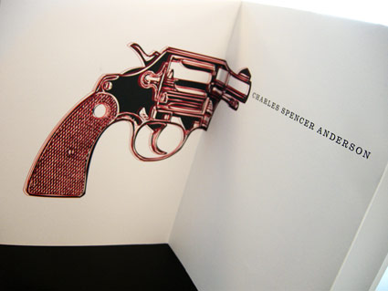
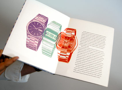
Back in the 1980s, Charles S. Anderson pioneered ‘bonehead’ design, which involved a midwestern attitude and lots of clip art. Art Institute of California Sacramento graphic design student Trixy Riggan ran with it, developing the handmade biographical tome pictured.
On the side, Trixy runs a clothing company, Fabulously Butch. I still have to snag one of her shirts. I’m told there would be irony in me wearing one.


The NBC Mystery Movie was a 1970s anthology series showcasing different crime dramas. Like Law & Order, but different. They had the coolest intro with theme music by Henry Mancini.
Drive Ins always had double features and Sacramento’s six screen is still open (Facebook group here). Also projecting is the local Movies on a Big Screen.
For intermission: Commercials, community service ads and countdown animations used to remind everyone to be back in their car in time for the second film. Here’s a bunch.
And
Check out my Burlingame Drive In prints, cards and postcards.
For the record, I did propose to my wife at the (now gone) chilly Burlingame between Nine Months and Clueless.
Local bumpers for theatre chains.
General Cinema’s original Feature Presentation animation (above) was iconic. Skip thru to 3:40 to see it in its 1960s blue glory!
Syufy’s old music (below) got the audience to clap along. Their googie-styled cinemas were shaped like dome spaceships.
United Artists (above) was pure 1980s flair!
I once saw a guy walk out of a showing of Amadeus (1984) humming the UA theme music.
And
Check out my Theatre prints, cards and postcards. Featuring the now defunct Millbrae and Belmont Theatres. Part of my 20th Century Obsolete series (below).
Movies on television were HUGE events. Here’s some of ABC’s dramatic intros/bumpers.
Plus
Here’s a short history of the ABC Movie of the Week: part one and part two. With movie and fall preview videos and a quick interview with Harry Marks, who designed the 1969 Movie of the Week intro with the help of a SFX guy named Doug Trumbull.
Back in the 1960s, CBS art director Lou Dorfsman created one of the most influential typographic treatments of all time.
Today, designers have rediscovered the Gastrotypographicalassemblage’s 3D complexity – and today it’s been influencing everything from the design of Zune advertisements to kinetic typography videos (note that the new adaptations also tend to be in black/white with minimal color).
The video (above) gives history. And here’s more history. Plus, photos and restoration images here.
William Golden (1911-59) developed the CBS eye back in the 1950s. The report by Charles Osgood (above) tells the story. Today, the CBS eye is considered one of the most identifiable marks in the world, right next to Target’s bulls-eye.
Golden also developed a proprietary Bodoni Didot font (a mix of Bodoni and Didot) as part of the Columbia Broadcasting System’s brand. This typeface has been used in multiple forms by CBS over the years.
Golden died of a heart attack at the age of 48. His replacement, Lou Dorfsman (1918-08), spent the next 40 years maintaining and refining the quality of the CBS brand; the Tiffany of networks.
More about Golden here. Below, a collection of CBS onscreen graphics/bumpers from over the years:
‘What about the children?’
Many worry about the content of children’s programming. Did anybody ever consider that the content may not have ever been as dangerous as the logos?
Video (above) of creepy tee vee logos that frightened us as children. End of shows, beginning of shows. Both versions of the Children’s Television Workshop (CTW) was nightmare-inducing. On merit alone, Viacom should get an award or something.
Here’s a few more . . . RKO Television 9 has to be the most chilling: