Kawamura’s Typographic Ts
‘T shirts that were designed to have the silhouette of 5 famous typefaces; Helvetica, Caslon, Baskerville, Courier and Cooper Black.’
Masashi Kawamura makes type into clothing. Details here.
Found via Tiffany Valdez
‘T shirts that were designed to have the silhouette of 5 famous typefaces; Helvetica, Caslon, Baskerville, Courier and Cooper Black.’
Masashi Kawamura makes type into clothing. Details here.
Found via Tiffany Valdez
‘The installation consists of a paint-bucket and a reversed, continuous world map cut from polyester-coated aluminium.’
This piece by Jørgen Craig Lello and Tobias Arnell illustrate the disconnect. See more of their work here.
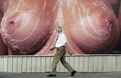
Aside from the breasts, ‘Reverse View’ is one of the main images used for The 28th Biennial of Graphic Arts in Slovenia.
Conan’s back tonite.
Pictured, the work of designer Andy Mangold, student at Maryland Institute College of Art.

‘The Biennial of Graphic Arts, which has been held without interruption since 1955, has a longer tradition than any other recurring exhibition in Slovenia and, in fact, is one of the oldest print biennials in the world.’
‘Oh, I get it, it’s a pun on ‘graphic,’ right?’ –Dabitch
This year they’ve decided to promote the Biennial with soapy breast billboards placed all over Ljubljana.
And I’d like to say it’s causing quite the outrage. But, no. It is Europe. It’s just turning a few heads.
But in the US, civilization would come to a stop as we know it. Banks would close, all media would crumble.
NBC would cancel another show.

Found via Metro
‘Eric Daman’s career has seen many reincarnations, first as a model most notably shot by Steven Meisel, then as a noted editorial stylist, then a sought-after costume designer with credits that range from TV’s Sex and the City to a long list of film titles and now a published author.’
Gossip Girl went to Paris this season with costume designer Eric Daman tagging along.
Click the image to watch Vogue Italy’s interview/jump.

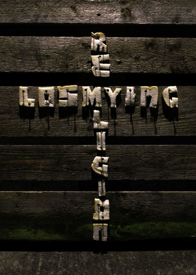
‘The letters are bread’
The work of Northern Ireland-based designer Christopher Scott. Photographed by Ryan O’Neill.
Found via Art Chantry
‘The hallmark of Szpajdel’s work is his surprisingly fluid combination of letters with visual elements from art movements such as art deco and art nouveau.’
The dark metal logo work of (Belgian forestry engineer) Christophe Szpajdel – compiled in convenient book form. Published by Die Gestalten Verlag.
Interview here. Another interview here.
Wolves in the Throne Room: A Looming Resonance
Found via Robynne Raye
B-movie typography eCards, designed by Will Staehle for TDC. Go here.
And check out Will Staehle’s website here.
Found via Ilene Strizver
‘Over the 26 years that it was published, U&lc gathered a following of thousands of avid readers that eagerly anticipated each issue. It became the most important typographic publication of its time.’
The 1970s looked like the 1970s because of Herb Lubalin.
And the way he did this was thru Upper & lowercase magazine. Tabloid in size, printed on newsprint, U&lc was read by most of the graphic design industry. Within, the fonts and philosophy of Lubalin’s International Typeface Corporation [ITC] stressed letters that were set ‘close, but not touching’ and . . . aw, hell, let them touch, overlap and be funky.
By the time I was in design school, the look had fallen out of favor – most ITC fonts were actually banned from use in my homework. ITC’s philosophy was to reinterpret the classics, often into something strangely unique, full of its own style – or a lack of style. Like Helvetica.
The 1970s were all about that. Taking things like Art Deco and doing something totally new with it. [Read more →]