entries Tagged as [design]
Miso
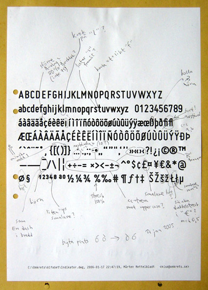
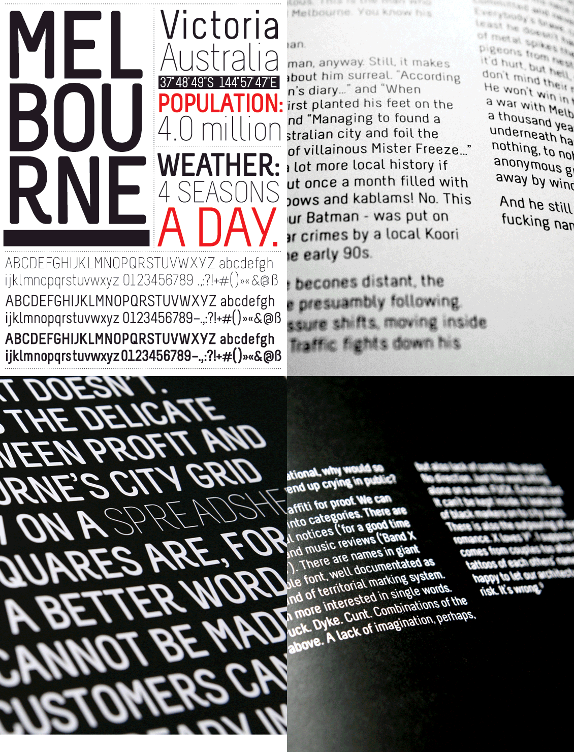
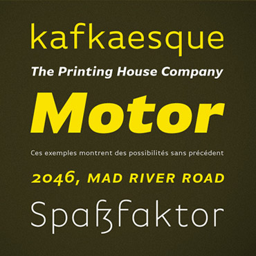
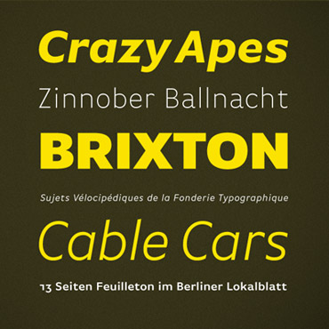
Mårten Nettelbladt’s geometric Miso fonts. Free download here.
Production notes available at Typophile.
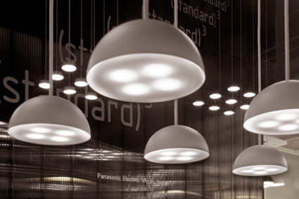
Also from Typophile: (below) photos of Miso in use at Milan Design Week 2009.
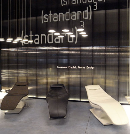
Found via Lori Yung
Lato, free open source fonts
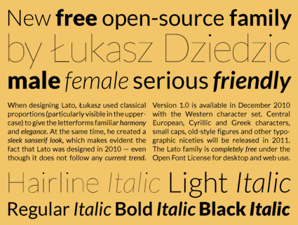
‘Lato is a sanserif typeface family designed by Warsaw-based designer Łukasz Dziedzic. Lato consists of five weights (plus corresponding italics), including a beautiful hairline style.’
Details at Typophile. Download the Lato fonts via Google.
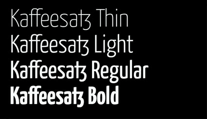
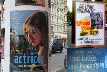
Yanone Kaffeesatz
‘Its Bold is reminiscent of 1920s coffee house typography, while the rather thin fonts bridge the gap to present times’
Yanone Kaffeesatz are the first typefaces designed by Yanone. They feel like a contemporary interpretation of the work of the great Ozwald Cooper (1879–1940).
Snag the 2004 free version here.
The pro version – released in 2009 under the name ‘Kava’ – is available thru FontFont.
Birra Stout
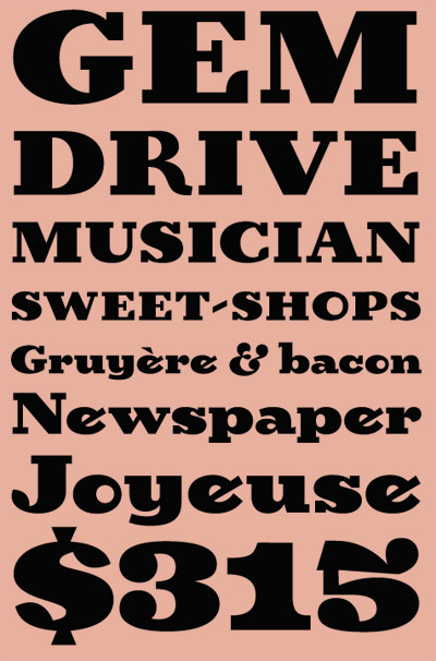
‘Birra arose from years of compulsive doodling in pen and ink, and conjures the whimsy and syncopated contrast of novelty handlettering in the early 20th century’
Birra is Joshua Darden’s reworking of Frederic W. Goudy’s least favorite novelty font, Goudy Stout. Though Birra is actually totally different and completely not the same. Not unlike being not similar like. It’s odd, fun, playful and one can download it free.
Grab it here.
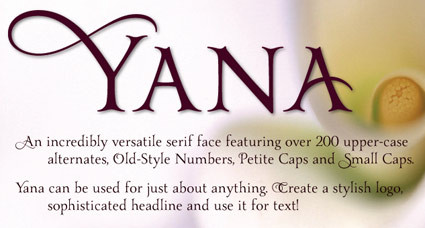
Yana, starting at $10
‘I told Yana that as soon as I figured out how to design type, that would be one of the designs I would create – and I would name it after her. She laughed, and said, ‘Well, I’ll be the first person to buy it.”
Yana: A classical, decorative type family, designed by Laura Worthington. Available thru Ascender.
Goudy’s Trajan
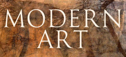
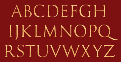
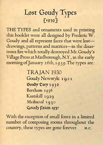
‘Not to be confused with Adobe’s Trajan typeface (which is very similar), this face is based on the drawings by Frederic W. Goudy of his rendition of the capital letters inscribed on the Trajan column in Rome.’
Expressive, classical.
Nick Castle’s digital version of Goudy’s Trajan, a reworking of one of Goudy’s lost fonts. Free trial version available, download here.
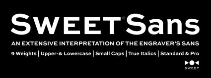
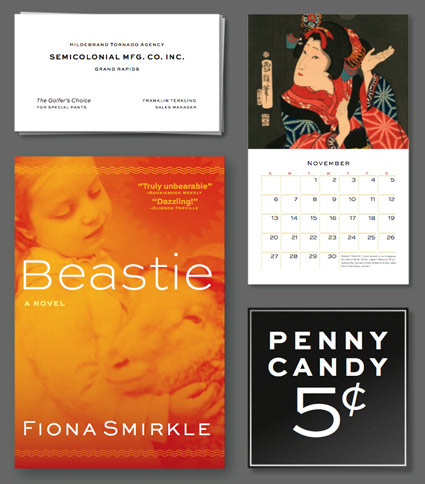
Sweet Sans, starting at $1
‘The standard Thin and Thin Small Caps fonts are priced at just $1. Give them a try.’
An update of Engravers Gothic by Mark van Bronkhorst. Info here.
‘Fuck The System’
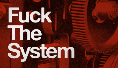
Just my mindset this morning.
Set in Alte Hass Grotesk, a free font based on the ‘cold type’ version of Helvetica. Download here.
League Gothic, open source font
This week I gave my design history talk on American Type Founders’ Gothics – a large collection of (mostly 19th century) sans serifs typefaces.
ATF was formed in 1892 by a merger of 23 American type companies – resulting in, literally, a huge pile of metal that had to be sorted, catalogued, duplicates removed and if necessary, redesigned. Morris Fuller Benton (1872-1948) ended up doing a lot of the dirty work – among the results were ATF’s very industrial Gothic series of typefaces.
These types exist today in many digital forms – some with their original ATF names, such as Franklin Gothic and News Gothic – or as revivals, which includes Benton Sans and Jonathan Hoefler’s comprehensive Knockout series.
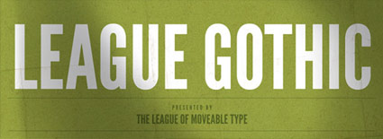
Amidst recent revivals is Caroline Hadilaksono and Micah Rich’s League Gothic (above) – an interpretation of ATF’s Alternate Gothic No. 1 (below).
Snag your own free version here.
And hell, if you see any problems, fix em. The font is open source.
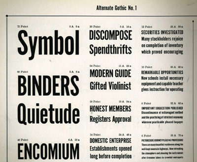
Alternate Gothic No. 1 specimen (cropped), ATF’s Book of American Types, 1934
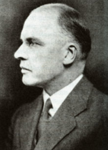
M.F. Benton, read more on Benton here
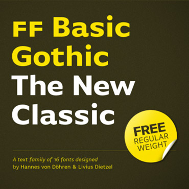
Basic Gothic, free weight
‘The name says it all: FontFont’s Basic Gothic is a neutral American grotesque for all purposes, something between Gill Sans and Verdana.’
More from Hannes von Döhren: The Basic Gothic types were a joint project with Livius Dietzel. Basic Gothic uses ideas from the 19th Century – resulting in some really nice workhorse fonts for today.
Grab the Regular weight free here. Another limited time offer.
