entries Tagged as [design]

The collage work of Cristiana Couceiro

When one thinks of collage, it’s usually something  . . .  scrapbooky. Not always the case.

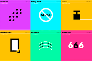
Here’s some clever modernist-influenced work by Lisbon-based artist Cristiana Couceiro. Love the hint of Univers and the careful subtle essences of Lester Beall, Bradbury Thompson, Tschichold  . . .

Found via the blog of Robert L. Peters

TETRO and typography

Watch this beautiful title sequence for Francis Ford Coppola’s TETRO. Designed by SFAUSTINA. Both avant garde and not at the same time.

And  . . .  I’ve always wondered why so many motion picture title sequences end with a shot of a bus.

Found via Twitter.com/Typegirl

Eric Gill: The wine

Wine label inspired by the work (and life) of font designer Eric Gill (1882-1940). Student-designed project.

The art of setting type

‘Graphic designers were never meant to set type  . . .  That’s what typesetters are for.’

I’m not even sure who said this, it was early on; probably college. Possibly a printer, maybe Roger. Roger would say stuff like that. He’d swear to the ‘ITC god’ and he had the old dusty Varitype machine sitting in the corner to prove it. [Read more →]

Armin Hofmann’s Graphic Design Bible

Like Helvetica? Like the Swiss International Style?

Armin Hofmann’s Graphic Design Manual (1965) is what I learned out of – and if it weren’t out of print, I’d be using it in my basics classes. (right now, I have a few slides made from my dog eared edition as part of a form lecture)

Graphic Design Manual breaks composition into basics: dot, line, confrontation, plus letters and signs. And it shows by example how these basics can be applied to good, clean graphic design: form, composition, typography.

I’ve seen it going for upwards of 90 bucks in some listings. As I write this, there are 22 used available at Amazon starting at $4.10.


The evolution of the Coke and Pepsi logos


Found via Reserves on TwitPic

Plus, there’s some more Evolution of Logos charts at the Best Ad blog.

And, here’s a link to the ‘official’ Pespi rebrand strategy proposal [pdf]. The most involved snow job in the history of brand design. Worth downloading and  . . .  reading with awe!

Mehallo merch: how and why  . . .

i’m digging all this
I’ve had these merchandise ideas for a few years and just never got around to building them until recently. Production issues always held me up   . . .  so did fulfillment, pricing   . . .  inventory   . . .   [Read more →]

Totally blunt: 8 common graphic design myths revealed

Thinking about going into graphic design? Wanna know what you’re getting yourself into? What’s it all about?

Click the image and read thru:


Found via Twitter.com/Colorburned

Liz Phair: The album covers video

Find more videos like this on www.truveo.com.


The Modernist Editions: More album covers


Image via Sleevage

‘It’s basically a set of modernist re-workings of classic album covers, where the album title has been distilled into a simple little black and white pictogram which acts as the artwork. So far the collection has 25 hits and misses.’ – Heath Killen, Illumination Ink

See em here.

Hm. More Blue Note mining  . . .


Image via dvisible magazine

Graphic designer Reid Miles and the Blue Note label – incredible album cover design. Here’s a great article on Miles.

And here’s the Wu-Tang albums as Blue Note releases. Found via Twitter.com/Sandoer.


Creative Commons License

the work at the mehallo blog. beta. is licensed under a creative commons attribution - noncommercial - no derivative works 3.0 united states license.  if reposting, credit must be given to steve mehallo - and if possible, please provide a link back to the mehallo blog. beta.

i include images for the purpose of critique, review, promotion and inspiration - and always make my best effort give credit/link back to the original source.  if i’ve screwed up, please fire me a note.

page layout based on the wordpress 'darkwater theme' by antbag, adapted and redesigned by mehallo.  valuable php assistance from bill mead.