entries Tagged as [design history]

Googie primer


Lyon’s Coffee Shop, San Bruno, CA 1962. Found via Googie Art.

I grew up around Googie Architecture. It was just there. Space age-looking buildings, funky decor and rocks in the walls. Lots of rocks. Flintstones-like, but where the Jetson’s were running the quarry.

The 24 hour Lyon’s in San Bruno (see above) was the high school hangout. Long weird nights. In college, those weird nights spread to the other Lyon’s in San Mateo, San Carlos and Daly City. Denny’s was the alternative.

The style’s roots can be traced back to Frank Lloyd Wright and Tallesin West. Architect John Lautner designed the first Googie structure in 1949 and it was panned by critics. The firm of Armet and Davis designed most of the rest. [Read more →]
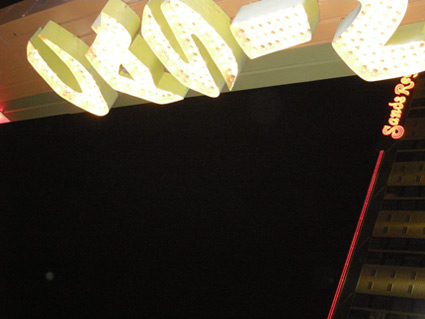
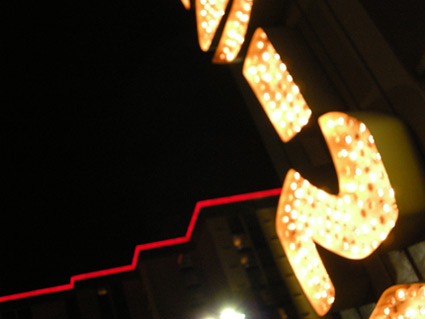
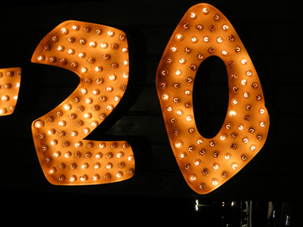
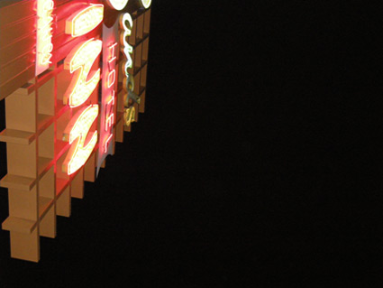
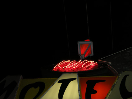
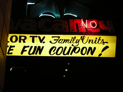
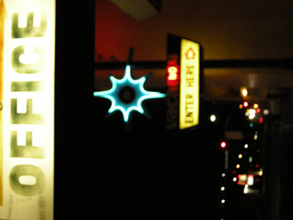
Lights and type of Reno

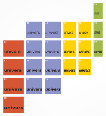
Snapped these while in Reno a few weeks back. Love 1950s vernacular typography, I’ve built an entire font family around this.

Drove the guy at the motel front desk crazy with my flash.

A really nice drug dealer tried to sell me his wares.

I’m not being sarcastic, he was really, really nice.

Took me a long moment before I realized what he was up to.

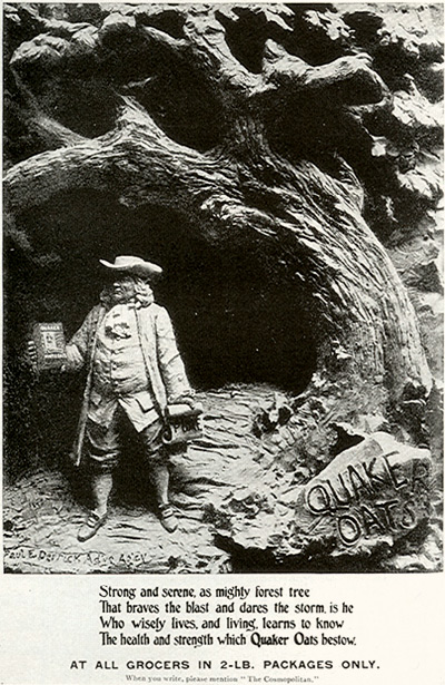
Not Ben Franklin


Photographic Quaker Oats advertisement, 1897

I always thought the Quaker Oats guy was Benjamin Franklin.

He actually started as a printer’s cut – clip art, in today’s terms – that was selected to go on the Oats packaging to show ‘purity.’ Quakers always looked pure, let’s sell some oats with that in mind.

Benjamin Franklin was really smart, not quite pure though.

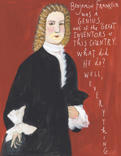
Ben Franklin ‘can do’


Click the image to read Maira Kalman’s ode to Franklin  . . . .

Benjamin Franklin was fun. So much fun, the International Printing Museum has on staff the incredible Phil Soinski.

Soinski portrays Franklin as part of their educational services; and does such a fantastic job, I learned more about Hot Type in one hour with ‘Ben’ than reading thru whatever pile of type books are currently stacked on my desk. Drop by the museum, set up a tour, take a class – their programs, their dedication to the craft of printing can be contagious.

And illustrator Maira Kalman gives us a bunch of really cool things to know about ultramegasuperinventor Ben Franklin in yesterday’s New York Times  . . . .

How type families work

Here’s a great article at Typotheque on fonts who hang out in families. Where they come from, why they get along better than real families.

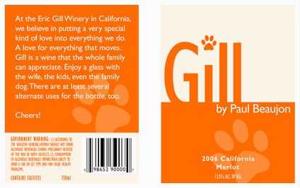
Eric Gill: The wine

Wine label inspired by the work (and life) of font designer Eric Gill (1882-1940). Student-designed project.

The art of setting type

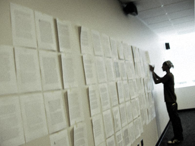
‘Graphic designers were never meant to set type  . . .  That’s what typesetters are for.’

I’m not even sure who said this, it was early on; probably college. Possibly a printer, maybe Roger. Roger would say stuff like that. He’d swear to the ‘ITC god’ and he had the old dusty Varitype machine sitting in the corner to prove it. [Read more →]

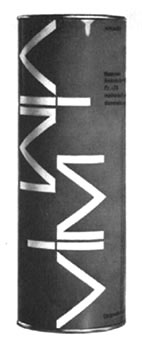
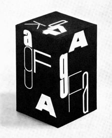
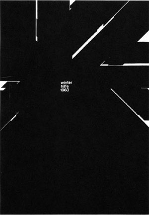
Armin Hofmann’s Graphic Design Bible

Like Helvetica? Like the Swiss International Style?

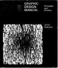
Armin Hofmann’s Graphic Design Manual (1965) is what I learned out of – and if it weren’t out of print, I’d be using it in my basics classes. (right now, I have a few slides made from my dog eared edition as part of a form lecture)

Graphic Design Manual breaks composition into basics: dot, line, confrontation, plus letters and signs. And it shows by example how these basics can be applied to good, clean graphic design: form, composition, typography.

I’ve seen it going for upwards of 90 bucks in some listings. As I write this, there are 22 used available at Amazon starting at $4.10.


Hm. More Blue Note mining  . . .


Image via dvisible magazine

Graphic designer Reid Miles and the Blue Note label – incredible album cover design. Here’s a great article on Miles.

And here’s the Wu-Tang albums as Blue Note releases. Found via Twitter.com/Sandoer.

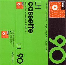
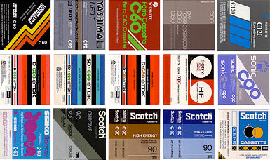
Tape Cassette Inserts on Fickr

I remember almost all of these.

Found via Twirk Ethic

Kroy!

I used to use ‘The Kroy Machine’ for the Monday Morning Blues.

The Blues was a college zine. I was editor and designer. We had no Macintosh, only an old Apple II with a basic word processing program hooked up to an inky typewriter-like dot matrix printer. Most articles were typed on an actual typewriter because that was sometimes easier.

The Kroy was a lot like a large Dymo labeller. And it was a BITCH to work with, the kerning sucked (the dial on the bottom was for kerning/tracking, but you couldn’t easily see what you were doing), the letters jumped around a lot – the gum on the labels was very sticky/not repositionable. But you could make little headlines on transparent tape – and it was a huge step up from rub off lettering.

Learned to hate the Souvenir and Stymie fonts while using that thing. Cooper, LOTS of Cooper Black!

Here’s more info about this particular machine, via our design studio uses only the finest state of the art technology.


Creative Commons License

the work at the mehallo blog. beta. is licensed under a creative commons attribution - noncommercial - no derivative works 3.0 united states license.  if reposting, credit must be given to steve mehallo - and if possible, please provide a link back to the mehallo blog. beta.

i include images for the purpose of critique, review, promotion and inspiration - and always make my best effort give credit/link back to the original source.  if i’ve screwed up, please fire me a note.

page layout based on the wordpress 'darkwater theme' by antbag, adapted and redesigned by mehallo.  valuable php assistance from bill mead.