entries Tagged as [design history]

Jack Marchment: Electroacoustic audioprose

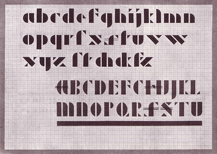
Classical Roman poet Ovid, bauhaus tinkerer Albers, provocative Futurist Marinetti  . . . .

Right now I’m enjoying the electronic music of UK-based Jack Marchment.

Having studied literary classics, Marchment has rechanneled his academic intensity into sound. ‘The whole idea of creating a music super-rich in intertexts is really a product of that approach.’

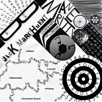
Consequently, Albers and Marinetti tracks appear on his latest release, the multi-dimensional Who’s Afraid Of Iannis Xenakis.

Aside from ear, the album’s cover (above) caught my eye. Designed by Joanna Lowndes, Marchment admits, ‘I had given her a fairly oppressive brief (with Marinetti at its core), but she delivered a sumptuous result.’

For more, here’s a great album review. One can also snag Marchment’s albums here.

Plus,
MySpace page here. His new label is on MySpace here. Video from his previous album, Corydon and Manjrekar, is below:
The bauhaus label: bringing sound design into the fold

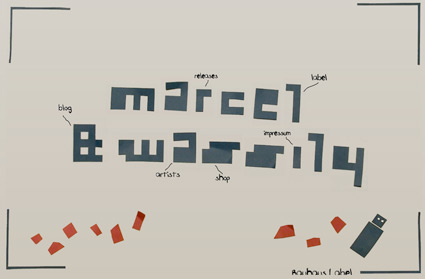
Out of Weimar, the first home to the bauhaus, is marcel & wassily: the bauhaus label.

The original bauhaus’ manifesto advocated the union of fine, applied and performing arts. This included architecture, civil engineering, design and media. Today, the Bauhaus-Universität Weimar has incorporated the next logical step, the dimension of sound.

Music, radio plays, sound art, experimental radio, electroacoustic constructs. First step: this past summer, a collection of music was distributed at the school on a concrete-cast USB stick via gumball machines. Very bauhaus in its thinking.

The label doesn’t stop with student work. And like the original school, is working with outside resources, bands and artists.

Check out the label’s cool site. Click around, see what pops up.

And here’s some of the USB hosted bands (with links to their MySpace spaces):


New Telepathics


The Awesome Soundsystem


Joe B. Hard & The What?


More artists listed here

Bauhaus Dessau in type

A 3D typographic re-rendering of Walter Gropius’ Bauhaus building in Dessau. By UK-based artist Chris Labrooy.

Set in ITC Bauhaus – a post-modern interpretation that’s everywhere these days – originally designed by Ed Benguiat and Victor Caruso in 1975.

Rendering details here.
Plus, here’s a recent photoset of the actual restored building. Building history here.

And
Here’s another one of my favorite type buildings.


Invitation to the opening of the Bauhaus building; design by Herbert Bayer, 1926

A whole bunch of bauhaus


Women in red. Photo by Fischer, 2004

One evening this past June, I went a bit crazy and tweeted a bunch of Bauhaus links. In honor of the design school’s 90th anniversary (founded 1919). History, photosets, auctions, bicycles, fonts, coffee, the Mexican bauhaus, anything interesting I could find online.

Jamie DeVriend collected and conveniently reposted these on her blog.

Happy exploring!


Herbert Bayer circles, 1923. Photo by Ralf Herrmann


Bauhaus greyscales faces tee


Josef Albers, Schablonenschrift. Photo by Ralf Herrmann


Bauhaus Dessau. Photo by Ralf Herrmann

Bauhaus at the MoMA

”It’s a Haushold word, the Bauhaus, but a misunderstood one. Its influence is all around us, from Ikea furniture to glass skyscrapers, but it is credited – and blamed – for much more than it should be.’ -Candace Jackson, Wall Street Journal

The bauhaus was about advanced thinking in design, and it has its successes and failures. It was a great experiment and it changed the world. Its influence can be seen in everything today.

Workshops for Modernity: Bauhaus 1919-1933 just opened in NYC. And the exhibition is about going beyond the basics, show how far reaching the school actually was.

WSJ article here. Exhibition info here. Catalog here. TIME magazine video here. Show runs thru January 25, 2010.


Ludwig Mies van der Rohe armchair, 1927-30

Summer school at the bauhaus

This year is the 90th anniversary of the bauhaus (1919-33). And workshops – titled ‘get on site’ – were held this past summer in Dessau. Here’s a photo gallery.

And here’s info on  . . .  the bauhaus bed and breakfast. Really.

Julius Shulman on film

Visual Acoustics, the new documentary profiling modernist photographer Julius Shulman (1910-2009) is now screening in select locations around the country.

More info at Grain Edit. Visit the Visual Acoustics site here.

Visions of the future


‘Futurism of the nineteen fifties: contemporary trends exaggerated’

Theo E. Korthals Altes takes a look at our fascination with depicting the future. Here.


‘Not (yet) built: a vision of the future’

Marian Bantjes: Optimistic modernism and soap

Modernism was optimistic. A utopia for the future! More than just a style to be pillaged. And even if you weren’t able to see Modernism: Designing a New World 1914–1939 at the Victoria & Albert Museum back in 2006, Marian’s commentary on the show says much. Go here.

US Interstate, London Underground Map

Here is the US Interstate highway system drawn in the style of H.C. Beck’s London Underground map.

More info (and links to other Interstate maps) here. Super large size here (Yahoo/Flickr account required to view).

Illustrated by Cameron Booth.

Found via Coudal Partners

Emigre’s new Baskerville Sans + No. 70

Taking the personality of Baskerville, mixing it with the thinking of Gill Sans (Sans version) and Futura (Modern version)  . . .  Zuzana Licko has finished work on the latest companion fonts for her popular Mrs Eaves typefaces.

Mr Eaves (above) is a sans serif take on the types of John Baskerville (1706-75). It can be snagged here.

And  . . .  also available is Emigre No. 70, a retrospect of Emigre Magazine. Emigre – which ran from 1984-2005 – was ‘the next big thing;’ which was a term they used a lot to describe design trends.

Emigre was a highly-influential, experimental and controversial design magazine that pushed the envelope to where the envelope didn’t look like the envelope anymore. I can safely say its influence can still be seen everywhere today. I miss going to Tower Books (owned by Tower Records) or Printers Inc. to snag the latest issue.

Details about Emigre 70 here.


Creative Commons License

the work at the mehallo blog. beta. is licensed under a creative commons attribution - noncommercial - no derivative works 3.0 united states license.  if reposting, credit must be given to steve mehallo - and if possible, please provide a link back to the mehallo blog. beta.

i include images for the purpose of critique, review, promotion and inspiration - and always make my best effort give credit/link back to the original source.  if i’ve screwed up, please fire me a note.

page layout based on the wordpress 'darkwater theme' by antbag, adapted and redesigned by mehallo.  valuable php assistance from bill mead.