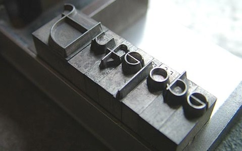
Barack Obama, font savvy

‘Can we add serifs to Gotham?’

One thing I like about Obama: He knows good design.

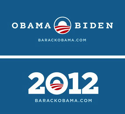
In 2008, his campaign lifted political propaganda out of the long ass slump it had been in. The fonts of choice were Eric Gill’s Perpetua and Tobias Frere-Jones’ Gotham.

And revealed this week: 2012 graphics featuring a custom slab serif version of Gotham.

So when The President calls wanting a font change, Hoefler & Frere-Jones were ready to oblige.

Found via Hoefler & Frere-Jones

Alexey Brodovitch, good layout

‘There is no recipe for good layout, but what must be maintained is a feeling of change and contrast.’ –Alexey Brodovitch (1898-1971)

Photo by Man Ray, layout by Brodovitch for Harper’s Bazaar, 1934.

Lillian Bassman, form and light

‘Her work was published for the most part in Harper’s Bazaar, between 1950-1965.’

The photography of Lillian Bassman. Beautiful geometric constructs shot in black and white.

Music by Budd/Wright, In the Midst of Life.

Warby Parker eyewear

‘For every pair of glasses you purchase, Warby Parker will donate a pair to someone in need’

Vintage styling, Netflix-like purchasing system, charitable donation.

All frames 95 bucks. Details here. Buy here.

Found via Shandi Pierzina

Dryden whisky

Canadian Club advertisement, 1928.

The work of commercial illustrator and fashion design pioneer Ernst Dryden (1887-1938).

Found via Divinely Elegant: The World of Ernst Dryden

BERN HARD Fashion in metal

‘Bernhard Fashion. This typeface was designed by Lucian Bernhard and introduced by American Typefounders in 1929.’

Found via Emily McGuiness

Alternative Organic Sauvignon Blanc

Design by The Creative Method.

Found via The Dieline

Carved BERN HARD

‘I was working on maintaining the quality of Bernhard’s handdone type while taking a new and different approach to it’

Student Lesley Gaesser’s large scale final project from my experimental type course at The Art Institute of California Sacramento.

Lesley did an 11 week study on the work of designer Lucian Bernhard (1883-1972) – which culminated in a final linocut-inspired project.

Bernard’s Antiqua type was traced onto Speedball carving blocks, cut by hand, inked and printed on large sheets of watercolor paper.

My next experimental course begins April 8.


If student hangs roughs low on the wall, one can only critique if lying on the floor; Photo by Daniel Mendez

Tschichold and Alta California

Rare Jan Tschichold book design, featuring his use of an early prototype of the Alta Calfornia font.

Cloth cover for Das lustige Buch (The Funny Book), Verlag der Bücherkreis GmbH, Berlin, 1931.

Letter March 2011

‘This is an experiment in carving one linocut letter per day in an attempt to complete an entire alphabet by March 31st. Chosen typeface: Champion Gothic by Hoefler & Frere-Jones. Lightweight was chosen based on a deep rooted affection with its ampersand.’

And so concludes Aymie Spitzer’s March of Letters. Blog here. Calendar archive here.

Found via Campbell BrownKorbel

Camphor

‘clean and cool, modern sans serif’

New from Linotype: Nick Job’s Camphor. Inspired by Edward Johnston’s type for the London Underground, Eric Gill’s Sans and the work of Adrian Frutiger.

Available here.


Creative Commons License

the work at the mehallo blog. beta. is licensed under a creative commons attribution - noncommercial - no derivative works 3.0 united states license.  if reposting, credit must be given to steve mehallo - and if possible, please provide a link back to the mehallo blog. beta.

i include images for the purpose of critique, review, promotion and inspiration - and always make my best effort give credit/link back to the original source.  if i’ve screwed up, please fire me a note.

page layout based on the wordpress 'darkwater theme' by antbag, adapted and redesigned by mehallo.  valuable php assistance from bill mead.