State of graphic design, 2012

‘As a student, live by these words, ‘Quantity rather than quality.’ The more you design the better your quality will become and you will continue to grow’ –Tony Montano

I like that quote.

Quality does come later. Being a designer becomes all about instinct – not having the best computer, not software, not measurements, not rules.

I’ve just started teaching another semester of Graphic Design History and Typography at American River College – have a whole new group of kids to introduce to my gospel of visuals.

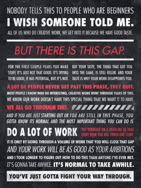
One thought that’s been weaving its way thru my classes over the years is simply, ‘the more you do, the better you get.’ We’ve all heard this, and yeah, it’s true. The only real stumbling block is ‘the more you do, if you’re not paying attention, you probably won’t get better.’

This year the student work has been incredible – but only when tied to good, old fashioned Hard Work. Risk taking, going out on that edge, trying something one has never done before leads to fantastic creations.

I haven’t been blogging much – I also have my usual four type classes at Ai Sacramento and a rather large project that’s been taking up the rest of my time (more on that soooooon) – so something had to give. It was blogging.

I’ll be posting more as time permits; otherwise been immediately throwing finds up on my Twitter account.

I’m keeping busy. Hope you are too.

Infographic found via Ai Sacramento Graphic Design; click image to jump/view larger

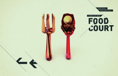
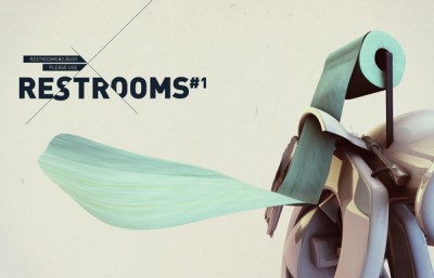
Disform

‘Signage for an alternative music festival.’

The work of Dani Wolf.

Found via YouWorkForThem

‘Want it Back’

New video for Amanda Palmer & The Grand Theft Orchestra’s Want It Back. Lettering by Curran James.

Found via aeroplanegirl

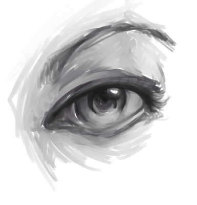
‘New answers to old riddles’

The work of Britt Wilson.

Found via Ape on the Moon

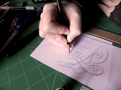
Calligraphy for theatre

Exquisite lettering by Luca Barcellona and Francesca Biasetton for ELITA, Milan.

Found via Cátedra Bardelás

Mouse movements

‘My mouse cursor path over the course of a week’

Designer Gavin Potenza keeps track of his mouse.

Image borrowed from his blog; read more here.

Today

‘annular solar eclipse and pleiades alignment tonight. frequency shift. reset.’

Found via Jes Cellophane

Calm design

Often there’s this thing – where the graphic designer – feels like shouting, ‘I’M A PROFESSIONAL, I KNOW WHAT I’M DOING. REALLY.’

It usually arises from the idea that graphic design is a voodoo art that many do not understand. Or they think they do, but only understand a small portion of it. Trained, professional designers do spend at least 4–5 years studying our craft – and the years after finessing what we know.

Keeping communication open to clients is also important. But really, there’s some of us who know what we’re doing.

Mostly.

Button design by UXPin.

Found via Sandoer Berg

25 things you should know about other people

Former student Alice Woodruff posted this list on my Facebook page.

It was written by writer and model Sovereign Syre, co-founder of Darling House. Syre’s ‘Things you should know’ was originally published on blogcritics.org back in 2009.

It’s good thoughts and will probably offend some. Turning off one’s ego long enough to connect with others is often difficult. I have to enact #25 before week’s end. A good, unexpected apology for something I didn’t expect to occur will make someone else’s day. Fingers crossed.

[1]    Most people hide their suffering better than you think, you pass dozens of people a day on the street without any idea how well they’re wearing their tragedies.

[2]    People’s names are the sweetest sounds they hear. You should make a point of being good at learning and using them.

[3]    People love to spread their misery around, but not as much as they enjoy being lifted out of it.

[4]    Being young is not in and of itself an achievement. Neither is being beautiful. But people often treat you as if they are.

[5]    For a lot of people, music is a reflection of who they are and their relationship to life. Remember that before insulting someone’s favorite band.

[6]    The Golden Age never existed. People are always trying to get back to a time when things were simpler and better. The world was a far more dangerous place fifty years ago, especially if you were black or a woman or gay or diagnosed with cancer. [Read more →]

Creative advice roundup

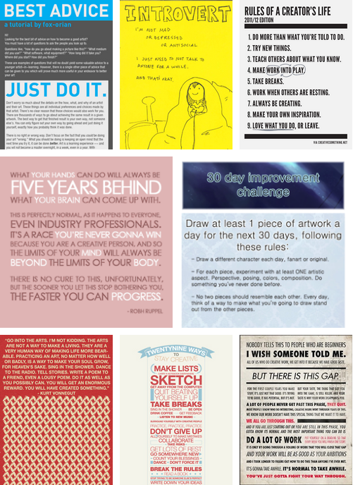
Here’s a roundup of advice graphics.

I’m always frustrated when beginning students give up prematurely, when there are those who see being ‘creative’ as either a job or something not important and/or not realizing the more a creative works at what they’re doing, the better they will get; collaboration is great, rules get in the way, others will never understand you and that’s okay, work should be fun (especially hard work), breaks are important and a zillion other things.

Click to view larger/jump.


Found via hyenabonz

How to piss off an introvert

Many creatives are introverts – some famous ones include J.K. Rowling, Eleanor Roosevelt, Clint Eastwood, David Letterman, Howard Stern, Steve Martin. The trick is most introverts are annoyed just enough by the banalities of everyday societal demands that one typically doesn’t want to get bogged down by the bullshit. Introverts have important thinking to do – typically, introverts are out to change the world in one way or another.

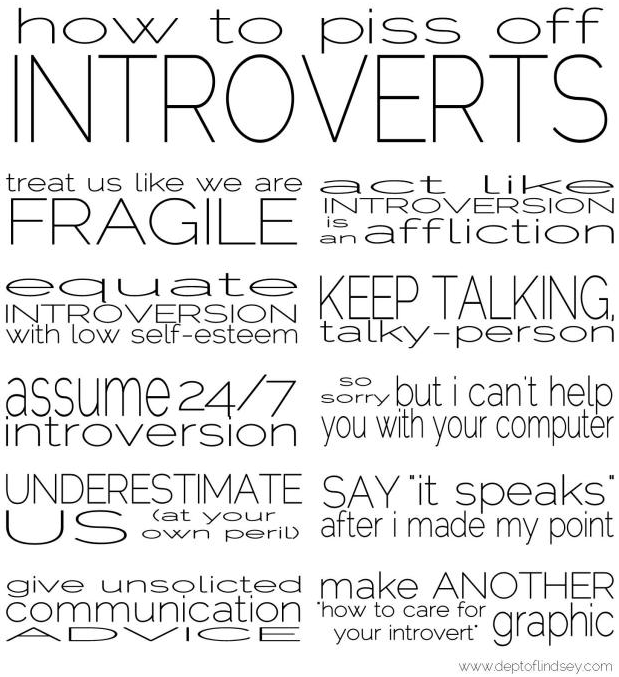
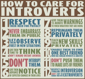
There’s a graphic that’s been bouncing around the interwebs (below) that doesn’t quite hit the mark. Shyness is something totally different.

Above, a list that nails it (and yes, the type is stretched. Typographers: Deal.) – it came from this cool post. And here’s an article with more detail (book available too).

When I’m in quiet mode, I’m busy. Then I come out and play when in a classroom or social situation. Even though the second part is a learned behavior, it is also quite fun and a great balance. Wouldn’t change it for anything.


Bullshit

Found via Lindsey, Jes


Creative Commons License

the work at the mehallo blog. beta. is licensed under a creative commons attribution - noncommercial - no derivative works 3.0 united states license.  if reposting, credit must be given to steve mehallo - and if possible, please provide a link back to the mehallo blog. beta.

i include images for the purpose of critique, review, promotion and inspiration - and always make my best effort give credit/link back to the original source.  if i’ve screwed up, please fire me a note.

page layout based on the wordpress 'darkwater theme' by antbag, adapted and redesigned by mehallo.  valuable php assistance from bill mead.