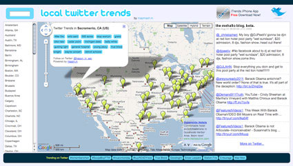
What’s trending near you?
Posted on September 3rd, 2009 by steve

I used to count ‘graphic design’ as one of the Seven Deadly Sins – I had it listed among the sins on an old business card (replacing ‘gluttony,’ of course).
Kansas State University Geography students have visualized the sins as regional, at least in the US. View the maps here.
Found via One Floor Up
Maps of War’s History of Religion
Student work from Sweden: Tomas Nilsson reinterprets Little Red Riding Hood (above). Music by Slagsmålsklubben. You know, I never did understand why the wolf – with the big ol’ teeth – never actually chewed his food.
Nilsson’s animation was inspired by Röyksopps’ Remind Me (below).
Found via Twitter.com/grain edit
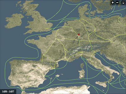
If you’re wondering why Type Daily says ‘since 1455’ up top . . . this historical atlas will fill in some of the blanks.
After Johann Gutenberg did his thing, the technology of printing spread across Europe in just around 50 years.
This interactive map from the University of Iowa charts its progress – with timeline, zoom features, trade routes, locations of paper mills and more. Also included is a briefly animated model of what we know of Gutenberg’s press.

From the Histeria! series, here’s a cartoon overview of the invention of printing . . . well, actually the invention of moveable type . . . well, whatever it was that ‘Type A’ Gutenberg guy did.
Found via Twitter.com/MyFonts
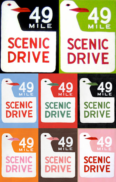
If you’ve been thru San Francisco, this sign should seem familiar.
Originally planned as a driving promotion for the 1939 Golden Gate International Exposition, the 49 Mile Scenic Drive [map] passes thru all the visual highlights and lowlights of The City. Rex May is credited with designing the iconic signs – for more dope on the drive, check out this handy guidebook.
And Annie Galvin of 3 Fish Studios made a big splash last year with her multicolored acrylic paintings, also available as nifty postcards (seen above).
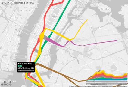
New York City Metropolitan Transit Authority ridership interactive map, browsable years 1905-2006.
Found via Twitter.com/jasonsantamaria

Henry C. Beck’s 1933 map for the London Undergound set the standard for transit maps worldwide. Based on an electrical schematic, and handlettered by Beck – he pitched the map to the Underground as easier to understand than what they’d been using. Skeptical at first, they eventually released Beck’s version. It was a major hit with commuters – and he spent the next 27 years updating and revising his creation.
Here’s the iconic tube map as interpreted in this presentation video by Digital Urban . . .
London Tube Map Traditional Layout from Digital Urban on Vimeo.


the work at the mehallo blog. beta. is licensed under a creative commons attribution - noncommercial - no derivative works 3.0 united states license. if reposting, credit must be given to steve mehallo - and if possible, please provide a link back to the mehallo blog. beta.
i include images for the purpose of critique, review, promotion and inspiration - and always make my best effort give credit/link back to the original source. if i’ve screwed up, please fire me a note.
page layout based on the wordpress 'darkwater theme' by antbag, adapted and redesigned by mehallo. valuable php assistance from bill mead.