Woodgrain notes
Posted on October 16th, 2009 by steve

Lenin Addresses the Troops (1920); after . . .

and (sorta) before
Here’s TIME’s Top 10 Doctored Photos.
Found via ISO50

One thing I know about journalists: They’re slow to change. Once dug in.
Here’s an opinion piece about where newspapers could be headed. It involves The Times of London’s ePaper, which is a nifty idea.
The online market – which, c’mon, papers still haven’t figured out – is tappable. Just have to reframe the conversation. It’ll be interesting to see where all of this goes.
Found via Japan_Blogs on Twitter
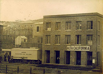
Alta California office, San Francisco 1851; found via Flickr
At one point in my life, I was going to be a journalist. So folly along . . . .
I love history, so every one of my fonts falls into some historical category (or categories, if you look at Jeanne Moderno).
Alta California is my artist’s response to Susan Kare’s early Macintosh font, San Francisco. And it was a tricky build, as I was literally going thru book after book after book of old types – then messing them up, then messing them up more; and redrawing the edges until I had what I wanted.
(Please note, when it comes to ‘grunge typography’ – I don’t trust anything automatic; I’ve always gone in and tweaked the edges until I have something that looks – printed. Printed poorly, but printed.) [Read more →]

‘Charting the intersection of Rural America and Contemporary Graphic Design’
The film about the Hamilton Woodtype Museum is making the rounds.
Official site here. Pictured: promo prints for the documentary.


Found via “JE NE SUIS QU’UNE PAUVRE PLUME…”

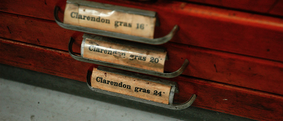
Here’s a detailed history over at Hoefler & Frere-Jones on slab serif typefaces; showcasing their new Clarendon-based Sentinel fonts.

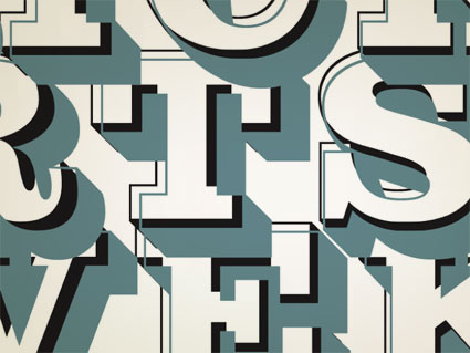
ADAC 38th season promotional material
It’s not often one gets to meet one of their heroes.
When I was in high school, a bunch of kids thought it would be funny to sign me up for every magazine subscription they could find – by sending in a large pile of subscription cards. My parents were not amused; but it was Rolling Stone that I kept. I fell in love with the hand-inked masthead – and decided that that was what I wanted to do.
Hand-ink mastheads.
Not a big field. And who knew people actually did this? I wanted to do it, and early attempts (for my high school paper) netted not so wonderful results. Who knew that someday I’d actually be drawing fonts as a consequence.
![]()
Rolling Stone masthead by Jim Parkinson
Around five years ago, I finally met the guy behind the logotype – lettering artist Jim Parkinson. And the conversations have been great – as long as I don’t actually call him hero, he’s cool. And (who knew?) we both like fresh anchovies. Which I’ve found can gross out anyone who is eating near us.
using jim’s fonts
I used Jim Parkinson’s Sutro fonts on promotional materials for the 38th season of the Sacramento Art Directors and Artists Club. I was the newly appointed president, so I was determined to use fonts from the best of the best and (of course) Jim was on my list. [Read more →]

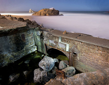
‘I must have it large, pretentious, in keeping with the environment, with the Heights, with the great ocean itself . . . ‘ -Adolph Sutro (1830-98), engineer, philanthropist, mayor of San Francisco
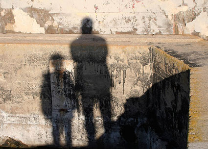
The ruins of San Francisco’s Sutro Baths (1896-1966) are fun to wander thru. Here’s some photosets on Flickr.
Sutro’s Cliff House was located just next door.

The Sutro Baths’ last stand: the fire in 1966 (film only, no audio)

A 1991 proposal for reopening the baths using solar/wind power

Program, 1897
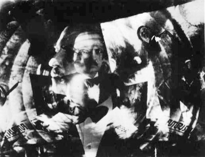
‘Futurism was an international art movement founded in Italy in 1909. It was (and is) a refreshing contrast to the weepy sentimentalism of Romanticism. The Futurists loved speed, noise, machines, pollution, and cities; they embraced the exciting new world that was then upon them rather than hypocritically enjoying the modern world’s comforts while loudly denouncing the forces that made them possible. Fearing and attacking technology has become almost second nature to many people today; the Futurist manifestos show us an alternative philosophy. Too bad they were all Fascists.’ -Kim Scarborough’s Guide to Futurism
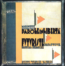
Parole in Libertà book cover (1932), found via laura@popdesign
This year is the 100th anniversary of F. T. Marinetti’s Manifesto of Futurism (1909) – and San Francisco has celebrations planned October 14th thru 18th. [Read more →]


the work at the mehallo blog. beta. is licensed under a creative commons attribution - noncommercial - no derivative works 3.0 united states license. if reposting, credit must be given to steve mehallo - and if possible, please provide a link back to the mehallo blog. beta.
i include images for the purpose of critique, review, promotion and inspiration - and always make my best effort give credit/link back to the original source. if i’ve screwed up, please fire me a note.
page layout based on the wordpress 'darkwater theme' by antbag, adapted and redesigned by mehallo. valuable php assistance from bill mead.