‘Make my website for free’
Here’s one more.
Same robots, but not really. Different robots because the voices are different.
I’m smart. I figured that out.
Here’s one more.
Same robots, but not really. Different robots because the voices are different.
I’m smart. I figured that out.
This one’s been bouncing around for a few weeks now. And one of the reasons this video resonates is – it’s sooo true. I’ve had similar conversations over the years (even just a couple months ago), but don’t remember this much swearing. At least not during the actual conversation.
And (below) here’s the sequel . . .
And another . . .
Found via Twitter.com/AngelaGlenn and Jonathan Weast
Congress Hall in Biel, Switzerland. Not Photoshop, it’s real. Responsible party: Sabina Lang and Daniel Baumann. Details here.
Click image for larger version/jump.
Found via Twitter.com/Typegirl
Interesting article over at Web Designer Depot on the differences between art and design.
As I like to reiterate in my classes, ‘Graphic design isn’t an art field, though it can contain elements of art. It’s a communication field.’
Big difference.
LAIKA from Michael Flückiger on Vimeo
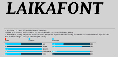
Traditional fonts are static. For their bachelor thesis, Michael Flückiger and Nicholas Kunz created a dynamic typeface called LAIKA.
LAIKA isn’t static. Style, weight, size, kerning and other properties can be adjusted on the fly using a control panel, as seen in the video. LAIKA can also respond to outside stimuli, such as people.
To test drive/interact with LAIKA, go here.

Interactive online interface for LAIKA
Found via Twitter.com/frank000
Sick of overdesigned interfaces? Go Swiss!
Emily Chang does a roundup of Helvetwitter, Helvetical and more.