Future flower
‘London architects Tonkin Liu have completed a wind-powered metal flower beside the River Mersey in England’
Found via Dezeen
‘London architects Tonkin Liu have completed a wind-powered metal flower beside the River Mersey in England’
Found via Dezeen
‘The Island satirises the London-centric view of the English capital and its commuter towns as independent from the rest of the country.’
Steven Walter’s personality-driven symbol and typographic map of London.
Available to view in full screen mode. Click on images to zoom/jump.
Found via Zara Evens
Video for Garbage’s I Think I’m Paranoid. From their second album.
‘Truth be told, some of Toffler’s predictions have come to pass some 30 years later – his ‘precooked, prepackaged, plastic wrapped instant society’ is fairly dead-on . . . A small segment involving gay marriage also seems very prescient considering current events.’ –Odd Culture
Alvin Toffler’s 1970 novel (above) was an interesting take on the future. Too much technology, too much information, too fast.
Toffler coined the term: Information overload.
In 1972 on a not-so-career-high, Orson Welles narrated a made-for-teevee-wayy-too-serious-tho-unintentionally-goofy Future Shock documentary. Watch it here: [Read more →]
‘If you wanna be masculine. Really masculine. Charles Bronson masculine. You need Man Dom cologne. Pour that shit everywhere. All over ya.’ -Jason Malmberg
1970s Japanese tv spot. With Bert Lahr (from the Wizard of Oz) working the door.
Found via Jason

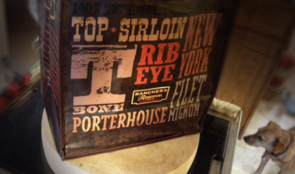
Safeway has a new reusable, old west-styled typographic beef cuts bag – picked it up last night. Reminds me of the CBS Gastrotypographicalassemblage.
Begging dog sold separately.

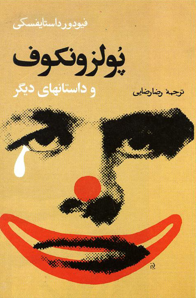
‘Morteza Momayez (1936-2005) was a Tehran-based graphic designer of posters, covers, logos, and books.’ -Steven Heller

Found via Reza Abedini
Steven Heller, Jonathan Hoefler and Tobias Frere-Jones on type.
‘Amazing fontstaches! I love Mr. Jeanne Moderno myself =D’ –Darren Evans
Hm.
I actually am Mr. Jeanne Moderno – since I did name the font after my wife.
And I did kind of base that bracket on the facial hair of this particular potato chip mascot.
Really.