Beyond Burberry

‘An ode to Lady and the Tramp’ -Emma Watson

Video for One Night Only’s Say You Don’t Want It. Featuring (now) former Burberry model, Emma Watson and her bf. Album drops in the US September 7, 2010.

Vuitton Persona

‘Vuitton Persona is an all-capital two-color custom font designed by Jean François Porchez for Louis Vuitton Malletier. Hand-painted stripes and monograms are part of the Vuitton heritage, and it was natural to apply this to new technologies.’

Exclusive typeface. Custom monograms. Details here. Official website here.

Georgia, expanded


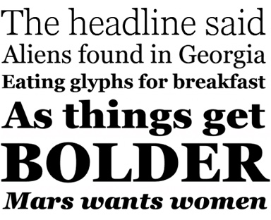
A few fonts from the new Georgia Pro type family

Matthew Carter’s Georgia is among my favorite fonts. And recently, Georgia turned into something a bit  . . .  more.

I love that Georgia exists, or the interwebs would be Times forever (well, until WOFF kicks in) – and without Georgia, the argument that sans fonts online are more legible (which I think is hooey) sort of wins.

And if you’re reading my blog directly online (without using RSS), you’re reading Georgia. It does what I like it to do. Reads well. [Read more →]

Commercial Type

‘Christian Schwartz has partnered with Paul Barnes to form Commercial Type, a new type foundry based in London and New York’

Pictured – some beautiful types – Austin and Giorgio – by Christian Schwartz and Paul Barnes.

Visit the new foundry here. Click on the images for type info/jump.

Metal Spiekermann!

Isla Waite’s extremely heavy, laser cut student final from my most recent experimental typography course. Her research subject was Erik Spiekermann.

No digitally-made drop shadows here.

Type Munching Dinos by Tiffany Valdez.

Mondo Spiekermann!

Erik Spiekermann was the guest on Design Chat last week.

Archive here. Detailed post about Spiekermann (with additional videos, links and tons more) here.

I still use his Sheep book as my intro text to the world of typography.

Stephen Fry and the Guttenberg Press


Part one

‘Fry travels across Europe to find out how Gutenberg kept his development work secret, about the role of avaricious investors and unscrupulous competitors and why Gutenberg’s approach started a cultural revolution.’

Stephen Fry loves design. That’s one of the reasons he’s really cool. [Read more →]

Me give talk: Being a teacher, the ‘idle youth’

So I’m pretty much out the door right now – driving down to TypeCon.

And this Thursday morning I’ll be speaking as an ‘icebreaker’ in the Type & Design Education Forum. I’ll be going over a bunch of things I’ve learned while teaching; things that I’ve discovered work very well in a creative classroom. [Read more →]

‘How to be alone’

I have my social side, and my quiet side. Need both. My quiet side results in new fonts and other creative endeavors.

Visual poem (above) by Tanya Davis.

Found via Porcelain Grotto

Copenhagen Mayo

‘I could not be happier about this, or any more proud to live in a city that recognise the importance of preserving this kind of work.’

Vintage signs unearthed and preserved in Copenhagen. Details here.

Found via Martin Klasch

Babel, Aldridge, Fantastic

‘The Who came to see me for a job. Then Cream. Then the Stones. And then The Beatles.’

Pictured, cover for Elton John’s 1975 concept album Captain Fantastic and the Brown Dirt Cowboy by designer/illustrator Alan Aldridge.

Aldridge interview here. Book, The Man with Kaleidoscope Eyes here. Babel track, below.


Elton John: Tower of Babel


Creative Commons License

the work at the mehallo blog. beta. is licensed under a creative commons attribution - noncommercial - no derivative works 3.0 united states license.  if reposting, credit must be given to steve mehallo - and if possible, please provide a link back to the mehallo blog. beta.

i include images for the purpose of critique, review, promotion and inspiration - and always make my best effort give credit/link back to the original source.  if i’ve screwed up, please fire me a note.

page layout based on the wordpress 'darkwater theme' by antbag, adapted and redesigned by mehallo.  valuable php assistance from bill mead.