Titillation
‘Designed by Suomi Type Foundry, Titillation is a rounded, tall and modern styled sans’
Tomi Haaparanta’s Titillation font. Available here.
‘Designed by Suomi Type Foundry, Titillation is a rounded, tall and modern styled sans’
Tomi Haaparanta’s Titillation font. Available here.
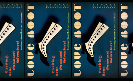
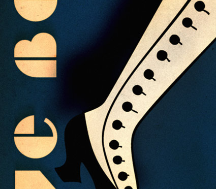
‘Exciting, Neue, Romance! Adventure!’
‘Love Boot’ prints, cards and postcards.
Vintage, repeating playbill poster design featuring type and boot dingbat from my Jeanne Moderno fonts.
And . . . Save $10 on your order of $35 or more at my store. Restrictions apply, go here for details/to get the discount.
(The prints come out really nice too)

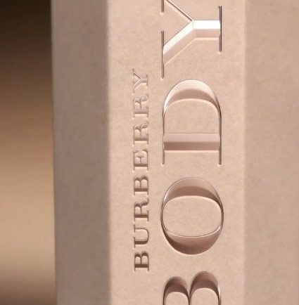
Got a whiff of Burberry Body yesterday.
Sweet and floral with a hit of musk and absinthe. The fragrance was developed by Michel Almairac with overall design headed up by Burberry creative director Christopher Bailey.
Campaign features Rosie Huntington-Whiteley (doing another trenchcoat tease), photographed by Mario Testino.


‘Give a Wall Street banker enough rope and he will hang himself’
The work of Miami-based street artist Above. Video by Peter Vahan and Hermes, location provided via Primary Flight and White Walls Gallery. Article here.
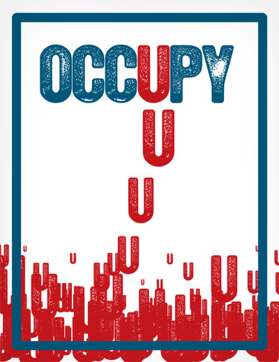
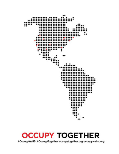
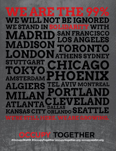
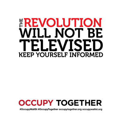
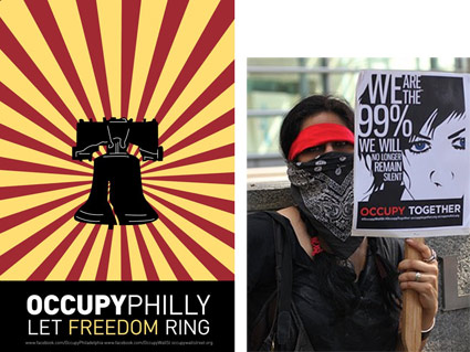
As more of the world finds itself occupied, additional visuals are showing up on the interwebs.
Above, OCCUPY U poster created by an anonymous designer friend, whose name is left off for fear of losing another job (click to download printable PDF).
Below, statistical poster from new website Occupy Design. And at bottom, Shepard Fairey does his thang.
Click on images to download and/or jump to respective websites.
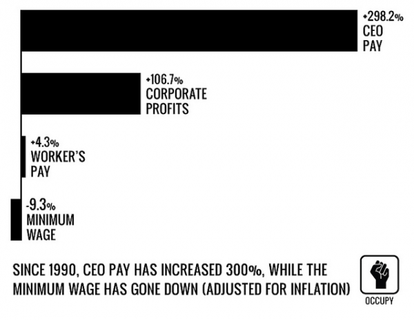
Occupy Design found via GOOD
‘What role we are playing. Making the filthy oil company look ‘clean,’ making the car brochure higher-quality than the car, making the spaghetti sauce look like it’s been put up by grandma, making the junky condo look hip. Is all that okay, or just the level to which design and many other professions have sunk?’ –Tibor Kalman
I first discovered Tibor Kalman’s work sometime around 1990.
He was doing something that most everyday graphic designers seemed to be avoiding. Questioning things.
His adeptness at social change – being a responsible human being, helping others – happened by working within the system. First at Barnes & Noble, M&Co., then Interview, Colors magazines. And as a teacher.
Before he passed in 1999, Kalman was the facilitator of what I see as a great awakening in our industry. And those who were part of his circle – such as his wife Maira, Stefan Sagmeister, Scott Stowell, Alexander Isley – have made graphic design much more than pretty brochures and generic logotypes.
Good design for good purposes is good. Making shitheads lots of money thru questionable practices is bad. Seems simple, right?
It isn’t.
I posted this because the rest of the world is waking up just about right now. And this past week, Steven Heller wrote up a great piece on Kalman.

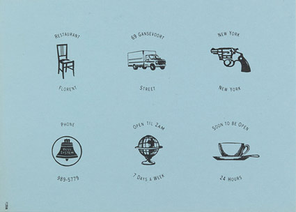
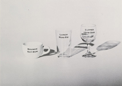
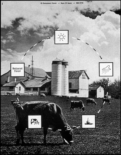
Pictured from top down, advertisements and promotions for NYC’s Restaurant Florent. With Alexander Isley, from 1985–88. Found via Tibor Kalman: Design and Undesign and MoMA
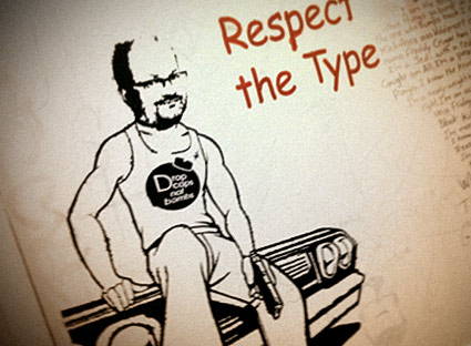
‘Drop caps not bombs’
An anonymously-created stencil interpretation of myself – spotted last quarter on the wall at the Art Institute of California Sacramento.
(Okay, I know which student made it, but I ain’t tellin)
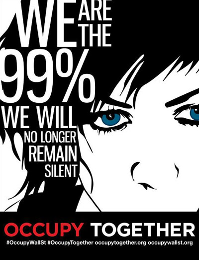
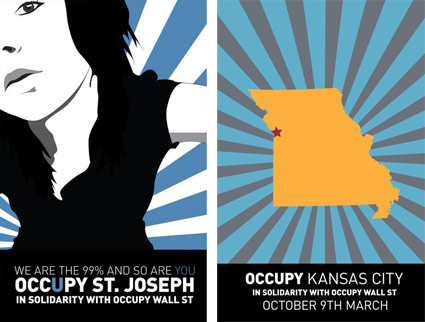
‘I’ve been doing posters for tons of cities across America’
In the past few weeks, one of my former students has found herself cast as the visual heart of the Occupy movement. Raina Dayne started with offering to do a poster and it’s blossomed into something much bigger.
Raina’s images can be downloaded for use at the Occupy Together website. Facebook page here, shirts here.
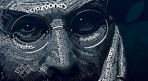
‘Your time is limited, so don’t waste it living someone else’s life. Don’t be trapped by dogma – which is living with the results of other people’s thinking. Don’t let the noise of others’ opinions drown out your own inner voice. And most important, have the courage to follow your heart and intuition. They somehow already know what you truly want to become. Everything else is secondary.’ –Steve Jobs
Intuition is very powerful, once one knows how to trust it. It involves turning off the insecurities of ego and concentrating on pure feeling. And it works wonders.
The news of Steve Jobs’ passing came in via social media. I saw a Facebook post right after I gave a design history lecture on early modern artists and how they’d managed to change the world.
I was fortunate enough to both go to school and work in and around Silicon Valley where Jobs’ approach reverberates and inspires. Playing it safe, following the status quo will not lead to new things, will not improve life as we know it – and Jobs knew how to get the best work out of Apple’s creative team.
He knew that details are excruciatingly important. Leveraging design, using good typography, giving us what we really want – instead of what we think we need – was all part of the package.
Thinking different makes the world a better place. That’s the legacy he leaves.
Image by Dylan Roscover, using Apple’s suite of fonts from over the years


the work at the mehallo blog. beta. is licensed under a creative commons attribution - noncommercial - no derivative works 3.0 united states license. if reposting, credit must be given to steve mehallo - and if possible, please provide a link back to the mehallo blog. beta.
i include images for the purpose of critique, review, promotion and inspiration - and always make my best effort give credit/link back to the original source. if i’ve screwed up, please fire me a note.
page layout based on the wordpress 'darkwater theme' by antbag, adapted and redesigned by mehallo. valuable php assistance from bill mead.